Do you hear the sound of the Pacific ocean crashing beneath your deck?
Well, some of these residents do. And today, I’m sharing a quick spin through a few more of the homes on Dwell on Design’s Fall Malibu Home Tours below.
Malibu Fires
Several weeks after I toured these homes, the fires began in Malibu. It was so tragic to see the devastation ripping through those hills.
So, while I had published this post about one of those beautiful homes, it seemed a little strange to keep posting more about them until the fires had all died down. All of the homes on the tour seem to have been located further south of most of the devastation, so I’m pretty sure these all survived.
It just seemed in poor taste to publish amidst all the bad news.
I was gifted some free tickets to the tour from Dwell on Design, in return for writing about some of these beautiful homes here on my blog. It is such a treat to get to share these with you, my readers!
All images in this post were taken by me.
Sharing these gorgeous malibu properties today
So, I’m back on track with all the beautiful remodeling and design work that was on view for all of us on that tour. Hope you design lovers enjoy!
What a treat to get to walk into one of these houses perched right above the beach in Malibu, on the Pacific Coast Highway. I have been down that highway many times and I’ve always imagined what it would be like, to stand in one of those homes and look out over the ocean.
I don’t have to wonder anymore. :-)
Malibu Home Tours - Dwell by Design, Architect Lorcan O’Herlihy #contemporaryarchitecture
Malibu Home Tour, Dwell on Design, Architect Lorcan O’Herlihy #contemporaryarchitecture
House Noir
One of the homes was right on the PCH, a modern, black metal clad house, “House Noir”. The ocean rolled in right under the deck.
Architect was Lorcan O’Herlihy.
Malibu Home Tour, Dwell on Design, Architect Lorcan O’Herlihy #contemporaryarchitecture
Inside, it was all white, sleek and contemporary.
Malibu Home Tour, Dwell on Design, Architect Lorcan O’Herlihy #contemporaryarchitecture
Malibu Home Tour, Dwell on Design, Architect Lorcan O’Herlihy #contemporaryarchitecture
Morning View Residence
This spacious home pictured below, designed by Vitus Matare, was another indoor/outdoor experience.
These wide sliding doors are very prevalent in a contemporary California style. My own clients, in Thousand Oaks, are going for 13’ wide sliders in their remodel.
Dwell on Design Malibu Home Tours | Architectural Designer: Vitus Matare #contemporaryarchitecture #slidingglassdoor
The large pivot door at the entry opens easily. It’s all about the glass in these contemporary homes.
California contemporary design - Dwell on Design’s Fall Home Tour, Designer: Vitus Mitare #contemporaryarchitecture #pivotdoor
This home had a huge kitchen island that was really the center of the whole main floor.
California contemporary design - Dwell on Design’s Fall Home Tour, Designer: Vitus Mitare #contemporaryarchitecture #kitchenisland
I like the idea of a second sink close to the cooktop. That’s always been one of the design flaws of pot fillers, I thought. You can fill a pot with water, but you still have to carry it, full of hot water, over to the sink to empty it, strain pasta or vegetables, etc.
California contemporary design - Dwell on Design’s Fall Home Tour, Designer: Vitus Mitare #contemporaryarchitecture #kitchendesignideas
California contemporary design - Dwell on Design’s Fall Home Tour, Designer: Vitus Mitare #contemporaryarchitecture #kitchendesignideas
The wood ceiling adds warmth in this space. Notice how the metal rings on the can lights are not white, which would have stood out dramatically! :-)
California contemporary design - Dwell on Design’s Fall Home Tour, Designer: Vitus Mitare #contemporaryarchitecture #slidingglassdoor
California contemporary design - Dwell on Design’s Fall Home Tour, Designer: Vitus Mitare #contemporaryarchitecture #slidingglassdoor
I do love the smooth concrete floors in this home. What a great base for any kind of rug or color palette. This house was for sale, so it was monochromatic and not really personalized for a reason.
Bathrooms With Venetian Plaster Walls
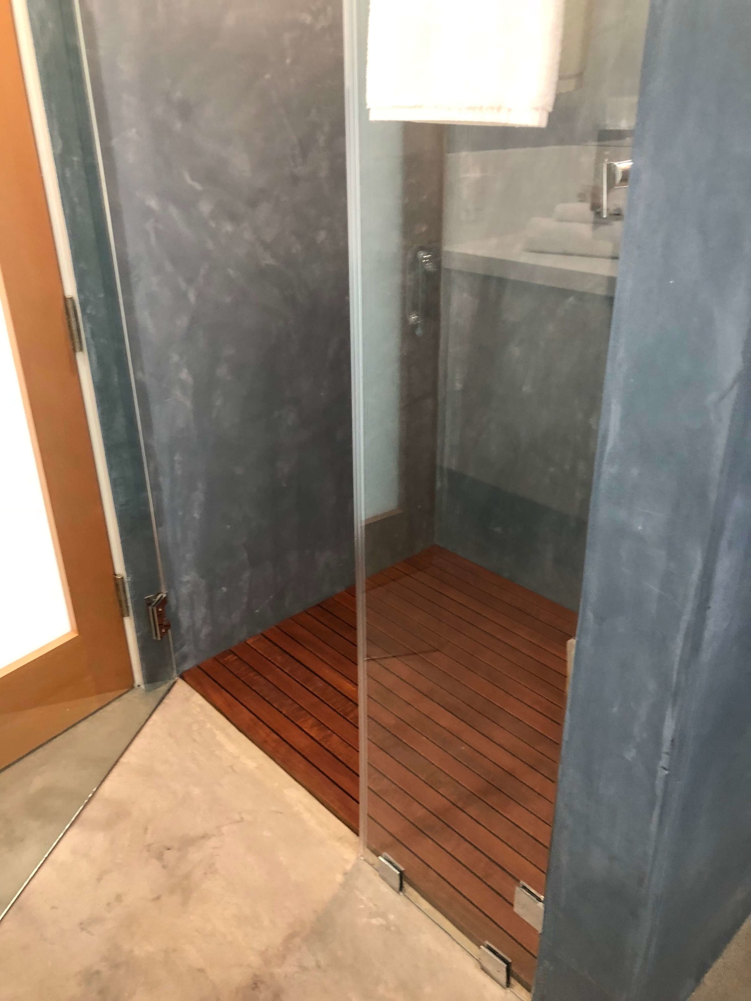
All the bathrooms in this house had Venetian plaster walls (even in the showers), concrete floors and a curbless shower with flush wood slats as the base. It all made for a very clean, simple aesthetic, with the wood and slight undulation in the plaster creating some depth and warmth.
I’ve worked with a finisher before who told me this is a possible finish for showers, but I have never used it before. I was so glad to get to see it in person and get some photos.
I’m sure it is better in this dry California climate than in our humid one here in Houston.
California contemporary design - Dwell on Design’s Fall Home Tour, Designer: Vitus Mitare #contemporaryarchitecture #venetianplaster #shower
California contemporary design - Dwell on Design’s Fall Home Tour, Designer: Vitus Mitare #contemporaryarchitecture #venetianplaster #shower
California contemporary design - Dwell on Design’s Fall Home Tour, Designer: Vitus Mitare #contemporaryarchitecture #venetianplaster #shower
Having three floors and then a roof deck, the main level walked out on a patio built on top of the garage on one side of the house.
Patio on top of garage | California contemporary design - Dwell on Design’s Fall Home Tour, Designer: Vitus Mitare #contemporaryarchitecture #patio
Garage, below the patio, with glass door, gray painted interior |California contemporary design - Dwell on Design’s Malibu Home Tour, Designer: Vitus Mitare #contemporaryarchitecture #garage
By the way, after this tour, I’m totally into painting a garage dark gray. I also love the glass garage doors (although mine would have to be etched glass so no one could see my messy garage ;-).
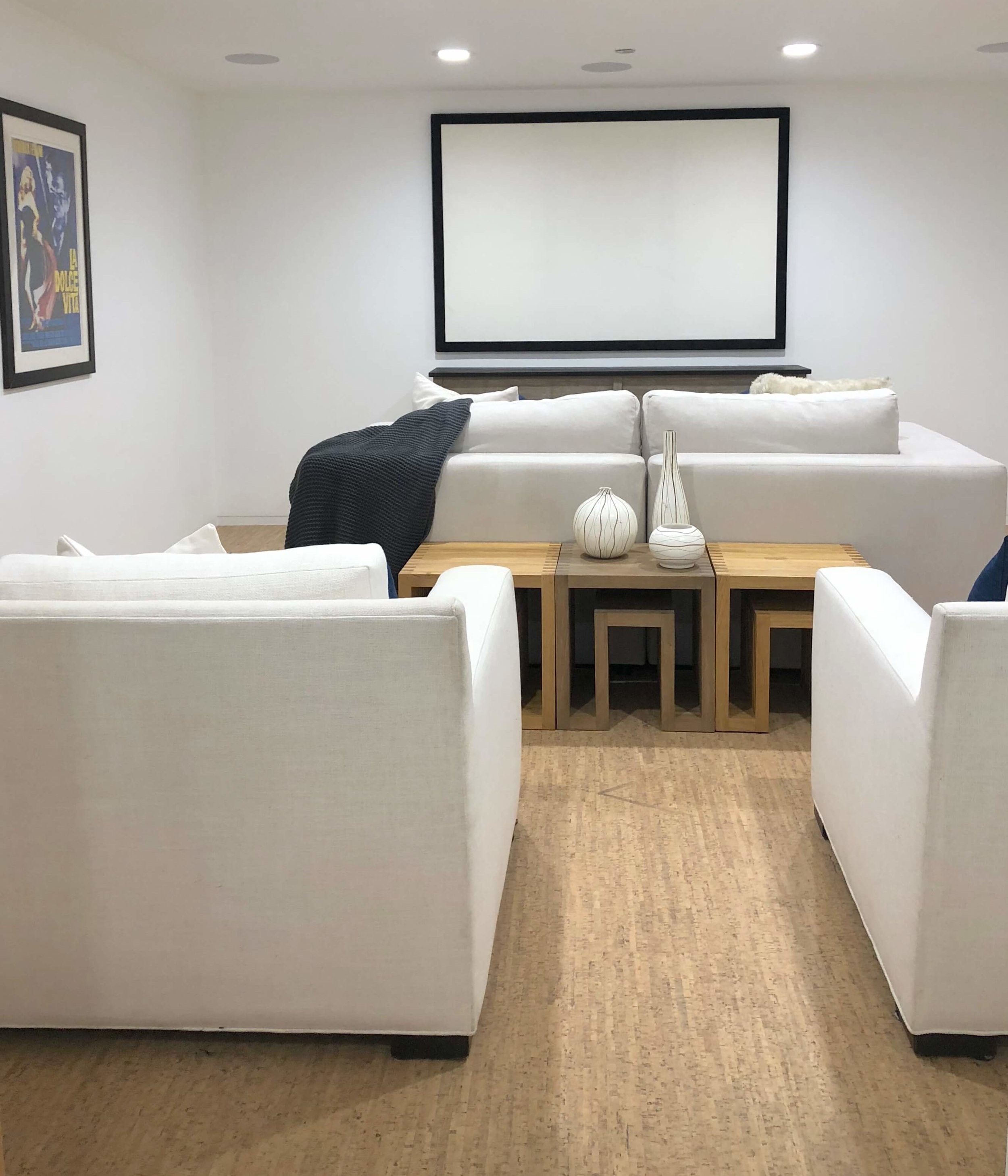
These stairs from the garage level, lead down to the media room. Love the cork flooring down there and the fact that it is white and not dark like most media rooms.
It warmed up the space and did some good things for sound absorption.
California contemporary design - Dwell on Design’s Fall Home Tour, Designer: Vitus Mitare #contemporaryarchitecture #stairs #corkfloor
California contemporary design - Dwell on Design’s Fall Home Tour, Designer: Vitus Mitare #contemporaryarchitecture #mediaroom #corkfloor
California contemporary design - Dwell on Design’s Fall Home Tour, Designer: Vitus Mitare #contemporaryarchitecture #mediaroom #corkfloor
Bedrooms
All the bedrooms opened up onto patios with more sliding glass walls.
This house also had no baseboards, like the house I shared before.
California contemporary design - Dwell on Design’s Fall Home Tour, Designer: Vitus Mitare #contemporaryarchitecture #bedroom #slidingglassdoor
California contemporary design - Dwell on Design’s Fall Home Tour, Designer: Vitus Mitare #contemporaryarchitecture #slidingglassdoor
California contemporary design - Dwell on Design’s Fall Home Tour, Designer: Vitus Mitare #contemporaryarchitecture #concretefloor
Suri Residence
There were two other houses on the tour, one was noted that we could not take pics, so I have none here. The other, I wasn’t told until I had snapped a few and I did take some of the exterior.
This house is up on a hill overlooking the PCH and the Pacific Ocean. What a spectacular view.
Malibu Home Tour, Dwell on Design - Burdge and Associates Architects | #contemporaryarchitecture #luxuryinteriors
Designed by Burdge & Associates Architects, you definitely feel on top of the world here.
The pics below are of the back kitchen or the entertaining kitchen, with a full walk-in refrigerator and gorgeous natural stone. The bar was downstairs with a game room, exercise room and spa area.
So luxurious!
Malibu Home Tour, Dwell on Design - Burdge and Associates Architects | #contemporaryarchitecture #kitchen #luxuryinteriors
Malibu Home Tour, Dwell on Design - Burdge and Associates Architects | #contemporaryarchitecture #bar #luxuryinteriors
What a glorious peek into the world of high end, contemporary style living. These Dwell on Design tours are not to be missed!
I hope to get back out in the spring of 2019 to see even more. It’s a great time to combine some work with pleasure and spend some time with my beautiful daughter, who lives in LA, as a touring partner. :-)
Loved touring these fab homes with my daughter | Malibu Home Tour, Dwell on Design #contemporaryarchitecture


