This living room needed some cosmetic changes to help this room feel more intentionally designed. Cosmetic changes for a fireplace / tv wall can be almost neglegible, a lot of times you have to do more construction. However, I think I had a solution that would really help.
This 4th floor walk up is not a forever home, but it had one nice feature that made it a more interesting room.
A sloped, beamed and painted wood ceiling.
See the pics below.
My blog contains affiliate links. Any purchases, at no additional charge to you, render me a small percentage, are most appreciated and make this blog possible. :-)
Before - Living room with sloped ceiling
Before - Fireplace / TV Wall
I wanted to start with the fireplace wall first.
When I enlarged the photo, it looked like the wall there was either painted brick or painted wood, I could see horizontal lines across the wall. I also noted that there wasn’t really mantel around the fireplace and but a shelf with brackets used as a mantel.
With only cosmetic changes to be made, I couldn’t suggest doing any kind of major construction.
It looked like the tv was housed in part of an old media cabinet, so I felt like that should be updated with something new. With the sloped ceiling, I wanted the tv cabinet to be lower on the right side of the fireplace, and then taller items used above the fireplace for an asymmetrical look.
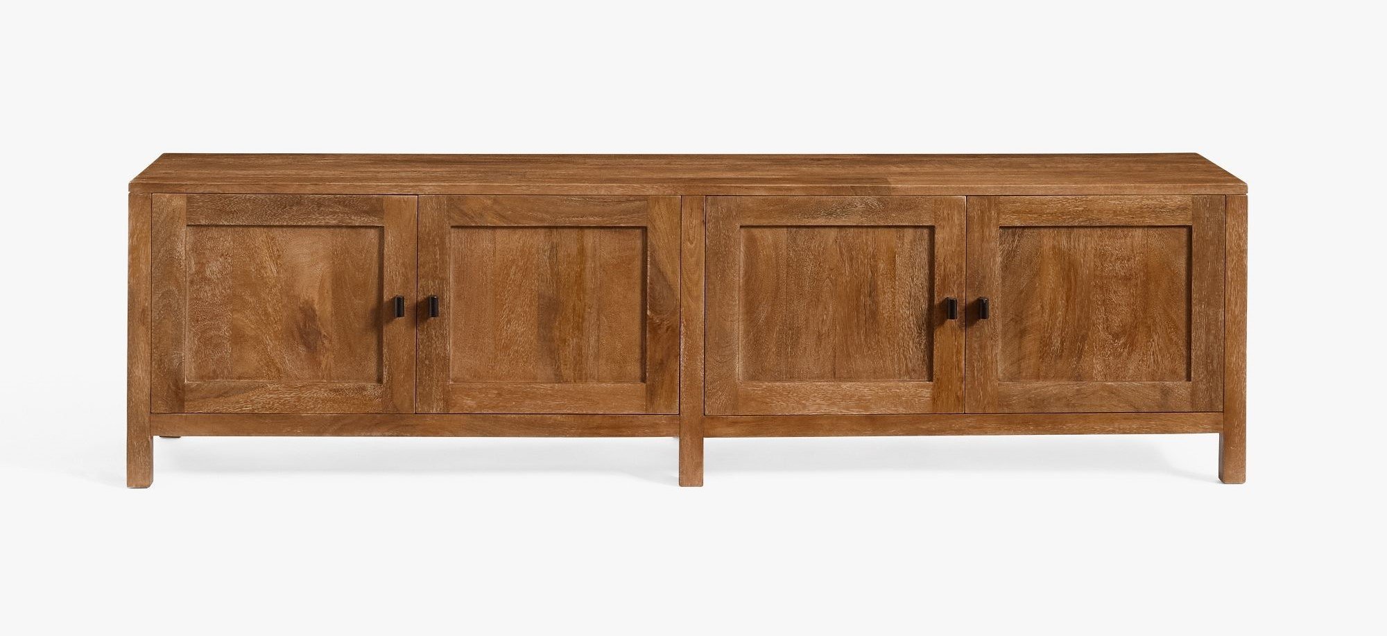
A cabinet like this one would work much better. I like the warm wood here and the fact that it is low, 19” high. If this is too wide, at 70”, then there are a lot of similar ones out there that could be substituted.
I did think they could easily replace the thin shelf with something beefier, with a minimal amount of effort. You can buy nicely finished shelves in a variety of sizes now and just replace what is there now.
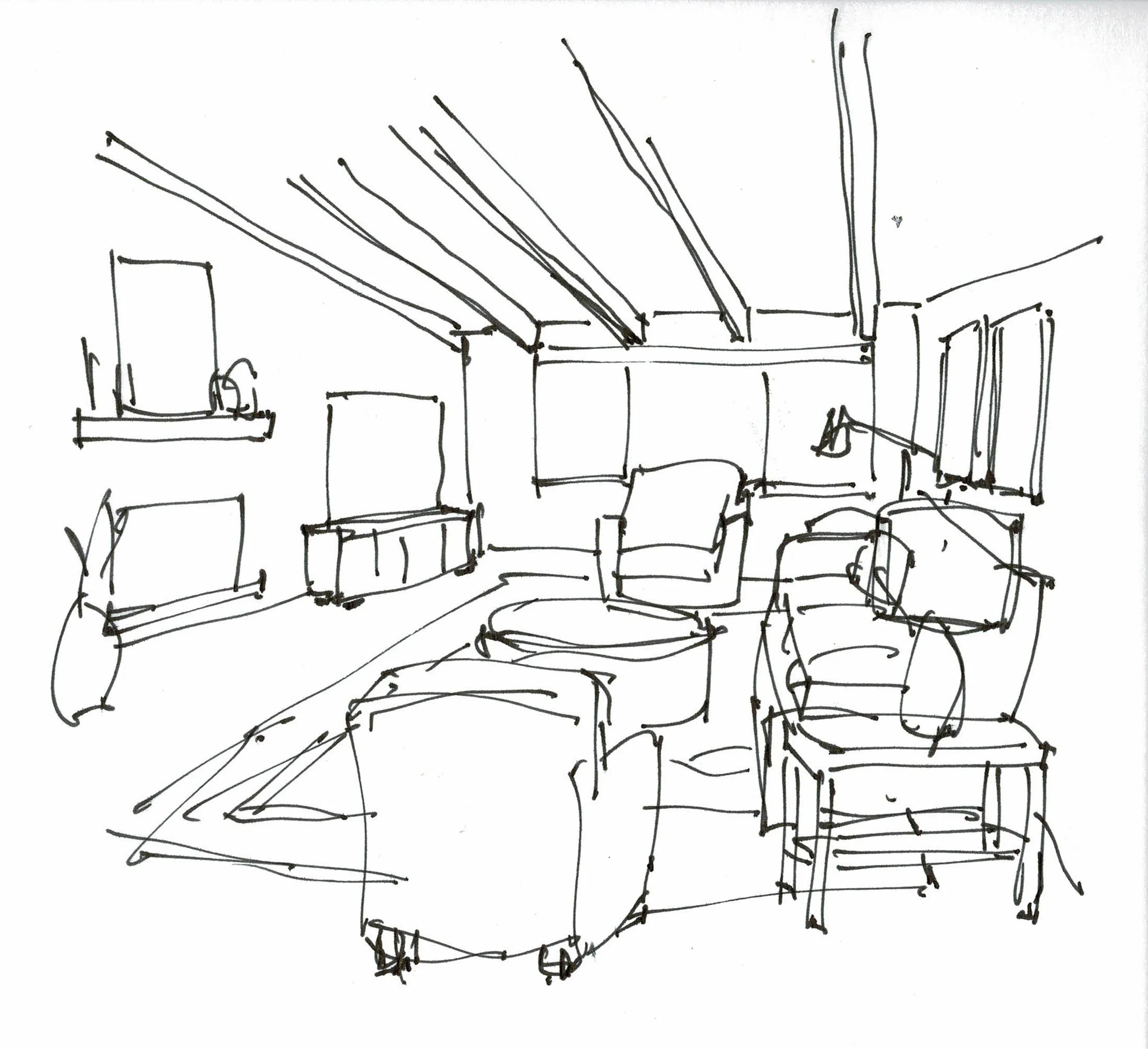
With some vertical artwork stacked on the mantel along with tall vases and candleholders, these furnishings are feeling more like they fit the angled wall.
A tall plant in the corner with a floor vase would help weight that side and contribute to the asymmetry.
Quick Sketch of Proposed Fireplace / TV Wall - Carla Aston, Designer
The big elephant in this room is truly a big elephant, the sectional sofa.
It is too large for this space and there is no flexibility with it like some sectionals have, where you can take them apart to make two small sofas.
I would opt for a standard width sofa here, around 7'-8’ in length, in a performance fabric. A softer look in this room would help.
Definitely go for a bigger rug, something lighter in color overall would be nice. Two chairs and a round coffee table with some large, vertical art pieces above the sofa would work nicely to furnish this room.
Quick Sketch of Proposed Living Room Furnishings - Carla Aston, Designer
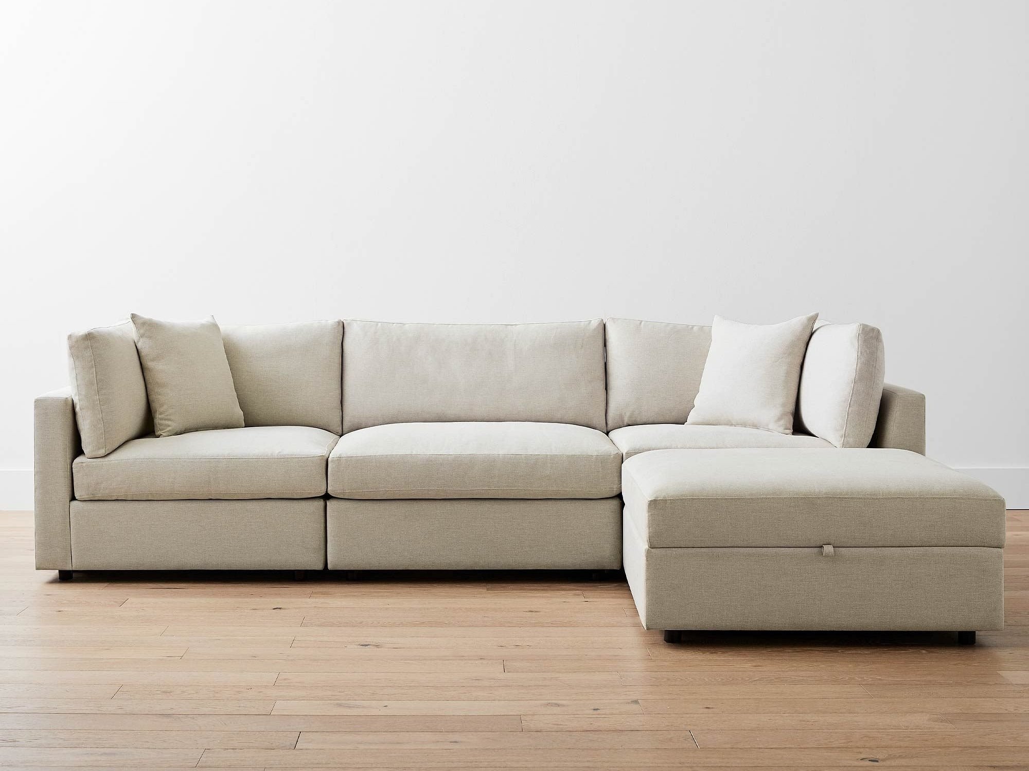
If they really wanted to keep a sectional, something like this modular one would work. I like that it has a movable storage ottoman that can function as part of the sofa’s chaise lounge.
Right now, the sofa feels like it blocks off the room. I thought perhaps they could rotate it, but it looks like there is a heating or a/c unit below the window that might need to be accessible and the tv would not be good for viewing from that side.
Instagram Subscriber Group
I’m going to discontinue my Instagram subscriber group in 2025. If you have design or decorating questions you want to ask through the first week of December, you might want to join for this short time. It has been fun but I’m going to focus my time elsewhere with more touring of homes and travel in the new year.
If you want to join for the next 3 months, there is a “Subscribe” button on my Instagram profile. This is a one question Q&A, done on the first Sat of the month. I start taking questions the week leading up to that first Saturday. I usually get several questions each time, all from different subscribers. I answer in my stories that weekend.)
This blogpost was thoughtfully written by me, Carla Aston, and not by AI, ghostwriters, or guest posters.


