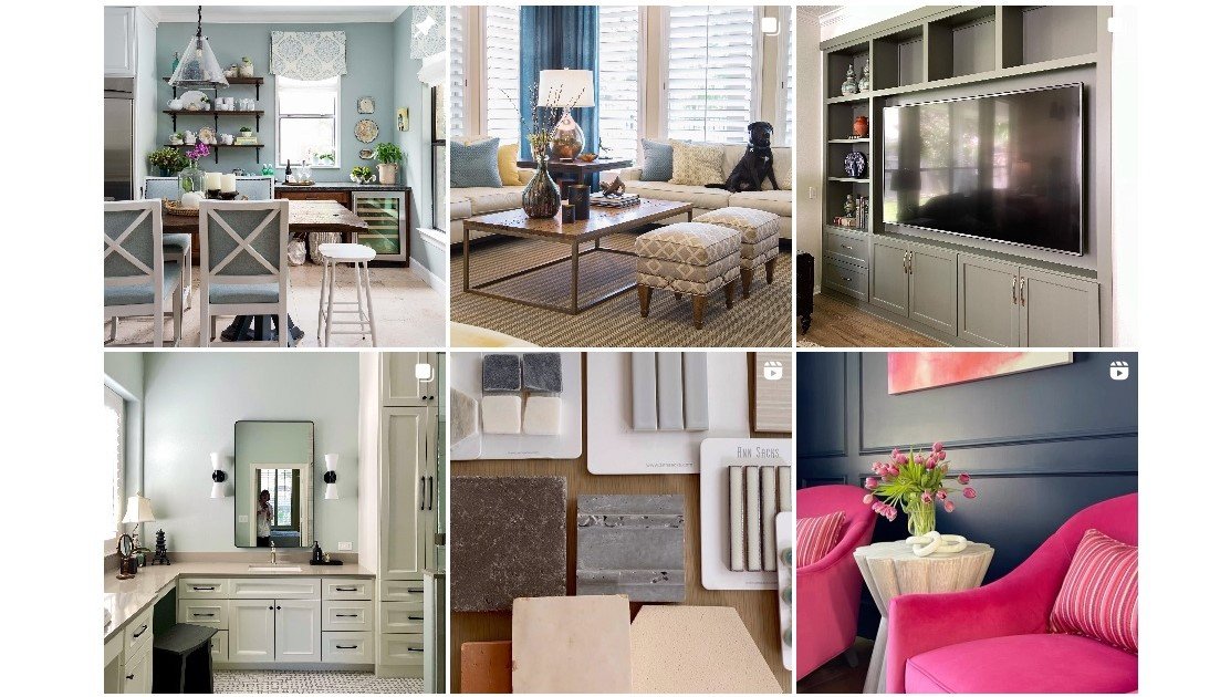
I had coffee with a designer friend last month and we were chatting about Instagram and how it just wasn’t that inspiring anymore.
I feel like there’s just so much inspo and the scrolling habit there just doesn’t provide depth or many real solutions for people to sink their teeth into and learn from.
These days I think for a designer to stand out on Instagram, you have to share wildly unique and different design, usually highly customized and expensive. I find myself even scrolling quickly through some amazing design because there’s just so much and it takes a lot to stop the scroll.
Let me tell you, that is hard for a content creator in design to keep up with. :-) And while eye-catching, I’m not sure it is really relatable or practical for most people.
Maybe that’s why a lot of design accounts have started posting images made in AI, but that is a whole different conversation. :-/
I’ve been looking elsewhere for Design Inspiration
If any of you follow my Instagram account, you might know I’ve been a bit out of commission lately. I had knee replacement surgery at the end of August. I had an allergic reaction afterwards and had to have another surgery two weeks later to check for infection.
I have had to really lay off of PT and everything for about a week. I’m still not totally in the clear and my recuperation period has been extended for sure. Especially when PT gets delayed, it just delays your healing.
I’m a person who needs to constantly be creating and challenging myself. I was worried I would be sitting on Instagram while not able to work much, scrolling the same old stuff, wasting my time, being bored and feeling stuck.
Although I still did some Q&A’s and have been keeping in touch with one client at the end of their project, I have found some cool design inspiration on YouTube during this down time that has totally inspired me. I wanted to share some of what I’ve found with you today just in case you are getting a little tired of Instagram inspo too.
YouTube Is Full of Design Inspiration
First, I wanted to watch some popular interior design YouTube creators to just see what they were putting out.
I got bored there fast. And annoyed. 😅
I soon found home tours though and happily settled in to binge watch.
There are several channels that do some nice home tours, Schumacher, Architectural Digest, House and Home, etc. but the ones I have enjoyed the most was from a channel named Homeworthy.
These tours seem to be mostly homes of designers (some well known and others not so much) along with some design enthusiasts. Each person takes you through their home sharing favorite art, furnishings, details about their remodels, etc.
These tours are very personal and really, the designers are allowed to go into great depth and even ramble a bit. You don’t hear a bunch of “chat” between the videographer and the designer at all, the designer is allowed to do all the talking which is really kind of unique.
I think I’ve seen almost all of them. They vary between sprawling southern mansions to tiny NYC apartments and everything in between in terms of both expense and scale.
Common Design Philosophies, priorities and Features
I do think there are some common threads that presented throughout the lot of the videos and that is what I’m really wanting to share here today. These commonalities show what designers consider important when decorating or creating a well-designed home.
I’m not surprised by these and I think any design lover would feel the same. See if these would ring true with you.
1) Comfort and Livability
Almost everyone comments on how they want their home to be comfortable and welcoming. Seriously, almost all say something about not wanting their home to not be too precious so that people are not afraid to put their feet up or sit and relax in their homes. Many talk about the use of performance fabrics.
Comfortable rooms that invite you in and aren’t necessarily “perfect” are always a winner.
2) Love of art/ gallery walls
We all know designers love gallery walls, well, you can see evidence of this in almost every home. They mostly seem to buy art they love first and then find the place for it. The gallery wall then is a great place for diversity and allows for collecting over time.
Gallery walls allow for art collections and photo walls to grow and evolve over time.
3) Consummate Collections
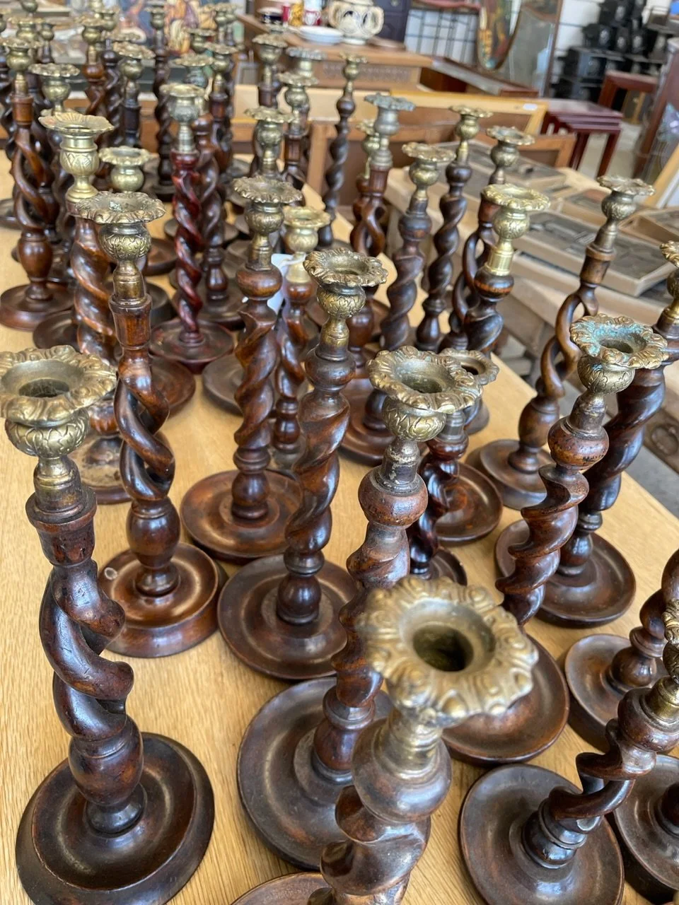
I would say that I really didn’t see much minimalism. In fact, it was just the opposite in most of these designer’s homes. They all seem to have collections going, everything from small items that fit on bookshelves to larger pieces like chairs and textiles.
I thought it was really interesting that most had kept things that had been inherited or passed down from family members. That actually made me so happy to see as we are constantly all being told by the design press that younger people don’t want any of our “stuff” anymore. It made me smile to see how the younger designers collected antiques and vintage and valued pieces that came from their family.
Collections of all kinds of interior decor help give a house personality.
4) Passion for Pillows
Oh, my goodness, as you might expect, designers love pillows. Often they don’t even have two pillows that match on a sofa, they have many customized in all kinds of different fabrics and trims in different shapes and sizes.
PIllows are a designer’s best way to add color and pattern in a space.
5) Tabletop Decorating
Almost all of the designers talked about how they loved setting a pretty table. I certainly have that in common with all of them!
Some designers even had tabletop collections with a few brands so, of course, they were into all things for a dining table. Special glassware, table linens and dishes, oh my! Many designers had incredible collections.
Tabletop decor seems to be a designer weakness.
6) Wallpaper
Of course, you saw that coming, right? Some designers had wallpaper in most of the rooms of their homes. It felt like a home wasn’t complete without wallpapers somewhere, even on the ceiling.
Wallpaper is a designer favorite tool for personalizing a home.
7) Trim
One thing that can really bust a budget is adding excessive trim to pillows, upholstery, drapery, etc. When it comes to designer’s own homes though, they applied trim liberally. After all, this will be the place for a designer to do exactly what they want and most did not hold back on trim.
Trims and welts are popular designer details to add onto upholstery and pillows.
8) Traditional Interiors
There was a relatively small amount of contemporary interiors among the bunch and even when they talked about how they liked a mix of traditional and modern, the spaces looked more trad than mod. I would say the antique collecting and the trims and patterns kept most of the spaces feeling more traditional overall.
That Studio McGee look of “new, mod, transitional” was just not present in the videos I watched.
Antiques, collectibles and items handed down from family members add a story to any interior.
9) Color Drenching
I have always loved seeing the same color used on walls, doors and mouldings in a room and I saw that a lot in these videos.
Walls, bookcases and the ceiling was done in this navy color in a recent new build project.
Navy walls, bookcases and ceiling as well as all trim mouldings make this small library feel enveloped in color. Carla Aston, Designer
Coffered ceiling is drenched in the same color as the walls and bookcases. Carla Aston, Designer
10) White Kitchens
There were a lot of white kitchens. So, if you’re seeing comments from Instagram decor influencers that white kitchens are “out”, well, not in a lot of designer’s kitchens.
These designers seem more interested in the materiality of their kitchens, like the countertops, backsplashes and the decorating than staying “on trend” with the color of their cabinets.
I, for one, love a white kitchen. :-)
White kitchen cabinets have a timeless appeal.
That’s my little summary of some of the YouTube design content that has inspired me while I’ve been healing. If you love design like me, I think you’d love these videos too!
More Design Inspired YouTube Channels
I have a few more channels I’ve found interesting too that I can share.
Abode has a big variety of quality home and garden tv.
I love Lone Fox for a young, DIY type designer who is designing his own home full of vintage, FB Marketplace and thrift store finds. He’s so creative and his videos are sooooo professional and entertaining.
For high end design, Sophie Paterson is interesting to watch. A London based designer, she does such amazing projects all over the world and I love the tours of her home she sometimes gives.
I’ve really gotten into gardening and houseplants and love watching these two channels, below.
Wyse Guide is rather like a Martha Stewart type, with gardening, cooking and decorating ideas posted regularly. He’s lives on a farm in Iowa and I identify with his midwest country upbringing! I have tried some of his tips and recipes and they were all excellent! Here’s the link to his Youtube channel.
If you love gardens and gardening, this channel is a must! Garden Answer is a young, avid gardener with the most amazing huge property in southeast Oregon. She is so energetic and a delight to watch. She makes me want to get out and garden!
This blogpost was thoughtfully written by me, Carla Aston, not by AI, ghost writers or guest posters.


