I used to have a small sitting room like this at the front of my house. I turned it into my home office some years ago since my home, built in the 90’s, didn’t have one.
I do LOVE the small secondary living room idea though, as it just opens itself up for all kinds of options.
I kept a lounge chair and ottoman in my room, along with all my design books, for a sweet getaway for myself.
This space reminds me of the library in my Texas hill country project. That was designed particularly for the woman of the house.
The room I’m sharing here today will be more of a ladies’ lounge, used as a place for friends to visit and enjoy, away from the busy, open part of the house. I can imagine perhaps some couples get togethers with some sports on tv in the other room, perhaps. Can’t you?
She’s done a lovely job so far with this space, so let’s finish it up.
My blog contains affiliate links. Any purchases, at no additional charge to you, render me a small percentage, are most appreciated and make this blog possible. :-)
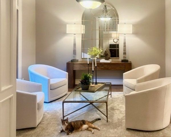
Ladies’ lounge room - a sitting room with a feminine touch.
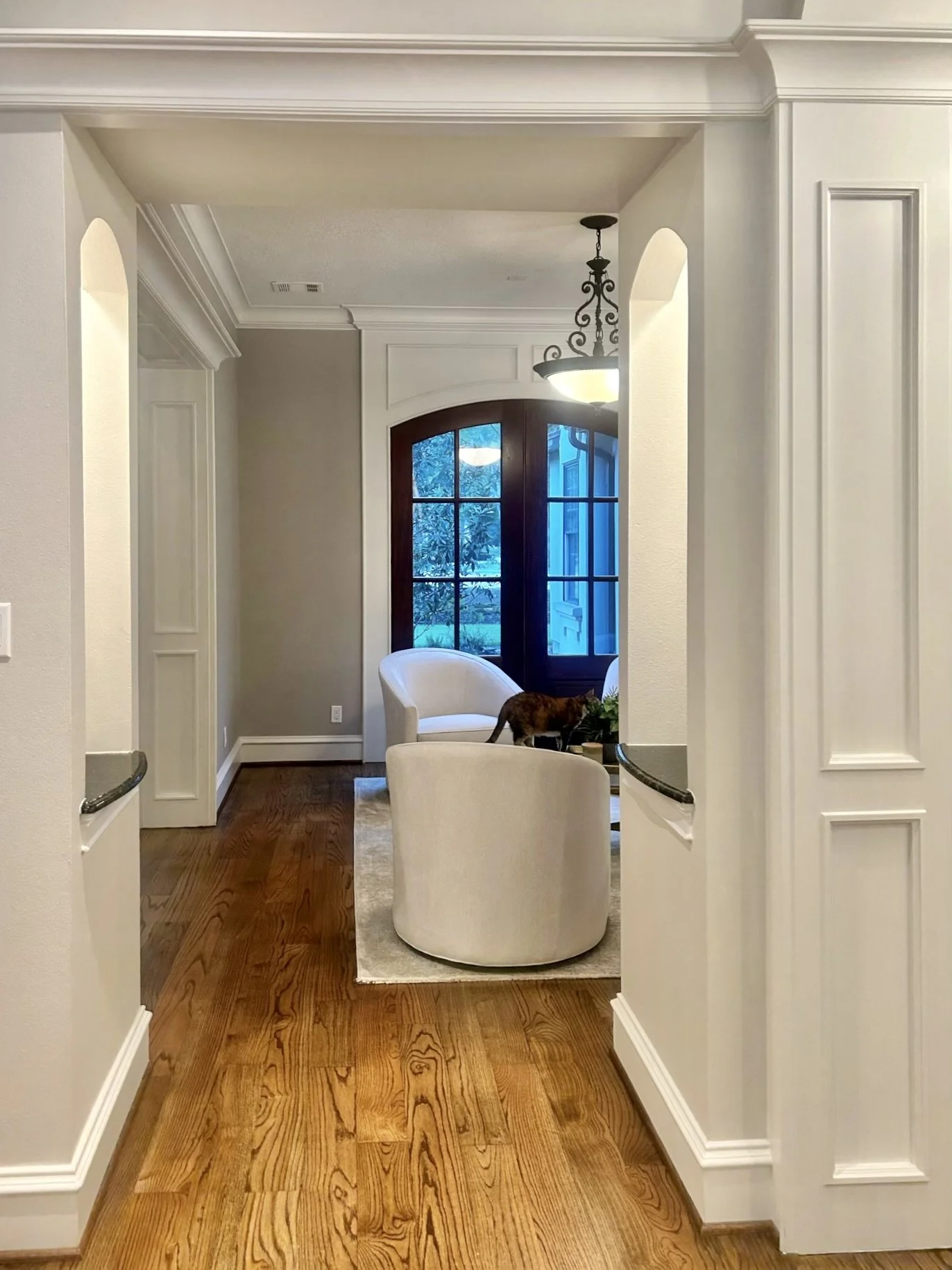
Ladies’ lounge room - a sitting room with a feminine touch. This room sits at the front of the house with some pretty French doors.
This blank wall will get some artwork in a ladies’ lounge.
The light neutrals are very pretty here and give an elegant look to this room. I’m going to go in with some warm gold neutrals to liven it up yet keep the feminine elegance.
I love a four-chair arrangement like this in a square space. It is a perfect situation for this seating group. I do prefer, however, a round coffee table instead of the rectangle.
I like this travertine top table with an iron base, I feel like it makes a statement and doesn’t disappear like the glass top.
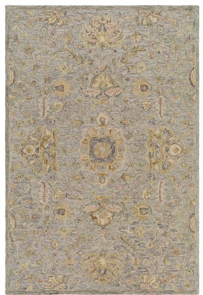
A new rug would be nice to bring in some of the warmth. I like this wool rug from Surya, kind of a mix of neutrals.
Pillows!
You knew that was coming, right? These gold velvet in a small pattern will look good here, one in each chair.
Wall Decor
I love the console with the arched mirror and tall lamps. Great job!
I do think we need some art. Four botanicals, two on each side, would be a sweet feminine touch. I love the idea of the wood frames to add some contrast on the wall.
Since we have some traditional art now, I like the idea of adding something abstract and simple on the blank wall in the corner. This art fills that space nicely and I like the mix of warm and cool neutrals.
Adding some drapery in here in a warm, soft gold color, will be nice at the French doors. I feel like the walls go a little gray, so I like adding in some warmer color here. I’d likely do some French rods wrapping around that white bump out, but it likely would be best to get these professionally done. When you extend out like this, you need to be sure the weight of the drapery won’t pull the rod off the wall.
We definitely need to change the light fixture, I’m wanting to go with something more modern, in a gilded look. This chandelier with flower shapes seems just perfect!
Now for accessories.
I’d like to see something big in the center of the console. This beautiful white sculptural bowl can be filled with some maiden hair ferns for a light, fluffy look.
I can see her reusing the horse sculpture with a round tray and a pretty brass vase for flowers.
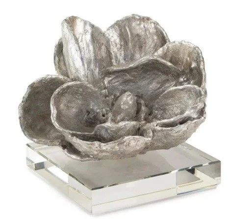
A stack of books and a silver magnolia sculpture finishes off the tablescape. I like the idea of something gold and silver on the table top here.
And here is the room all put together.
This blogpost was thoughtfully written by me, Carla Aston, and not by AI, ghostwriters, or guest posters.
I’m still taking a break from these Designed in a Click consultations because of my recent knee surgery, but I should be back at them in November. Thanks for your patience!
Perfect Brass Vase
BTW, I thought that brass vase was so perfect, I bought one for myself (like I really need more vases :-). It is just the right height for some substantial flowers, without going really big on an arrangement. The top part tapers in which is so handy for getting flowers to stand up nicely.
The brass doesn’t sweat, you can fill water directly into it without worry of it leaking and it has this fully felted bottom so it won’t scratch your table top!


