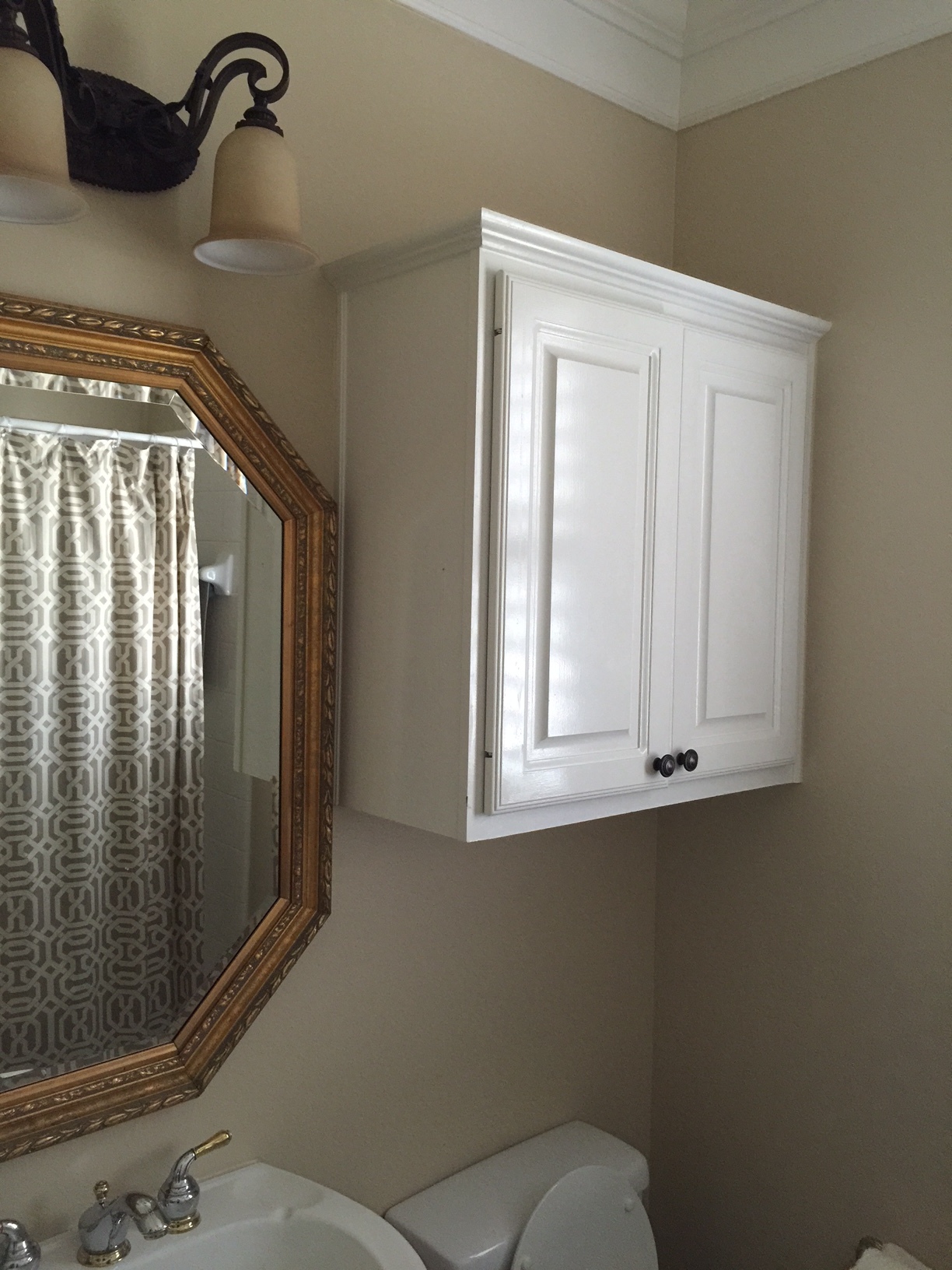
Christmas has come and gone. Now it’s time to begin thinking about the new year!
Are you considering any interior design projects for 2016? If so, whet your appetite a bit by taking a look at an example of what we here at DESIGNED w/Carla Aston do. I’m certain what follows will cause you to begin thinking about all of your home’s possibilities.
Right now I’m working with a former client on two small bathroom remodels in their home.
One is a powder room/guest bath; the other is a jack and jill bathroom that is shared by her two little boys.
The existing bathrooms were ordinary and had some fixtures that needed to be replaced. If you ask me, that means now is the perfect time to do a redo. ;-)
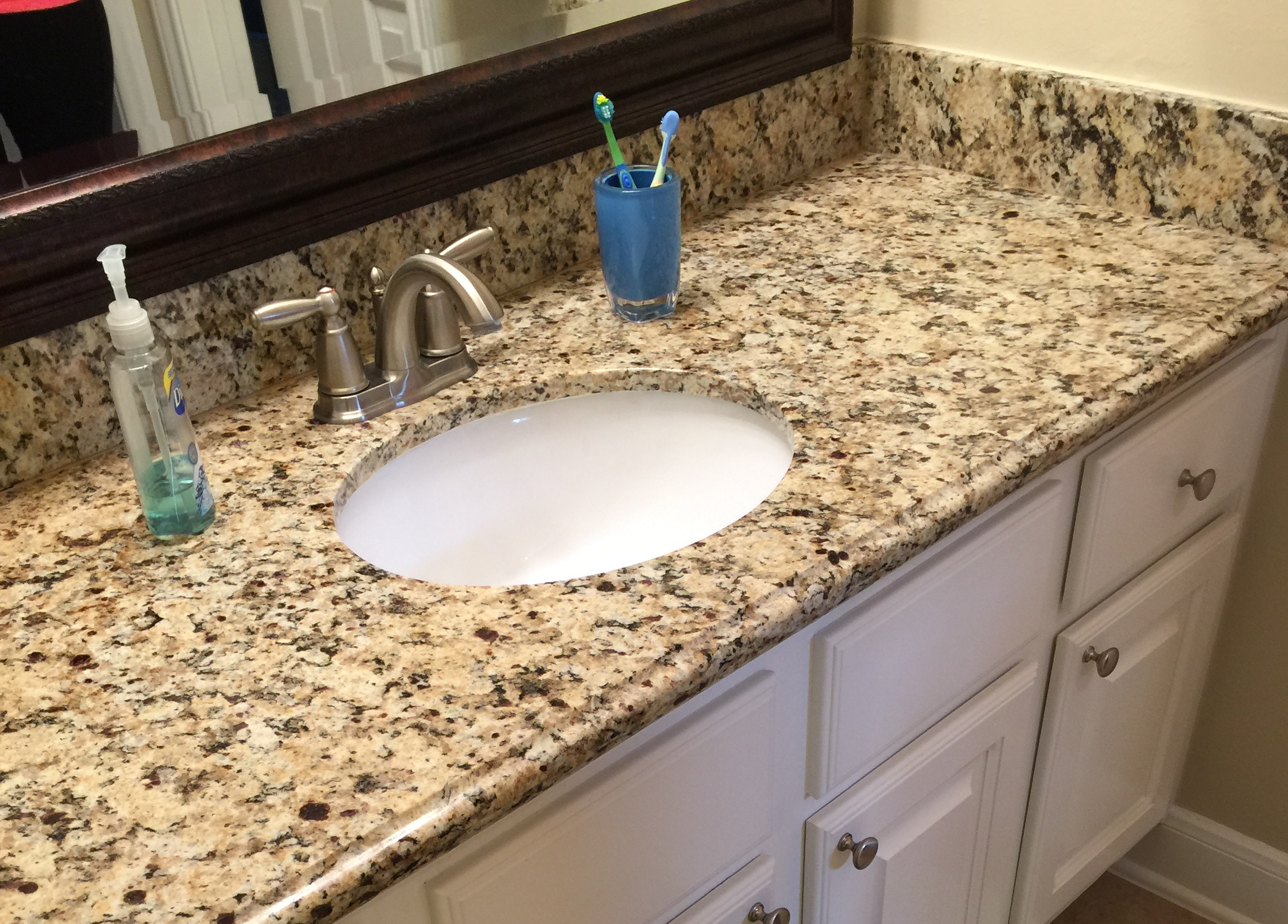
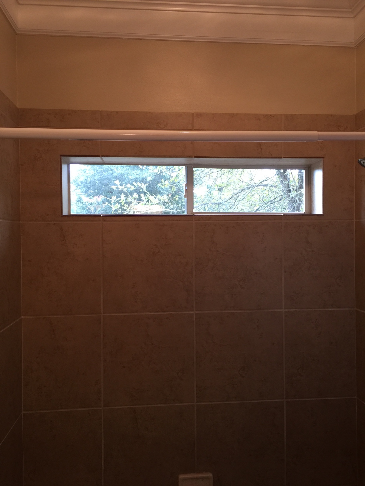
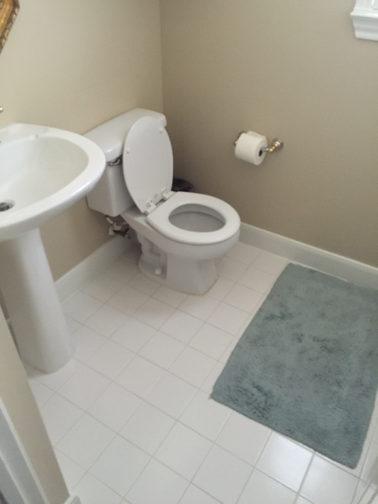
Here are the before shots:
We know this client quite well. We’ve worked in her home on projects twice before, so we understood her style and priorities from the get-go. She likes a fresh, updated look, with whites and cool, soft colors that are combined with warm woods and some interesting lighting.
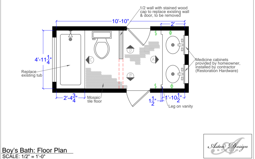
The boys’ bath needed to be durable and long-lasting in style. It needed to feel more spacious and work as these boys grew. She wanted to remove the wall and door between the sink and the toilet/tub room. (There are only so many doors that a small space can take!) We did a partial height wall there that opened up the space visually, and we also got rid of that door.
Click images to enlarge:
I know all too well from designing my own kids’ bathrooms how tile on the walls of a small bathroom can keep water damage at bay. In a small bathroom water will be sloshed! I proposed a large white subway tile for a clean, fresh look on all the walls. We topped that with some color that will work with the soft cool colors in the adjoining bedrooms by wrapping it on the top part of the walls and onto the ceiling.
My client didn’t want any extra cabinetry on the walls — like a head-knocker above the toilet. We still needed to incorporate some storage into the room. We did that with a beautiful warm, wood cabinet that would be slightly distressed, as well as some great medicine cabinets from Restoration Hardware. (Every little bit of storage helps!)
We did some vintage look lighting and plumbing fixtures (love the “X” handles). We incorporated that design into the cabinet door as well. One way to add style to any space is to do a surface mount or close-to-the-ceiling light fixture instead of a can light. We did two of those here to add interest and to give a hint of a vintage look.
Everyone is mad for mosaics these days, and we are too! We love using them in small bathrooms on the floor. The grout helps with traction; and interesting floors can go a long way in making a style statement. We went with a white, glazed penny tile — not too pricey, though — with a dark gray grout to give some detail and make the space a bit more interesting. You know how I love a well-designed shampoo niche, and that penny tile will be great in there.
We did hooks in here instead of towel bars, because a wood rack with hooks on the tub side adds some warmth to that side of the room. I also added hooks on the wood vanity on each side, which provides convenience for these little guys and offers just a bit more elbow room at the vanity.
Here’s how everything combined: (BTW, those light fixtures would be the same bronze finish, we just didn't have the image that reflected that.)
For the powder/guest bath we kept the fresh white and wood approach by using some upgraded materials, such as... a hex marble mosaic for the floor, and marble subway tile on the walls surrounding the tub (along with a neat shampoo niche too, of course). We did white shiplap style paneling here up the main vanity wall (our homeowner’s request, and a good one at that), as well as a stained wood countertop and framed mirror to interject warmth and a natural appeal. That counter stretching across the the toilet area — the one with the wide mirror and sconces spread out — will help make this small bathroom look bigger. I also love the chunky white bowl sink and the vintage look faucet, too.
I used polished nickel finishes in here because it just feels a little less rustic and adds some polish to this space. A pretty custom shower curtain adds a finishing touch.
Were these “before” bathrooms horrible? No. But they were plain, boring, and had some chipped tubs. What we did was add some personality into these rooms by adding style and interesting details. We upgraded and customized the design of these spaces so they’d add value to the home and make them fun to be in.
Just in case you think we throw this stuff together without thought or planning…
This rundown should assure you that our selections are made as a result of many strategic thought processes; there’s a reason for everything. And yes...details really do make the room, even in the smallest of spaces.
I’ve got my handy Bathroom Design Guide to share here today. If you need some help planning your bathroom remodel, my project checklist can serve as your go-to source so you don’t leave anything out and can thoughtfully design the bathroom of your dreams!
Click Here >>>> Bathroom Design Guide

