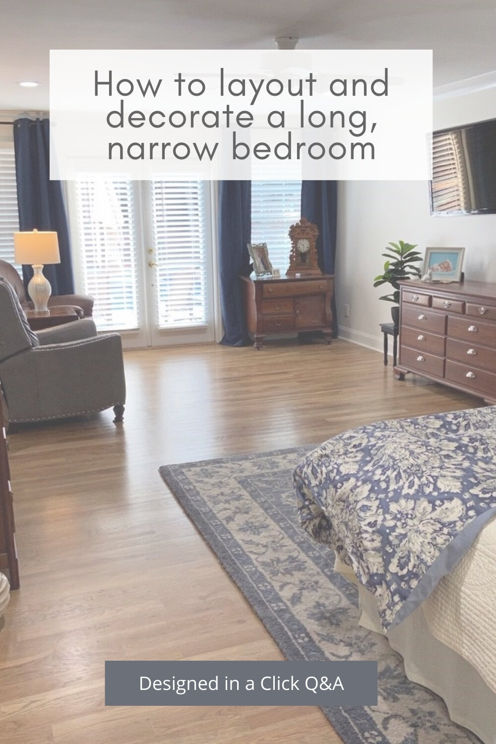
I’m sharing an online design consultation I had with someone who had a long, narrow bedroom. The bed and tv locations were set and couldn’t be moved, but she wanted to know how to arrange everything else, where to do a photo collage, how to make her bed look more comfy and inviting, etc.
There’s lots to unpack here, so let’s dive in.
My blog contains affiliate links. Any purchases, at no additional charge to you, render me a small percentage, are most appreciated and make this blog possible. :-)
Here are the images she sent.
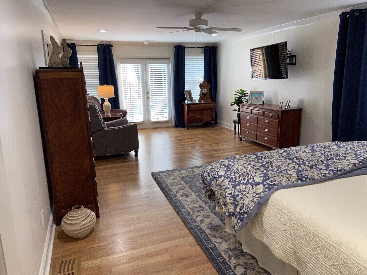
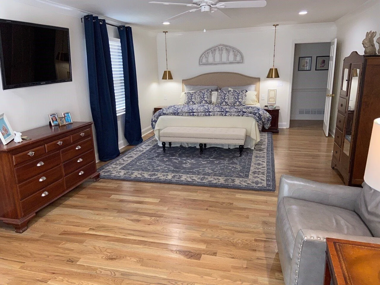
This homeowner added on to their 1959 home and created the longer bedroom. The extra room is really nice to have, but she wondered how to lay it out to feel more full and more intentionally designed.
She didn’t like the bare walls and wanted to put up a photo collage of family photos but didn’t know where to put them.
She wanted to know what kind of rug to add to this room and then how to make the seating area and bed more comfy and inviting.
None of the furniture had to stay except the bed and tv.
Here was my advice for this long, narrow bedroom…..
First of all, I think it would help to divide this room even more, into two different areas, visually, by adding another rug to the space. This will also help soften the room and give that area down there some distinction.
I would take the rug you have, turn it a quarter turn, and put it down in the seating area. (The rug is 12’ long and the room a little over 13’ wide, so it would fit nicely.)
Because it has a distinct centered pattern, it will work well out in the middle of the room.
Then you can get a companion type rug, something more solid (it will be mostly covered by the bed anyway), for the bed part of the room. I like something like this, a neutral all-over small patterned rug.
As you enter the room, I think you should remove the armoire (tall cabinet) as you walk in there. You have a more limited width in that room anyway, and it feels crowded there, visually.
I'd like to see a very thin console, you can get them really skinny, at 9-12" deep, so they don't take up much space. That will ground your picture collage wall, that you can feature here. Something like this console.
That's going to open up the view through to the seating area and your windows and make the bed area not feel as tight.
Seating Area Furniture
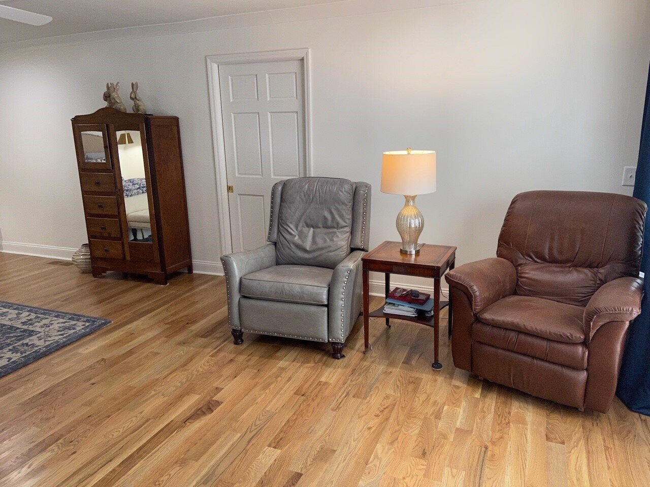
Regarding the seating area, I think one leather chair is enough for this space. I saw this Fairfield Chair, fabric recliner at High Point Market last year and it is really comfy. I like that it is geometric, in contrast to the more floral rug you have.
I think it would pair well with the gray recliner you have there now.
Then, I'd do a floor lamp behind a round table. I know the recliners have to sit away from the wall some, but this will help to fill that space back there behind the table a bit. One single large piece of art would be nice here, to balance the other walls with groupings of pictures.
I love this round side table, I have it myself. It is just the right size and the lower shelf is handy. The finish goes with everything and adds a touch of wood here.
For the floor lamp, I like the brass finish on this lamp.
Here’s an example of a large art piece that could go behind these chairs, this one is 5' wide, but you could do 4' or so.
And here’s the sketch of the seating area.
TV Wall Decor
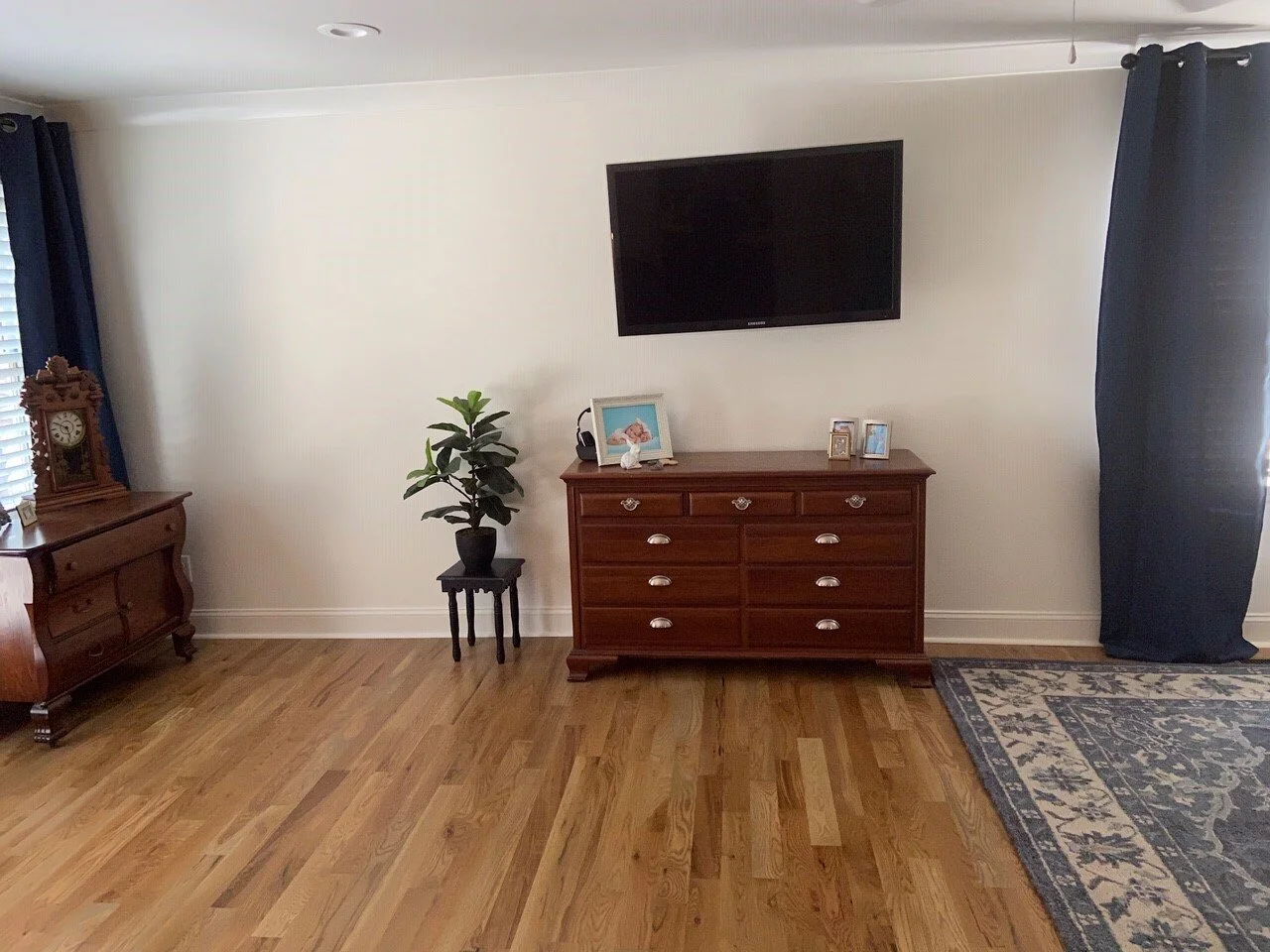
For the tv wall, I'd get a taller dresser underneath and then lower the tv if at all possible, even 6" would help.
TV's that are really high up on the wall feel a little like a hospital to me, so if you can get a console or dresser that is 42' high or more, that will make the height you like there feel more logical and less hospital-like. I like this one in the whitewashed finish and it is 55" tall. (Maybe you won't even have to lower the tv!)
For the big blank space that is on the left side of the tv, you could do a low upholstered bench and then a grouping of four photos over there.
See my sketch of the tv wall.
Bed Wall Recommendations
As far as making the bed area look more comfy, I'd go for some new nightstands. I think yours need to be taller and a painted finish would be nice. I think they'd feel more useful and relate to the pendants better if they were taller.
These are both about 30” tall, which is really becoming the new norm for nightstand height these days. Check the widths to see what would fit your bed wall best. I like the finishes on these two.
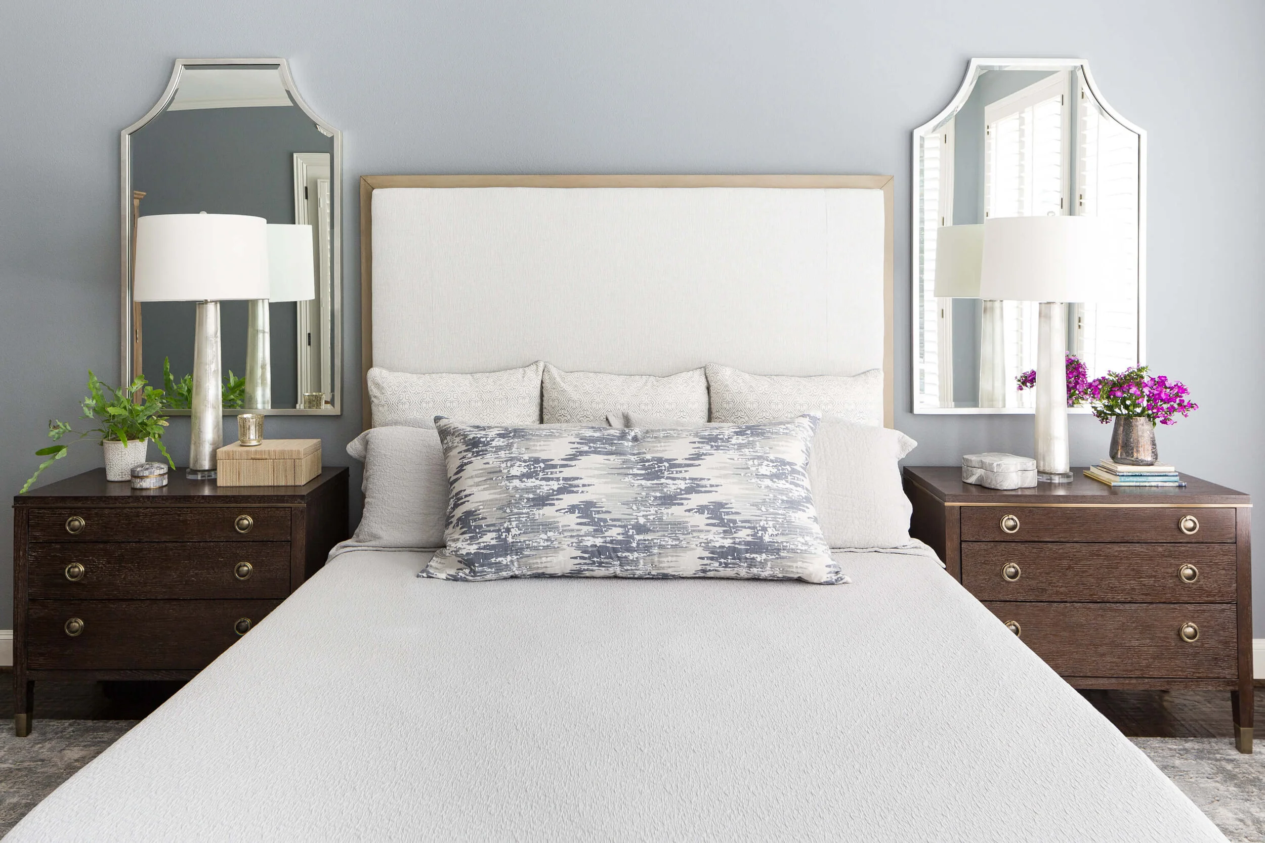
Regarding the bedding, I'd start with maybe going for some Euro shams in white with an edging. (3) of those behind the cream shams you have will give a good backing to the other pillows there.
See this example in one of my projects.
Bedding designed with 3 euro shams backing the pillow stack. Two king pillows are in front with a large decorative lumbar pillow topping off the bed. Carla Aston, Designer | Colleen Scott, Photographer
Here are some shams that I'm talking about. I like the gray border here.
Then, I'd think about a new bedskirt that matches the Euro shams, something tailored. I like the way this is crisply edged.
You might consider reupholstering your bench, just because it looks a little pinkish to me. I don't mind the cream coverlet with the white bedding, but with the pinkish tone in the bench, it might be too many variations of whites together there that is causing a little disruption.
If you reupholster, pick a solid or textured blue color fabric and I think the bed will look well coordinated and inviting, on top of the neutral rug.
I think this room has some great potential for becoming a welcoming retreat!
Some tweaking of furniture selections, wall decor and bedding will help pull this room together nicely.
My Designed in a Click email consultations are currently still closed, but should open later this month. I’m just trying to catch up on all my work! Please don’t purchase until you see the “Currently Unavailable” note removed. :-)
Subscribe to my twice weekly blog for design insight, advice and inspiraton. You’ll get my best bookshelf styling tips for free, when you sign up!


