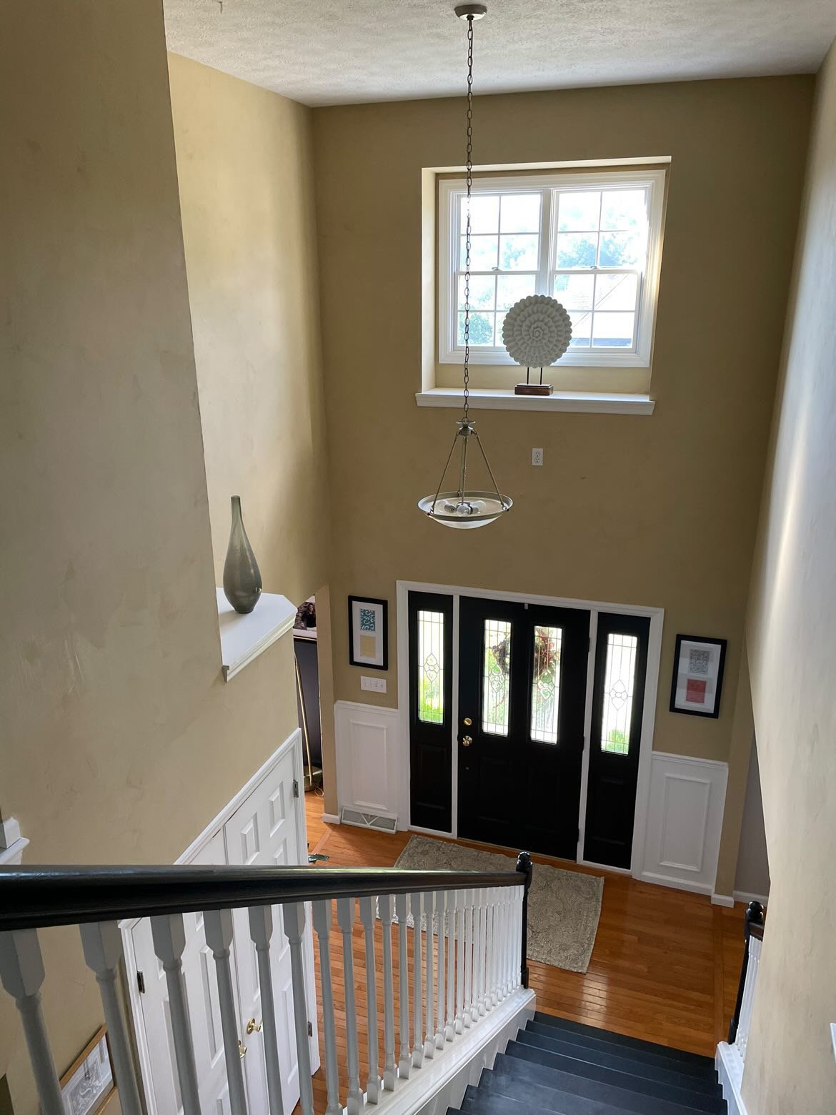
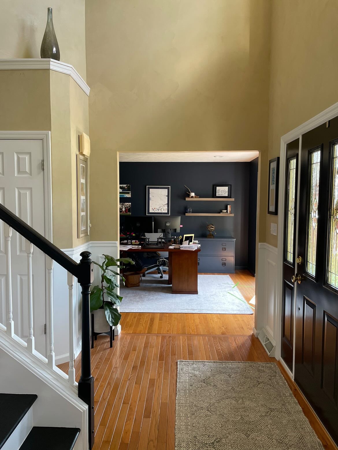
This foyer has a problem I see a lot in my area, a two story space with tall empty walls and a few awkward ledges that needed decorating.
This homeowner asked about what she could put on the ledges to make things look better here and more designed.
I actually think the solution was not putting too much up there. They would be hard to dust and often, these ledges can look contrived or cluttered.
I thought it would be best to deal with this space in another way altogether.
Here are more pics of the whole space so you can get an idea of what is happening here. They were about to repaint these walls in BM Revere Pewter too, so they wanted to work out what was happening before beginning that project.
I think that is a great color choice here.
How to dress up this foyer/ entry hall without accessorizing the ledges. carlaaston.com
How to dress up this foyer / entry hall without accessorizing the ledges. carlaaston.com
How to dress up this foyer / entry hall without accessorizing the ledges. carlaaston.com
How to dress up this foyer / entry hall without accessorizing the ledges. carlaaston.com
First of all, I like that there is a chair rail and some applied moulding going on already in here. What I’d like to propose is more of it.
There is a way to do this minimally and then a way to go bigger with it.
Option 1 - Trimming out the high window
With regard to decorating the ledge at the window, I just wouldn’t bother with that at all. It is not that deep and I think it would be better to focus on making the window feel larger and more special.
That can be done with adding trim moulding to the window to expand it’s look.
I’d add more substantial light fixture, a lantern type look, and then also look at trimming out the openings to the dining room and study. All that will add something extra to this entry way but keep it at a more minimal cost.
Option 2 - Applying moulding to entry door wall top to bottom
I really like the idea of adding mouldings to this whole front wall. I feel like it just finishes it off and the window will feel more integrated into the wall design overall.
I’d still trim out the two openings to the study and dining and do the lantern here too.
Adding trim moulding to front door wall at foyer. carlaaston.com
Honestly, I don’t like the ledge above the closet there at all, especially the way the trim travels down the wall there. I’d have that corner filled in there with framing and sheetrock to go to the ceiling and just get rid of the ledge. It doesn’t really offer any advantage to this space at all.
Do you want to know how to make a space in your home feel more special and finished? I’ll be taking questions again in another month or so on my quarterly Instagram Q&A, so follow me there so you can ask a question.
If you want more immediate attention, try my Designed in a Click service.. :-)
See more info on designing walls in two story spaces, below.


This entry hall has a problem I see a lot in my area, a two story space with tall empty walls and a few awkward ledges. Click through to see some suggestions on how to make this space feel more finished and special.