Right up there with wall decorating in interior design dilemmas is this challenge, furniture layouts. It can be a big stumbling block to buying furniture, hanging wall decor and living functionally in your home.
I am sharing two furniture layout questions from my July Q&A today. With both of these, I think the homeowners were trying to make their existing situation work, but they both needed a bit of a rethink to get things resolved.
Living Room Furniture Arrangement #1
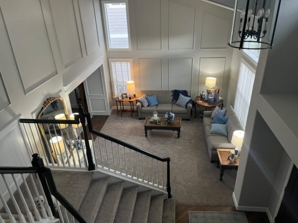
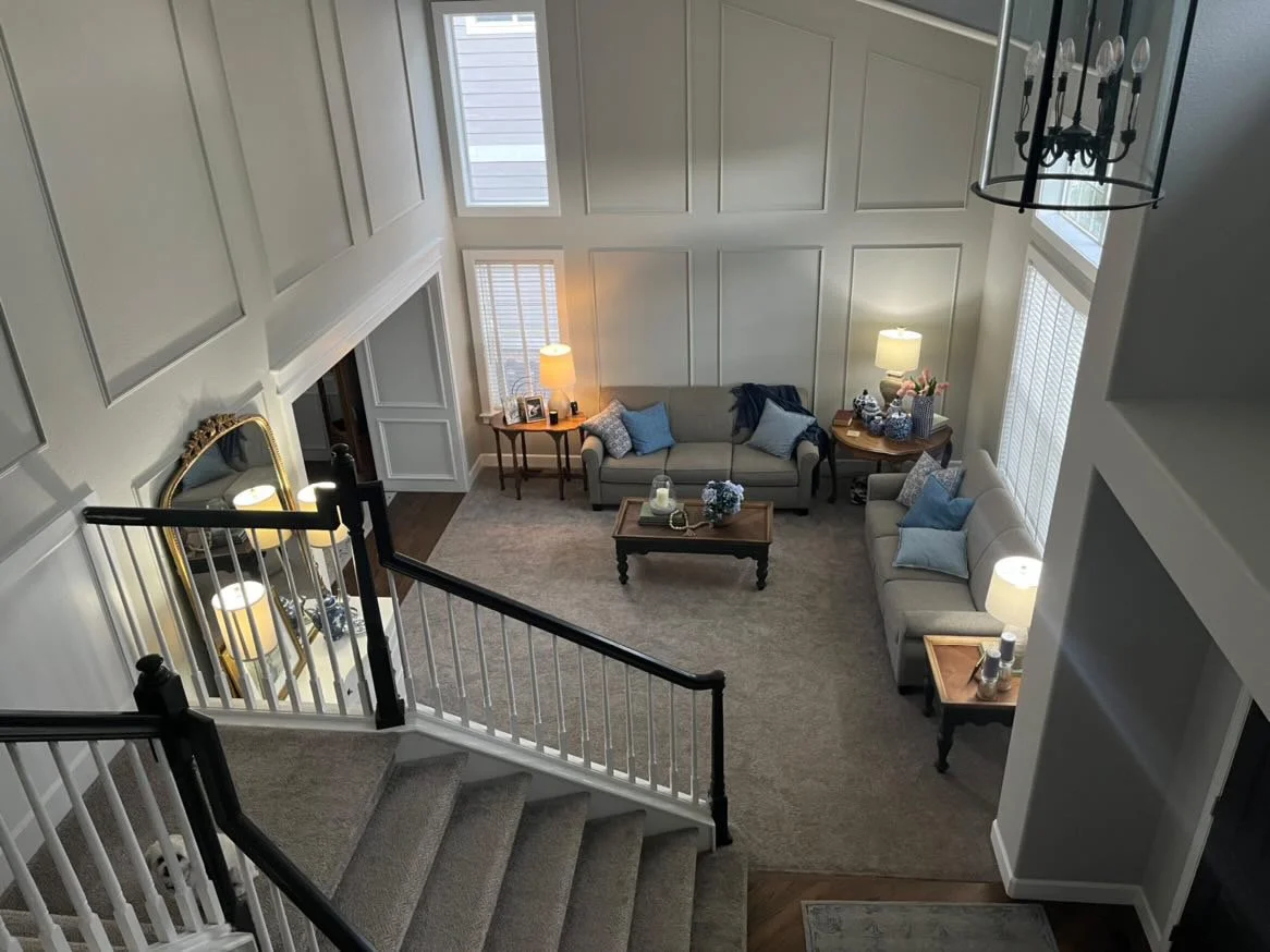
This homeowner wanted to know how to make her living room feel less empty. She felt the sofas needed to go against the walls, but it just pushed all the furniture to one corner and left the middle of the room vacant.
Furniture Layout Tweaks For 2 Living Rooms - This living room furniture felt too spread out against the wall and left a vacant spot in the room. carlaaston.com
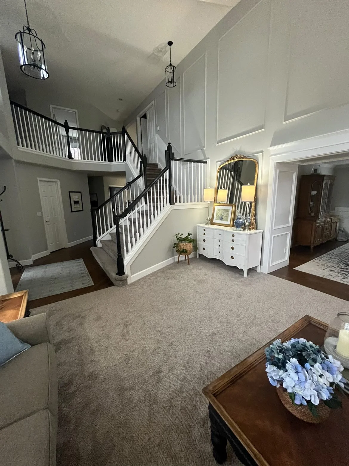
Furniture Layout Tweaks For 2 Living Rooms - Continuous wood flooring would be a nice upgrade if possible. carlaaston.com
Furniture Layout Tweaks For 2 Living Rooms - This living room has a large vacant spot in the middle of the room. carlaaston.com
One of the first things I think she needs to do is get some wood flooring that will flow between the entry and dining room. I know it is hard to go back and match (hopefully it is available), but it will definitely increase the value of the home and make it easier to arrange the furniture.
Right now, the carpet serves to chop up the space some. If there was wood flooring that continued throughout, they could use an area rug to create a seating grouping.
I’d pull the sofa there at the front window a bit away from that wall to make the grouping appear more to float.
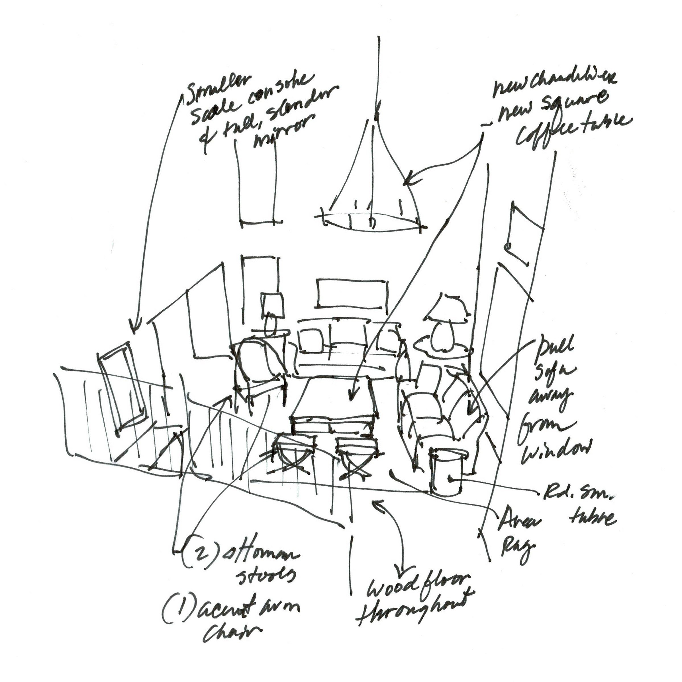
I’d go with a square or round coffee table to fill the room more, add a single lounge chair there off to the side and two ottoman stools on the outside edge of the coffee table. That will help fill in the area and give you a really comfortable, inviting look. This way there is no sofa in the middle of the room, which I would not recommend here.
I also like doing a chandelier in the room if possible, it will help focus the attention there.
Furniture Layout Tweaks For 2 Living Rooms - Proposed Furniture Layout Sketch | carlaaston.com
Lastly, I’d go for a smaller console and vertical mirror by the stair. Now that the furniture grouping expanded and fills the void, this should get smaller and play a supporting role.
Living Room Furniture Arrangement #2
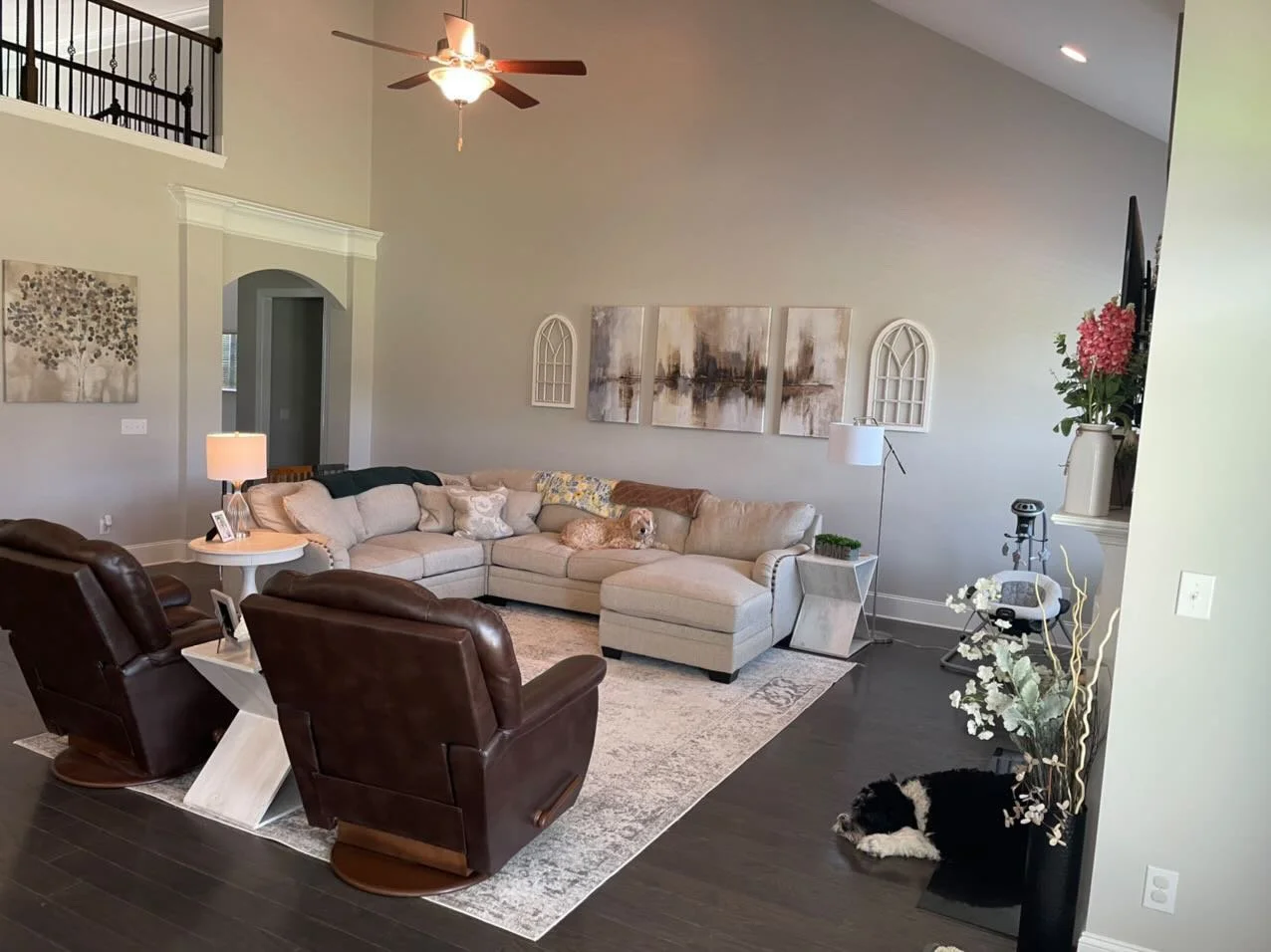
This living room also looks really large and open. The homeowner wanted to know what to put on the big wall above the sectional sofa.
Furniture Layout Tweaks For 2 Living Rooms - This homeowner wanted to know how to decorate this big wall, but the furniture needs a bit of rearranging first. | carlaaston.com
Furniture Layout Tweaks For 2 Living Rooms - This is a really big room and it might benefit overall with a rearrangement of the furniture. | carlaaston.com
That is really a difficult question, as that wall is huge. It would take a lot of wall decor and $$ to fill it.
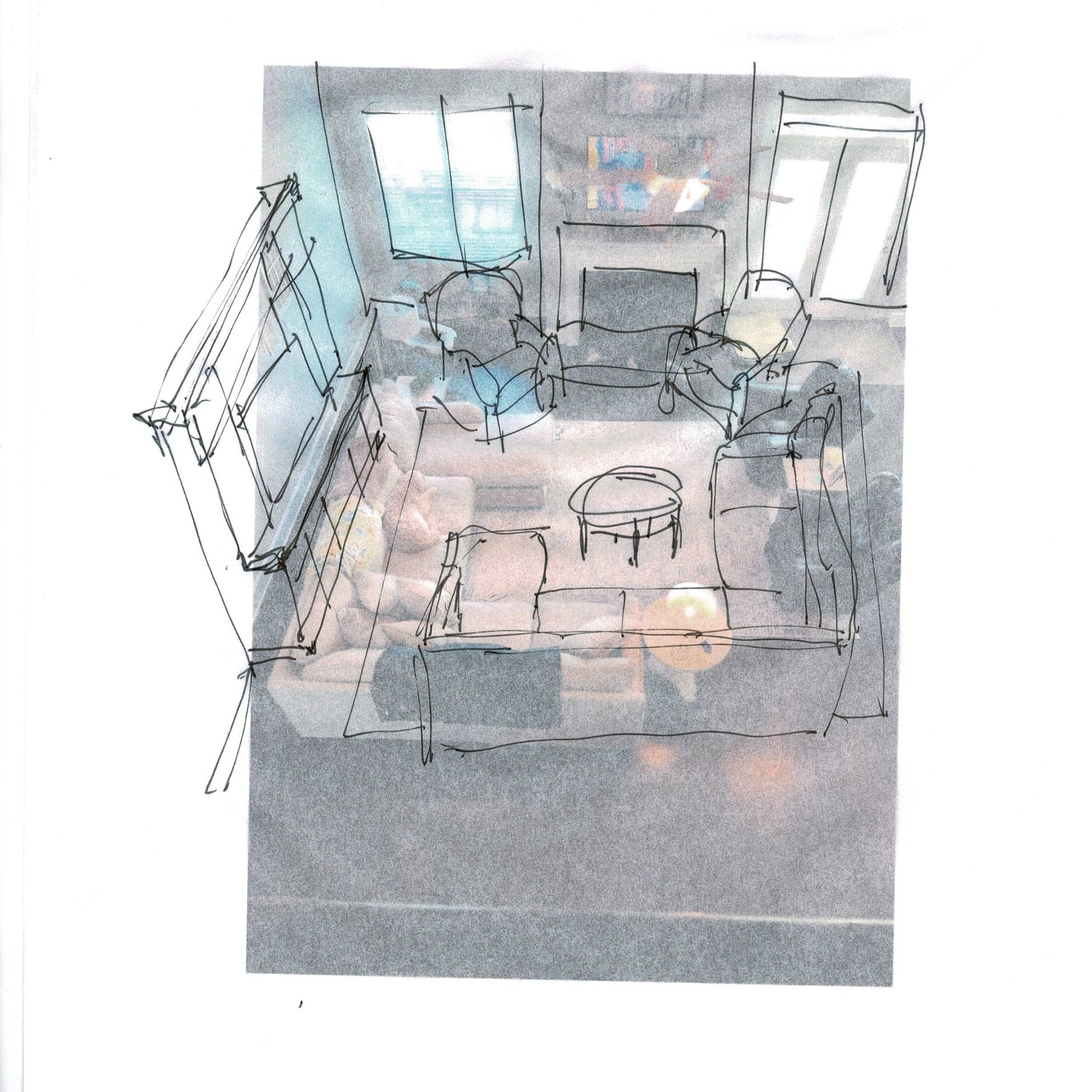
I did a bit of a mix up for this one, proposing that she move the tv to a tall entertainment center on that wall. She could shift the sectional and place the two recliners up at the fireplace.
The backs of those chairs aren’t that attractive anyway and right now, their backs face the open kitchen.
I normally don’t like putting sectionals where they kind of block off the corners too much, but this is such a big room. I’m sure there will be plenty of room to tweak the seating to create good paths into the seating group.
Furniture Layout Tweaks For 2 Living Rooms - This room feels cozier with the tv off the fireplace and in a cabinet on the large wall. | carlaaston.com
Personally, I like the tv lower in this situation. I feel like it is a more intimate grouping in this large space.
With the tall entertainment center, there is no big need to decorate that wall, although art on each side and even above could be added if desired.
Do you have a design or decorating question? My Q&A for my Instagram Subscribers is done once a month in stories there. Follow me there to subscribe.
OR you can try my Designed in a Click service.
Related Posts:



I’m sharing 5 furniture layouts done during my recent Instagram Q and A. All of these situations are different and rather unique. Some of these were not published on Instagram, so they’re new to see, if you happened to catch those over there.
Take a look at these layouts. Maybe something like these would work for you!