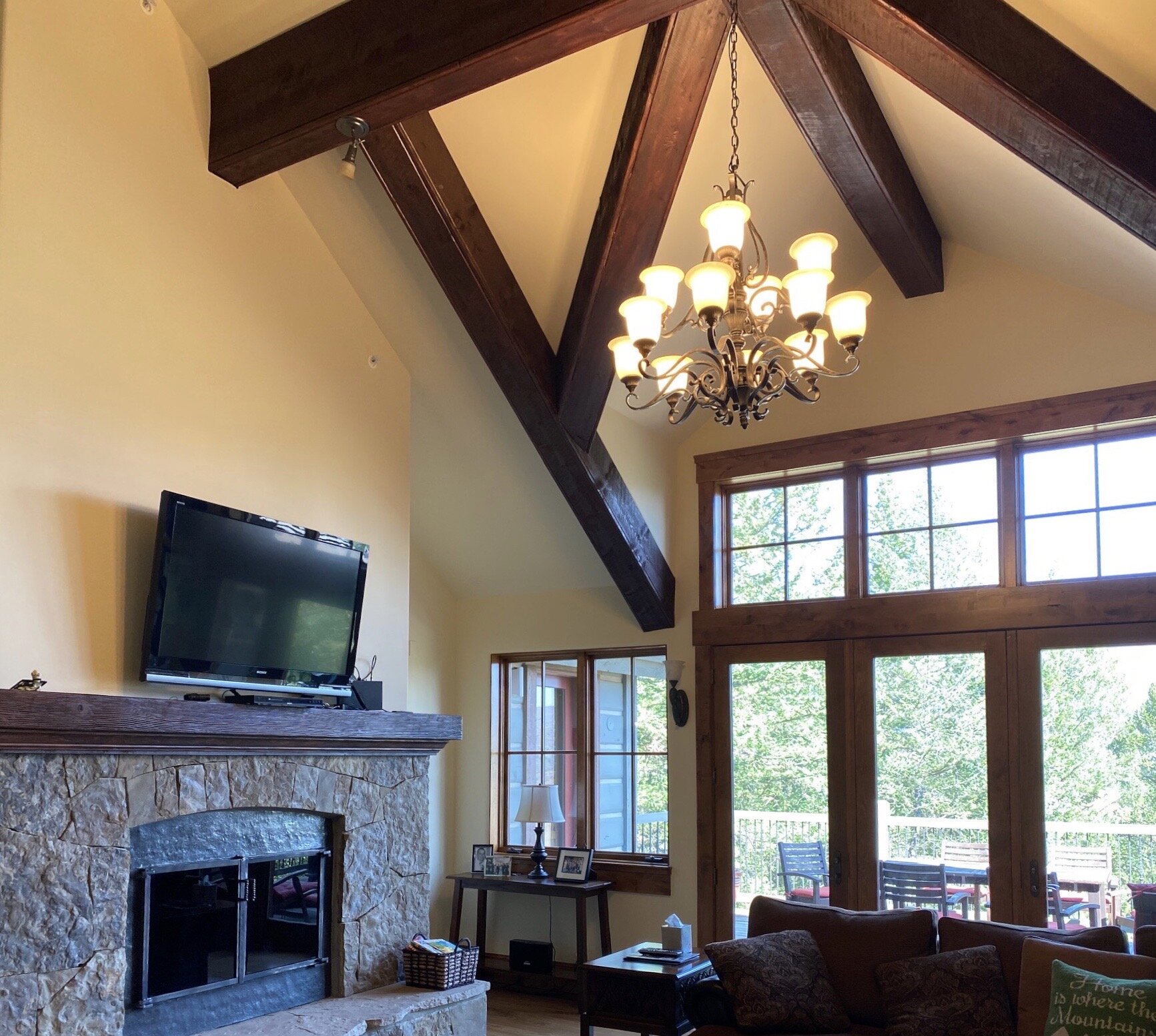
I’ve always dreamed of having a mountain home, so when I received a fireplace wall design dilemma in this home, I was particularly intrigued. :-)
Yes, I often live vicariously through my clients!
I loved the beams, the fireplace stone work and mantel, all good so far. This fireplace wall just needed a finishing touch to make it all gel with the rest of the home and give it the importance it deserved.
(This post was first published in Sept 2020, but deserves a reboot here in winter 2022. Links are all updated for shopping a rustic look, below.)
My blog contains affiliate links. Any purchases, at no additional charge to you, render me a small percentage, are most appreciated and make this blog possible. :-)
Design Dilemma for mountain home fireplace wall
Here were the homeowner’s questions:
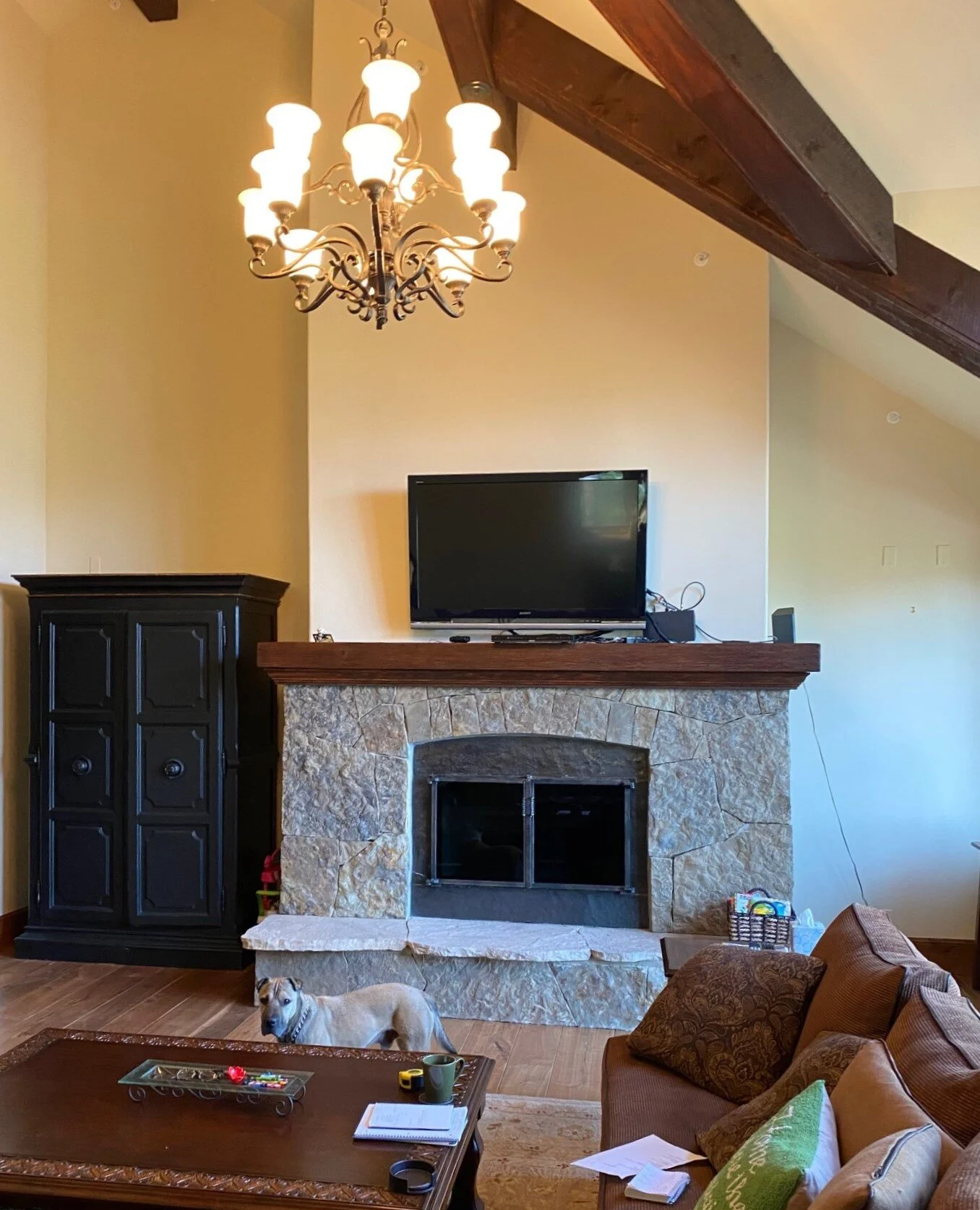
The fireplace/tv wall in the living room of our new ski house has me stumped! We will be redecorating and are thinking about moving the tv to the left of the fireplace. We considered built-ins but the areas flanking the fireplace are vastly different in height and depth. To be specific, I have the following questions:
1) What would you put on the left side of the fireplace to accommodate the tv and cable box? It’s a big space, 76 inches wide and 28 deep. What would you put on the right side to balance out the left, considering there is a window only 11 1/2 inches from the corner? The space is 58 inches wide.
2) Would a painting be the best option for over the mantel? I imagined something that was fairly large and was more vertical.
3) What accessories would you suggest?
4) Can you suggest an updated light fixture?
This mountain home’s fireplace wall design dilemma concerned the location of the tv, what to do on each side of the fireplace, and questions about art and accessories for styling.
Here were my suggestions:
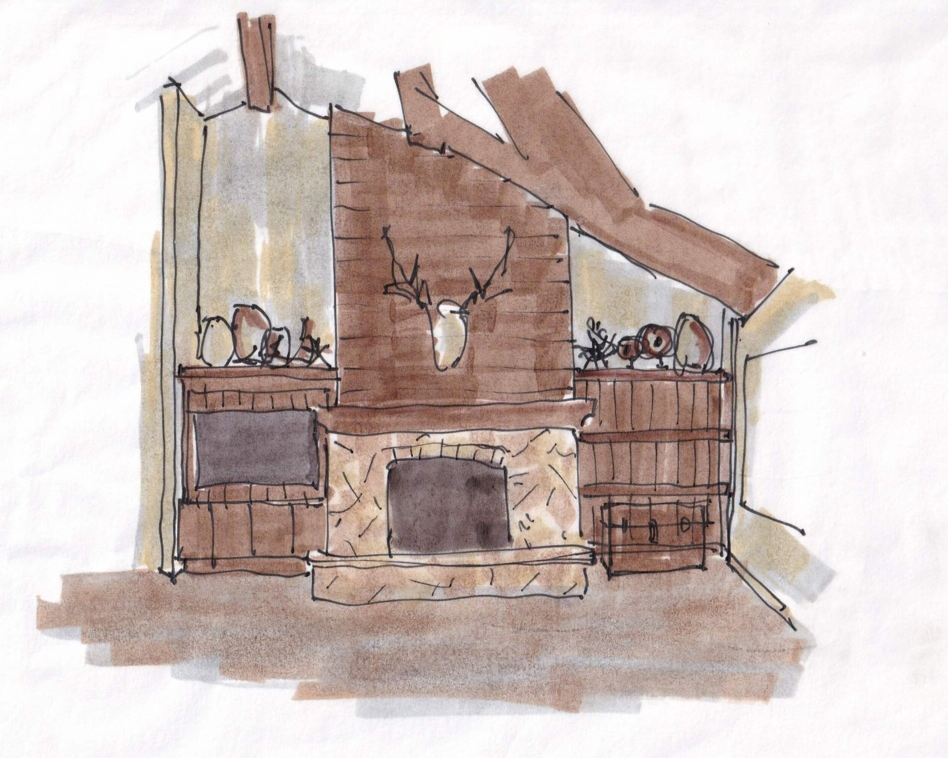
In this fireplace wall design, I would add some wood to that wall to create some richness and do things like camouflage the tv better, and provide some symmetry.
I would do a wood built-in (match the mantel color) on the left and then at the same height on the right, do 2 1/2" thick (beefy) floating shelves. Then I'd back that space on the right with wood paneling, so that it appears to have the same darker finish as the left and looks balanced, but without the depth of a built in.
You can make the shelves' depth a few inches shy of the window, I don't think those need to be the same depth on both sides.
I like the idea of a shiplap style paneling, it's simple and I'd add it also to the area above the fireplace. There, I'd run it horizontally, that will sort of mitigate the sharp angled ceiling a bit. I’d run it vertically in the niches (behind the tv too), to add verticality to those areas. I've done a sketch, attached.
I like how this looks with the high contrast between the wood and your walls. It makes this wall more finished looking and would add value to your home.
You could do those floating shelves on the right at 10" deep. I think that is enough.
I'd actually look at doing an old trunk of some kind under the lower shelf, to add something big in there, you don't want to get caught up with too many little decorative items on the shelves so that it looks spotty and cluttered. The trunk, or even a few stacked trunks, would simulate the mass of a built-in cabinet there.
This trunk from Etsy would be great for storage too.
Here’s one I found at Round Top a few years ago. (Can’t you just see that riding along on top of a stagecoach in the wild west??? :-)
Regarding art for over the mantel, here’s a suggestion. You could do something vertical or square, or something sculptural like antlers or taxidermy.
If you do the paneling there, I kind of like the idea of not covering it up too much. This is faux taxidermy. It's large but you can see the wood behind so it doesn't feel so big.
I also like this art as an option for above the fireplace. It is kind of a bright spot on top of the wood.
As far as a light fixture goes, I'd do something in iron, but rather open and airy.
The beams are large and really a statement here, you don't want another big massive element competing for attention in that space. I like less curly iron and something simpler in style.
This light fixture is cool with the leather straps.
Lastly, I did a little online accessory shopping for her. Fun!
I’m not into cutesy stuff, I wanted items that would be rustic or made of natural materials. Basically, I was thinking of the big fireplace wall and log cabin in the TV series, “Yellowstone”. :-)
I like the idea of some vintage looking books, those by the yard books in gray, harvest and brown, really fit the look perfectly. Good for reading on a chilly night too!
Rustic Mountain House Decor For Bookshelf Styling
PLEASE NOTE: My Designed in a Click email consultations are open currently, I’m accepting two more before I head to KBIS early Feb. I’ll be back again to work them mid-Feb. :-)


