I’m back from Highpoint Market and ready to talk about color! I’ve seen this gradual change from cool to warm tones in the last couple of markets, but it was quite apparent this time that warm colors are back!
Cinnamon, terracotta, ochre, cream, rose, peach, blush, mocha, rusty orange, even a few reds…..that whole family of colors was seen in various shades in many showrooms I visited this past week.
A color specialist I heard at an event even spoke about the return of warm colors to interiors.
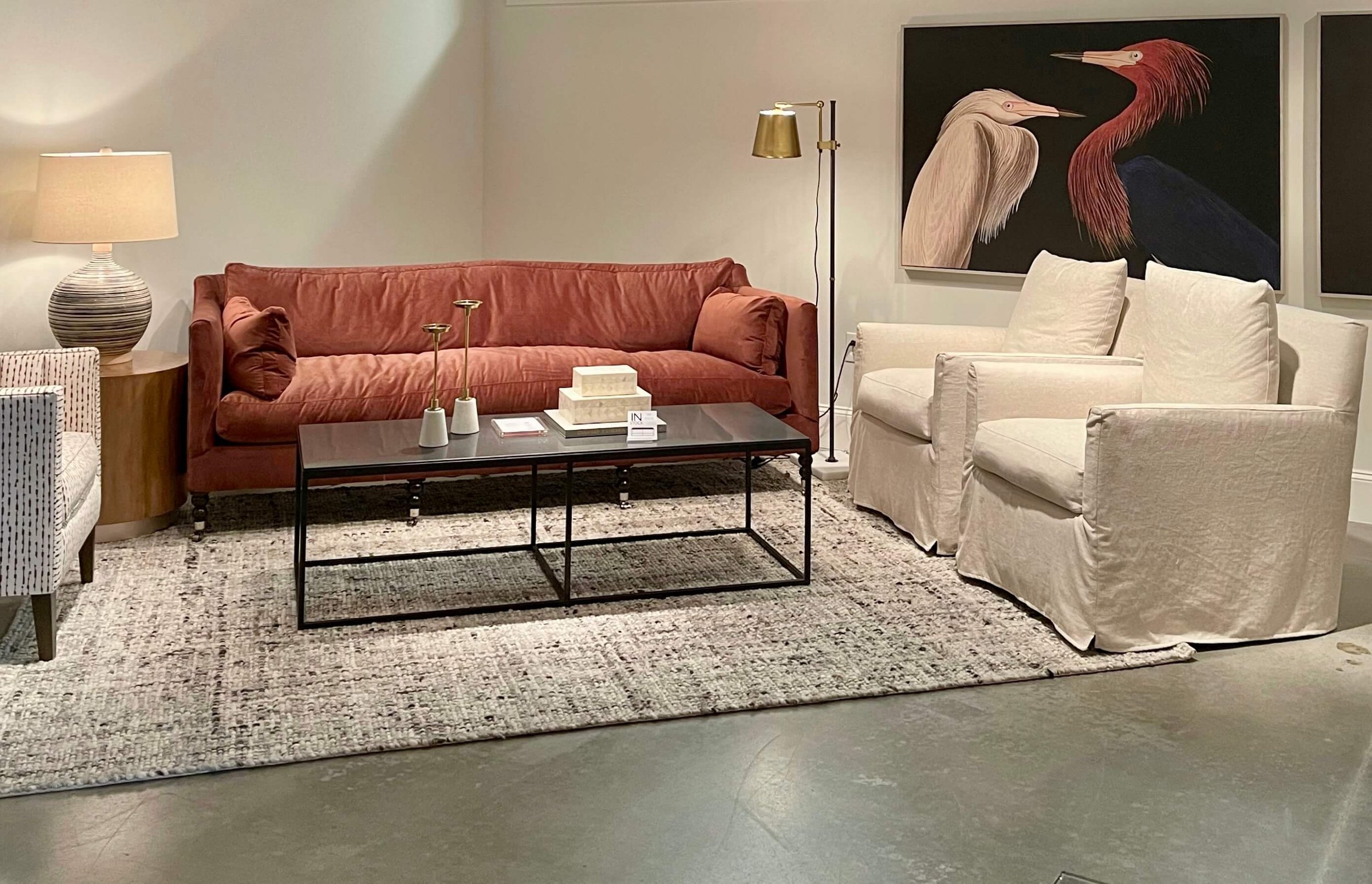
Terracotta was a stand out color
Take a look at some of the colorful vignettes I saw at this market. Terracotta was probably the most apparent to me, and this lovely setting, below, really made a statement.
This color statement in the Wesley Hall showroom was cozy and luxurious. It was interesting to see the cognac leather ottoman paired with this color. carlaaston.com
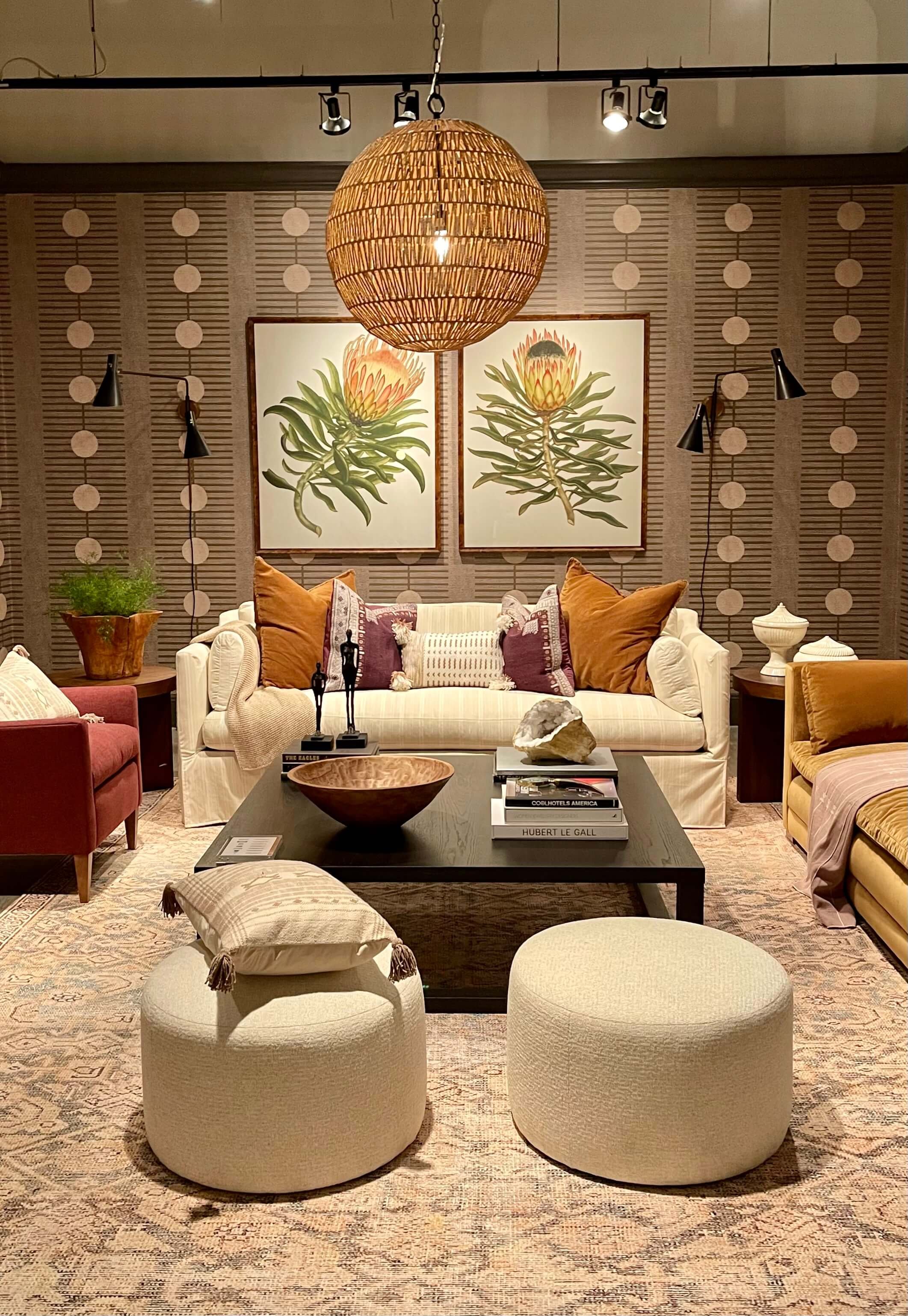
This beautiful vignette was designed by Alison Giese for Rowe and it really presents this warm toned palette with all the colors I was seeing.
A lovely room designed by Alison Giese for Rowe Furniture at Highpoint Market presented all the warm tones that are really becoming popular.
These more rusty orange tones were also displayed. They look great with gray and cream, so you can see some interesting ways to introduce some warm tones back into a more neutral gray home.
Rusty orange tones in the Universal Furniture showroom at Highpoint Market. carlaaston.com
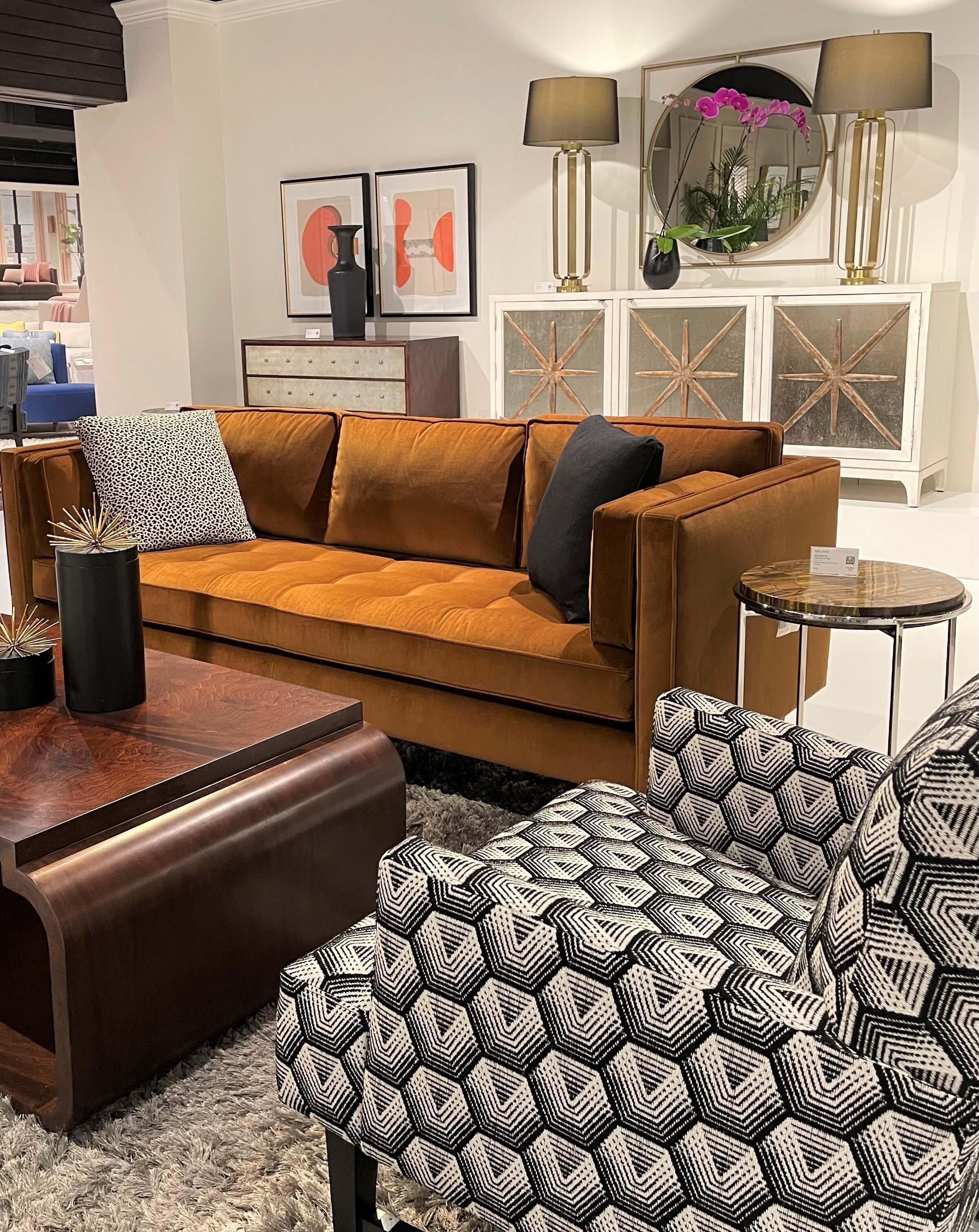
A cognac color sofa with a reddish wood stained table in the Melange, Hooker showroom at Highpoint Market. carlaaston.com
This lovely rug in the Jaipur Living showroom would certainly bring this warm color to a room. carlaaston.com
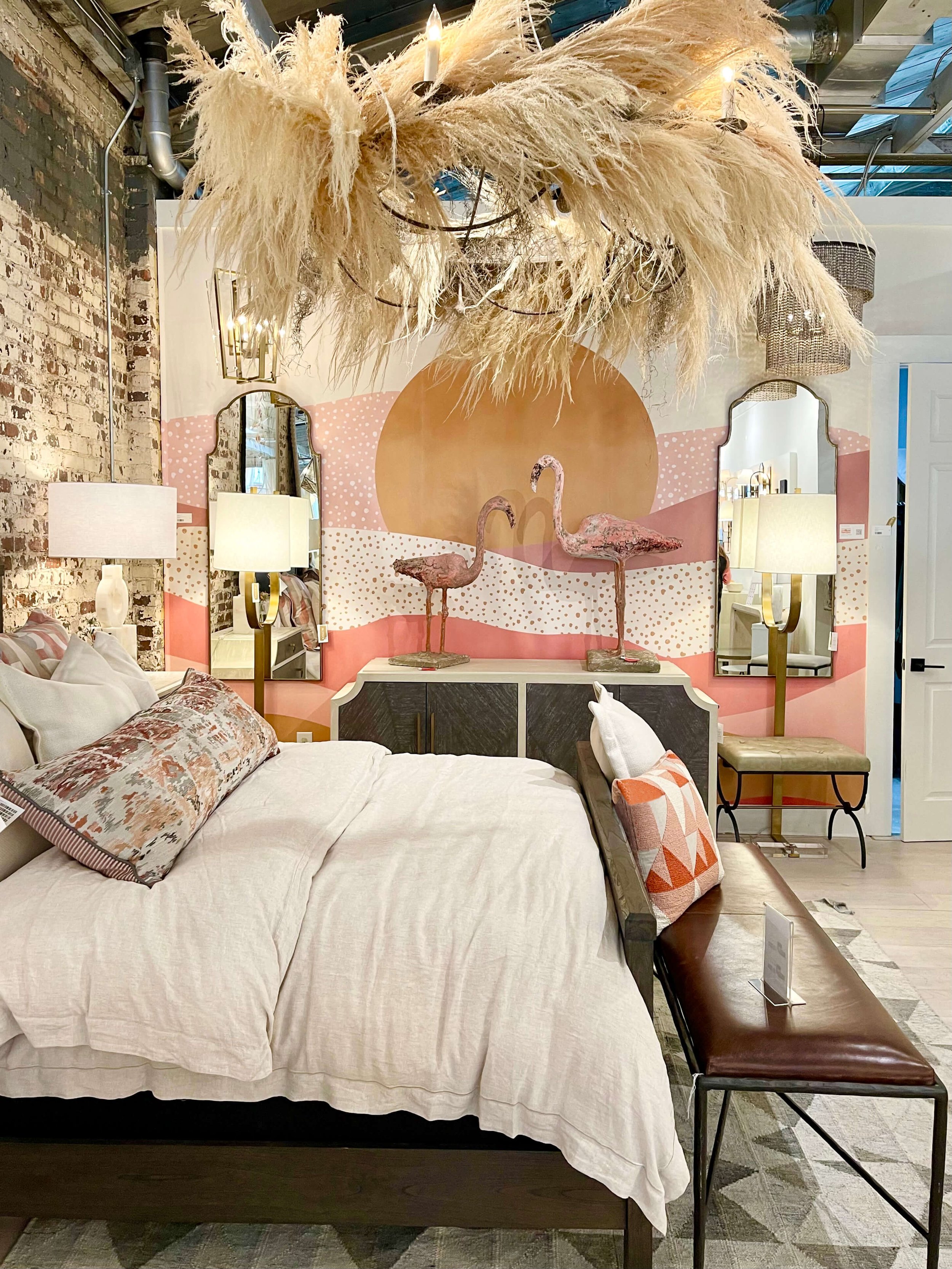
Peach, blush, ochre and soft terracotta tones were showing up in the Gabby showroom.
Peach, blush and ochre in the Gabby showroom at Highpoint Market. carlaaston.com
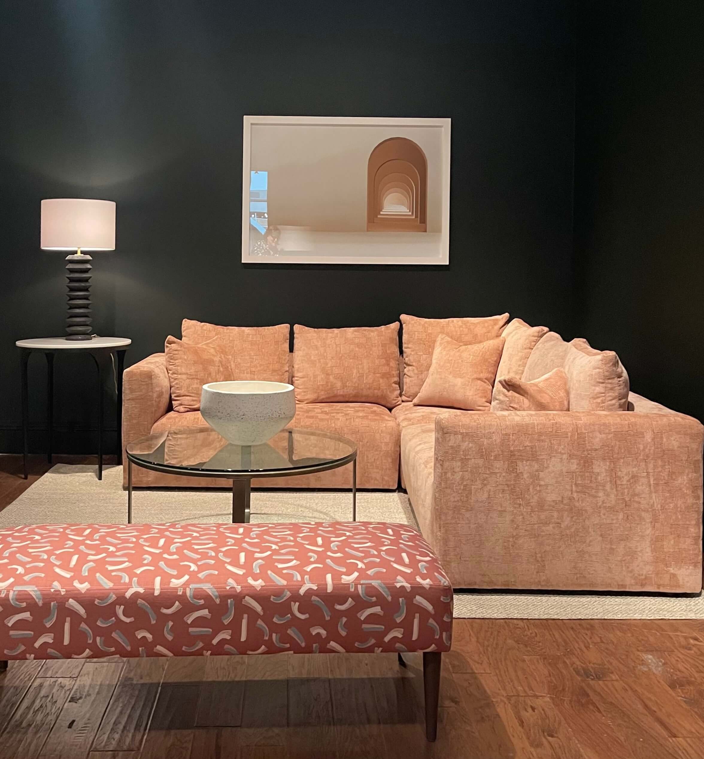
Here’s more peachy blush in the Rowe showroom.
Peach and blush seen against dark gray walls in the Rowe showroom at Highpoint Market. carlaaston.com
Anyone remember rojo caliente marble? It was used more during the 80’s and when I saw this table at Four Hands, it took me back!
A rojo caliente marble table in the Four Hands showroom shows off this popular color. Highpoint Market 2022, carlaaston.com
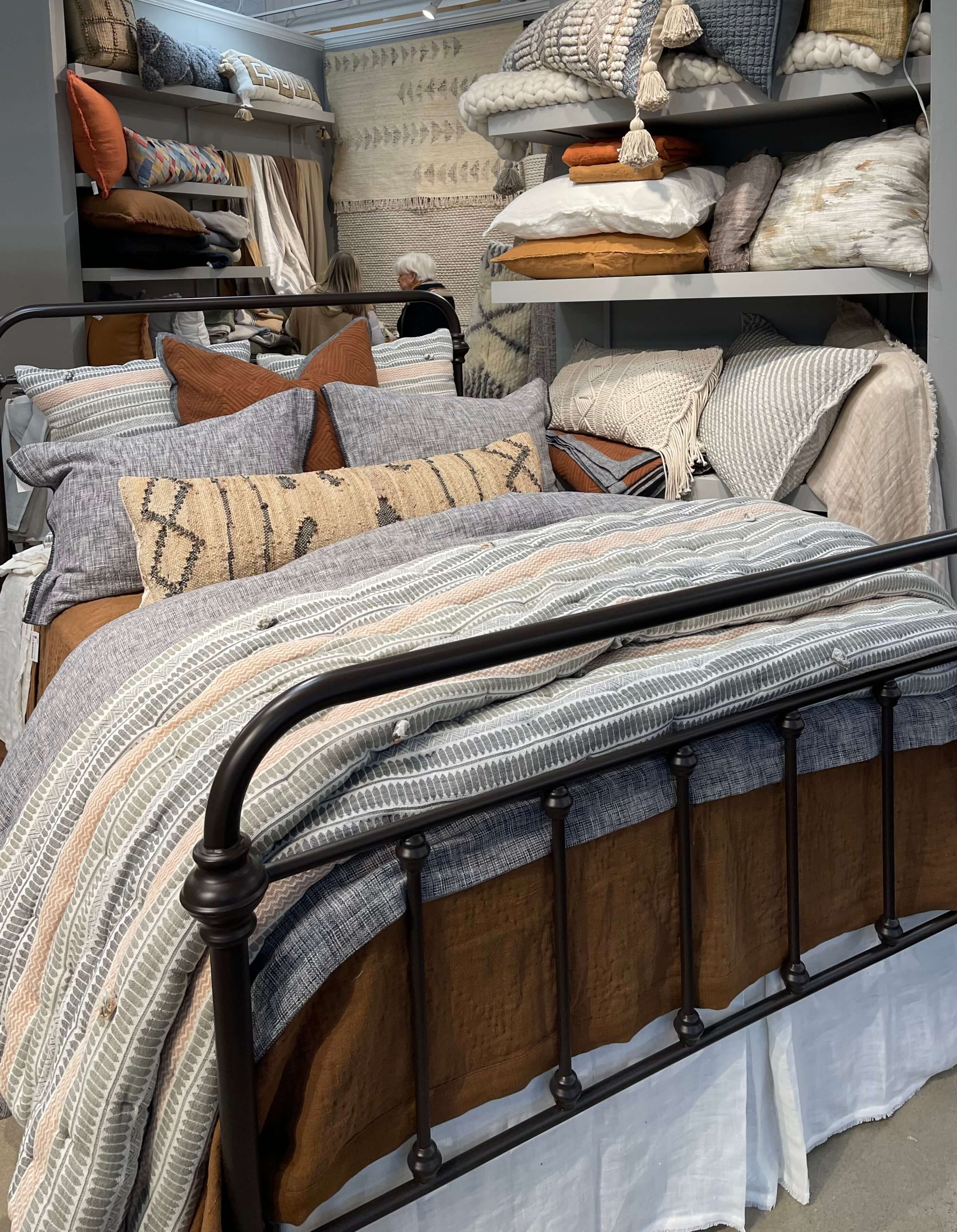
A warm brown, seen below, adds so much richness to the gray/blue and white bedding. You can see how adding warm colors can be done without replacing everything you might have.
Amity Home showed a combination of warm and cool tones in this bedding display at Highpoint Market 2022. carlaaston.com
This vignette in the Wesley Hall showroom is a good example of how you can keep your neutral furnishings and just paint the walls and add some pillows to create a new warm toned look.
This wall color in the Wesley Hall showroom was really rich and provided a nice backdrop for neutral upholstery. It’s BM Mountain Retreat 1176. carlaaston.com
This image below was taken the same area, so same wall color, although it photographed more orange toned here. You can see it pairs nicely with navy too.
Navy pairs well with terracotta and orange in this room at the Wesley Hall showroom. carlaaston.com
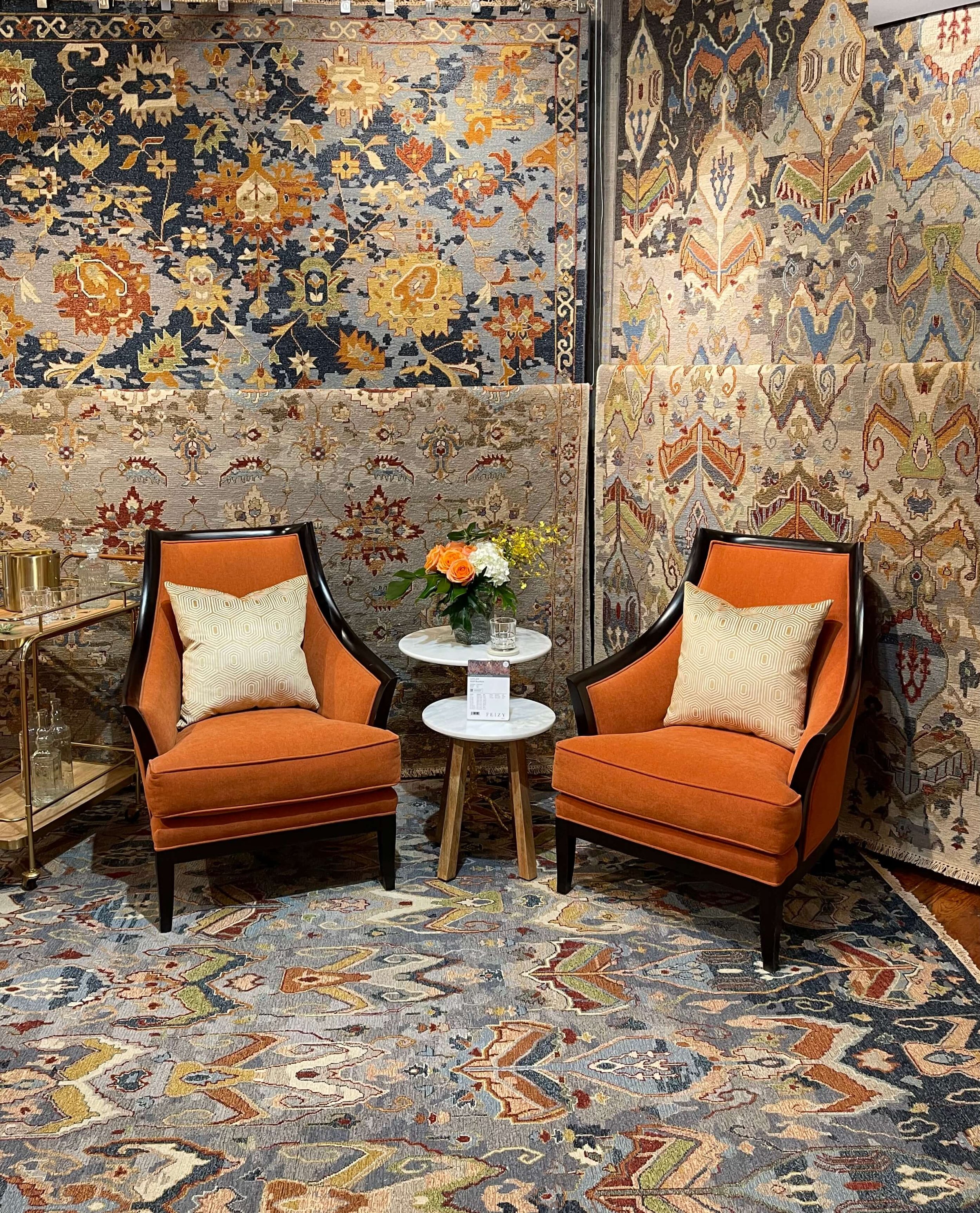
The Feizy showroom was displaying new rugs with a navy and orange tone color scheme.
Navy and orange toned large scale patterned rugs at the Feizy showroom at Highpoint Market. carlaaston.com
This large, cognac leather sectional in the Century showroom, has a rich, warm look. It makes for a nice contrast with the gray walls.
Cognac leather sectional against gray walls in the Century showroom.
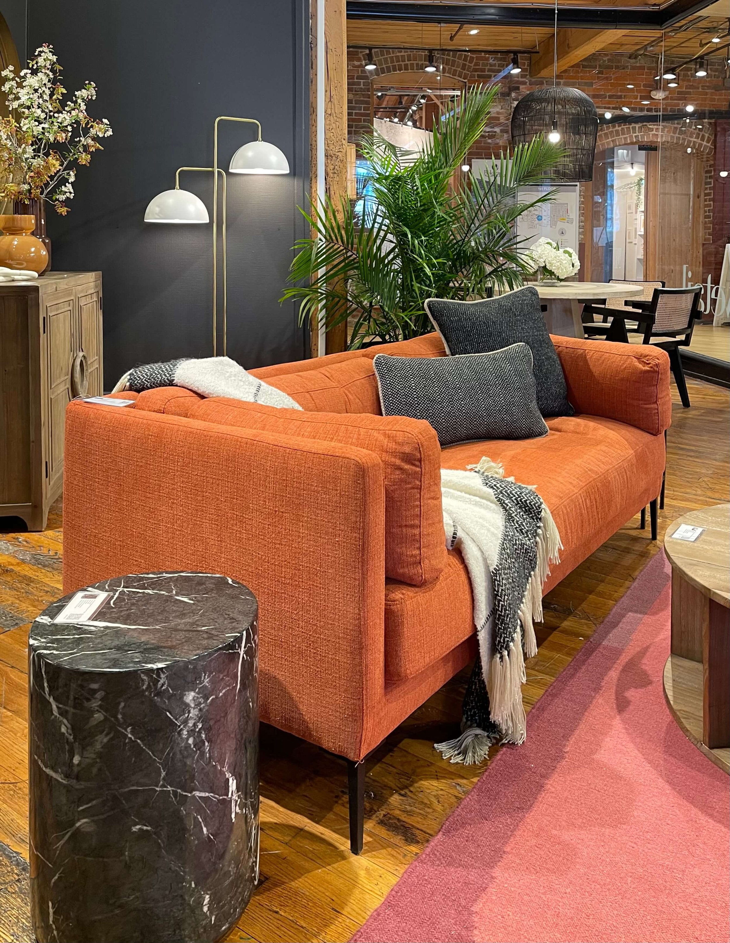
Burnt orange and a pink rug are combined with dark gray walls and side table in the Dovetail showroom.
Bold orange combines nicely with gray walls and pillows in the Dovetail showroom at Highpoint Market. carlaaston.com
Here’s another room in the Wesley Hall showroom with soft warm tones….blush, beige, cream and terracotta.
Blush, rose, beige and terracotta combine for a warm toned space in the Wesley Hall showroom. carlaaston.com
Still Seeing Greens
While we are seeing a lot of greens in painted finishes like kitchen cabinets these days, I didn’t see it so much in the showrooms. There were some, however, that stood out.
The Vanguard showroom featured some shades of green.
Green walls and pillows bring some color to light, neutral upholstery in the Vanguard showroom. carlaaston.com
This was a unique combination, more of an analogous green color scheme with various greens used in one setting. carlaaston.com
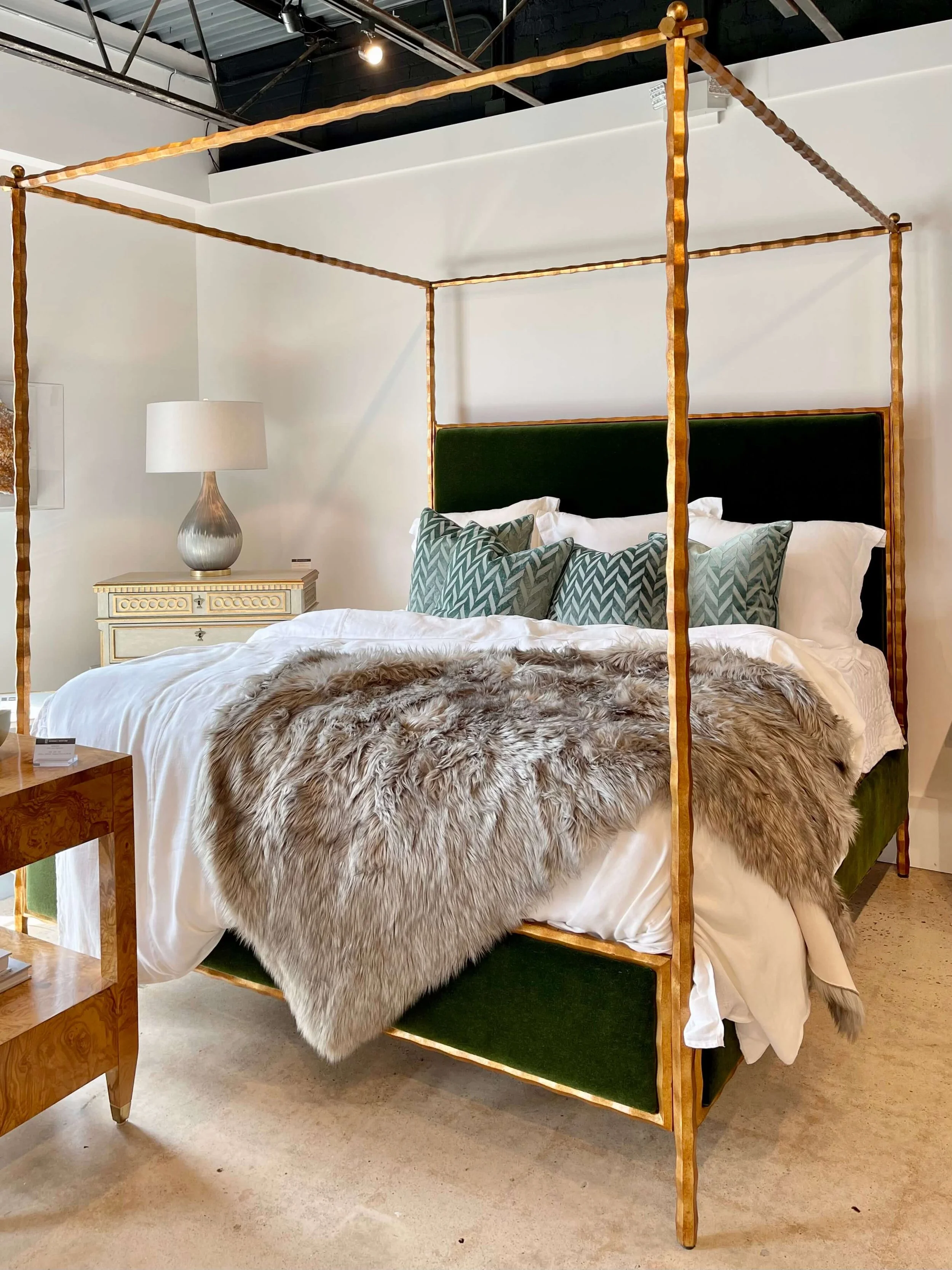
This fabulous bed in the Modern History showroom was decked out in a hunter green velvet.
This hunter green velvet was stunning against the gilded iron framing of the bed in the Modern History showroom at Highpoint Market. carlaaston.com
This sage green sofa from Sam Moore reminded me of Sherwin Williams’ color of the year 2022, Evergreen Fog.
This sage green sofa from the Sam Moore showroom seen at Highpoint Market, incorporates a metal framing detail. carlaaston.com
The Century showroom had this gorgeous, sophisticated room painted a soft green, much like a cross between Benjamin Moore’s color of the year, October Mist, and Behr’s color of the year, Breezeway. I shared these green colors and some palettes in this post back last fall when these colors came out.
I like the soft peachy blush colored upholstery they scattered throughout with the cream tones. It’s a nice marriage of warm and cool.
The Century showroom combined soft green walls with peachy blush and cream upholstery for a sophisticated look. carlaaston.com
Subscribe to my blog to get more trends and design insider info directly to your inbox! I’ll be sharing more in my upcoming posts.
Check out these terracotta color palettes I’ve shared in the past.
Pin this pin to Pinterest to save for later reference.
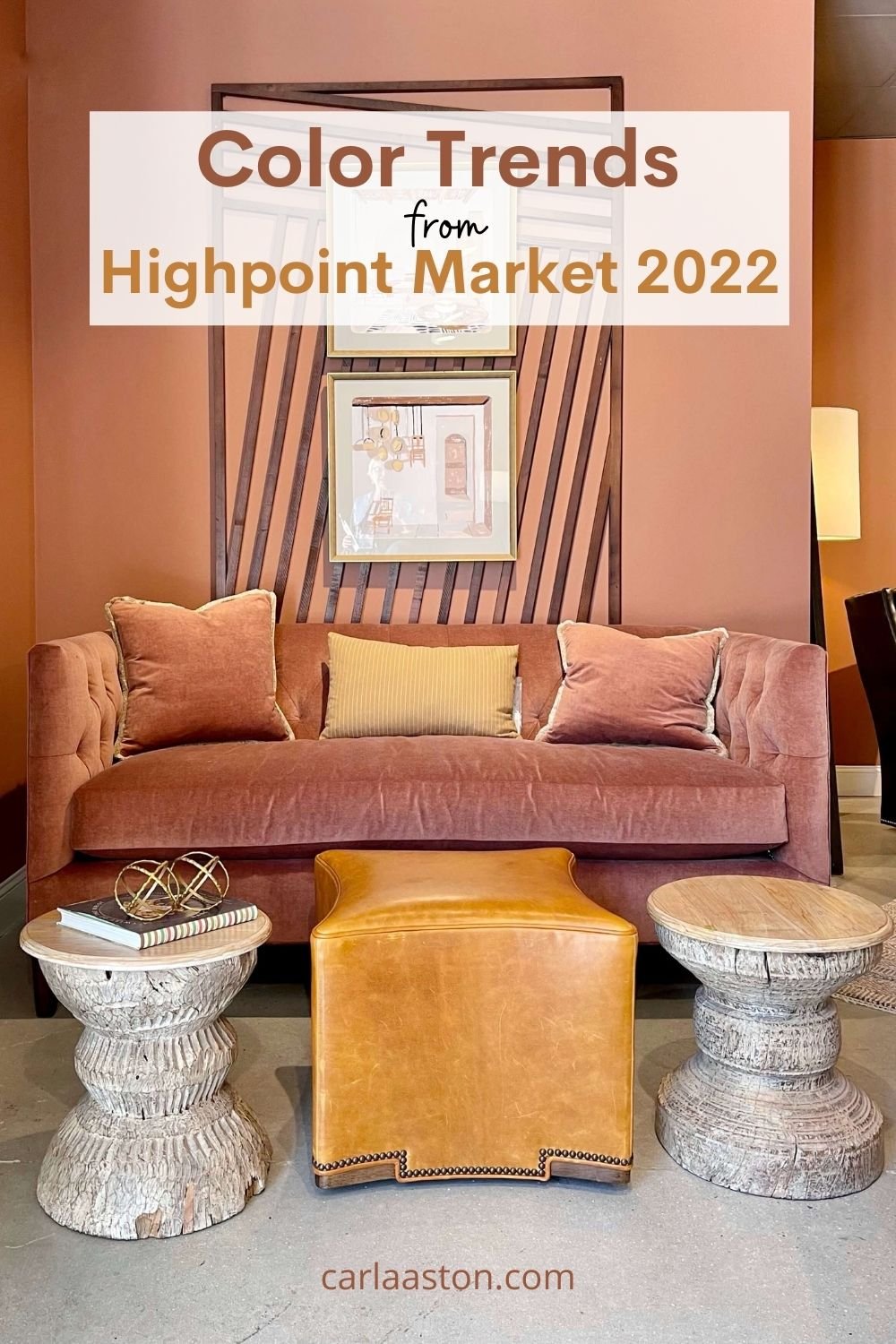
Color trends from Highpoint Market 2022
Want some help with furniture budgets or to see how a designer budgets for a project? Check out my ebook guide, below.












![More Help For Your Travertine Floor Problem! [Warm Toned Color Palette]](https://images.squarespace-cdn.com/content/v1/4fcf5c8684aef9ce6e0a44b0/1613516289251-5HS2QWA5PYHK0N0IN93B/Travertine_tile_flat_lay_moodboard___Copy__1613516252_62832.jpg)

I’m back from Highpoint Market and ready to talk about color! I’ve got loads of pretty pics too along with some tips on how you can incorporate this color trend into your home.