
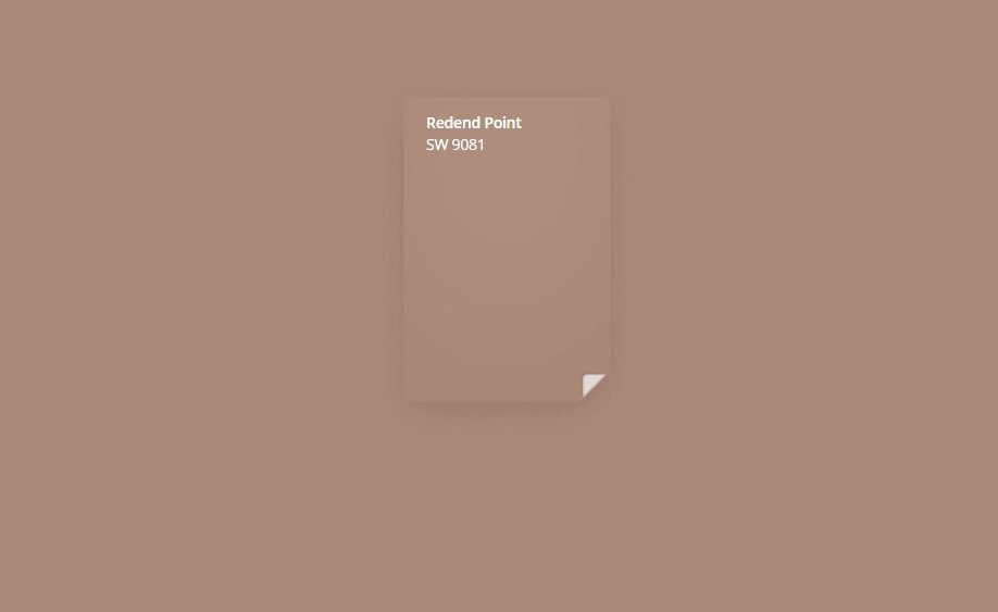
Did you see this color of the year, Sherwin Williams’ Redend Point, coming? I saw this palette coming, but not this exact color. Let’s dig in and see how this color is coming forward in design.
First of all, I’ve been chuckling over some of the comments I’ve seen on social media about this color.
“Wet Band-Aid”, “Calamine Lotion”, “an Arizona senior living facility” were among some of the hilarious comments I’ve seen.
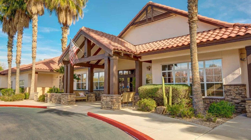
Well, that was spot on. (An Arizona Senior Living Facility)
Remember how I’ve talked about a trending color coming out of Highpoint last season? (And the season before that too….)
These warm terracotta colors were in many showrooms.

Here’s a little “Redend Point” going on in the art and rug with this peach colored sofa in the Rowe showroom at Highpoint Market. carlaaston.com

This Boho style in the Gabby showroom at Highpoint Market shows a little “Redend Point” vibe. carlaaston.com

Darker terracotta looks were popular at Highpoint last spring 2022, this one in the Wesley Hall showroom. The softer look of “Redend Point” is seen in the art. carlaaston.com

A little “Redend Point” color can be mixed with this palette seen in the Wesley Hall showroom at Highpoint Market. carlaaston.com
I even saw a little Redend Point color going on at Round Top last spring.

Candleholders in a slightly peachier Sherwin Williams Redend Point color at Roundtop, Paul Michael showroom, Spring 2022. carlaaston.com
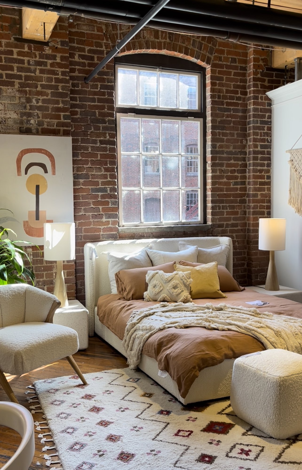
While I do prefer the stronger look of terracotta to the more “nude” look of Redend, I do see how this softer color can work well with a boho style. (Not that I would paint anything big with it…..)
I talked to a journalist recently who was asking me to weigh in for an article on what colors work with terracotta floors. I told her that a boho palette of soft creams, warm whites, goldenrod yellow, and brick reds can be very successful. It’s rather an analogous color scheme (colors positioned next to each other on the color wheel).
You can see that palette works well here.
The Dovetail showroom at Highpoint Market showcased some boho style with this warm terracotta color palette. A “Redend Point” color could be minimally worked in here. carlaaston.com
This color doesn’t stand alone very well or mix with white, in my opinion. It’s not like Emerald Green, Indigo Blue or even a soft green like Evergreen Fog.
The kitchen example on Sherwin Williams’ website makes that point. To me, this is just dead looking. Of all the colors in the paint deck you could choose and you chose this one? Nope.

Sherwin Williams Redend Point paint color on this kitchen.
In my opinion, Redend Point needs to play a small part in color palette. To me, it should be used as more of a supporting character. It needs richness like a brick red and ocher or even going dark, like a charcoal gray helps.
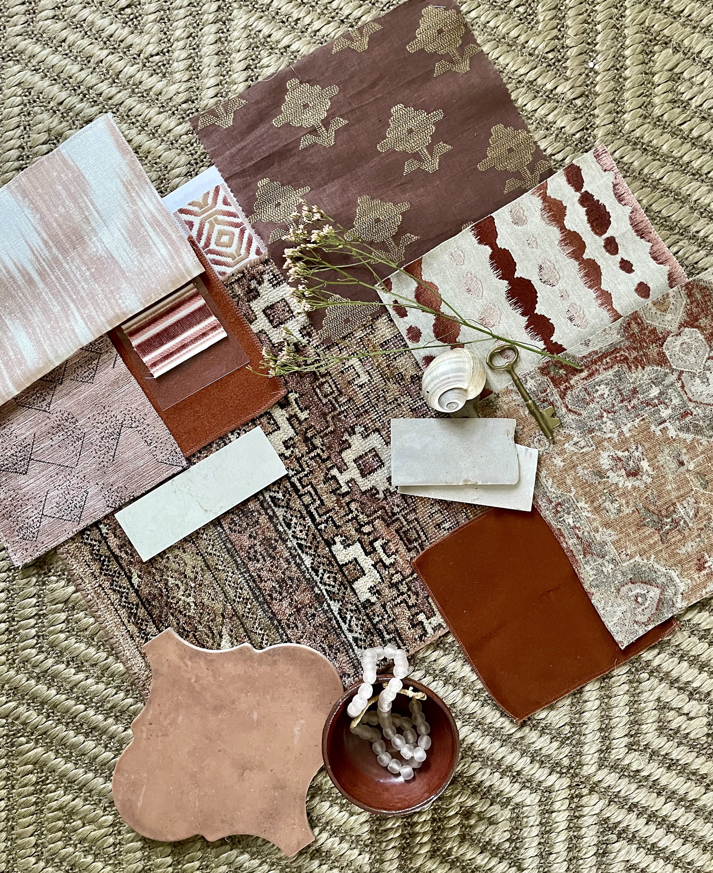
I pulled some of the palettes I created in the past here that I think would work with a little Redend Point mixed in. (As a small pillow or something, like this one below. :-)

SW Redend Point color used as a small pillow in this vignette in the Wesley Hall showroom at Highpoint Market. carlaaston.com
Color Palettes That Could Include a Bit of SW Redend point
I have a few of these from my Flatlay Sources Guide here. The sources for three of these flatlays are included in the guide.
Terracotta, blush, and brick red color palette | carlaaston.com
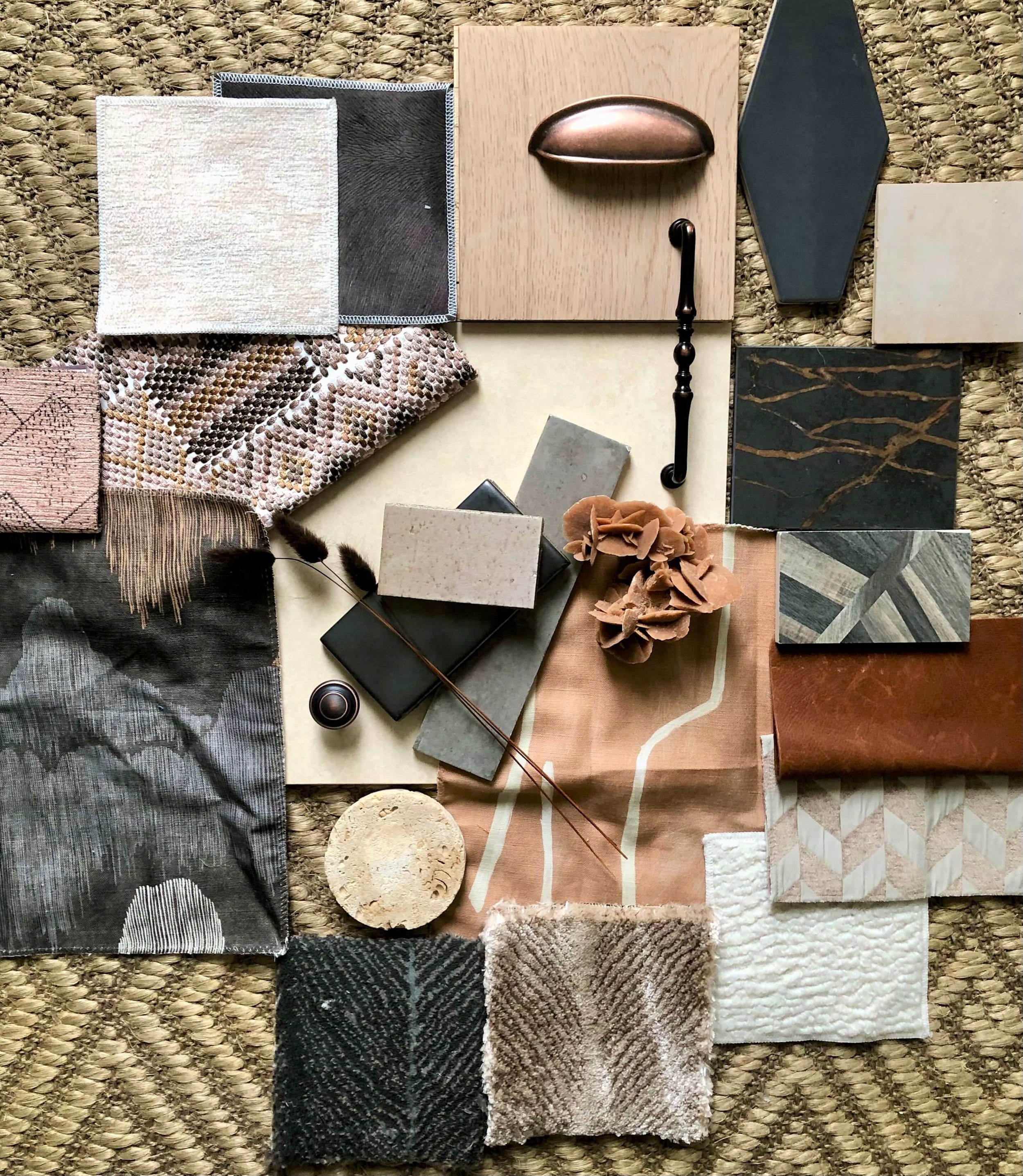
I could see a little SW Redend Point in this palette. It’s a nice compliment to charcoal gray. carlaaston.com

Coastal palette with seagrass, soft blue greens and a pinkish wood tone. carlaaston.com

Warm tones with medium gray in this palette that has a touch of Sherwin Williams Redend Point. carlaaston.com

The wood floor color and a few of the fabrics in this color palette resemble Sherwin Williams’ 2023 Color of the Year. carlaaston.com
Looks like I’ve used this color in a palette for my living room in the Seasonal Living Virtual Showhouse. :-)
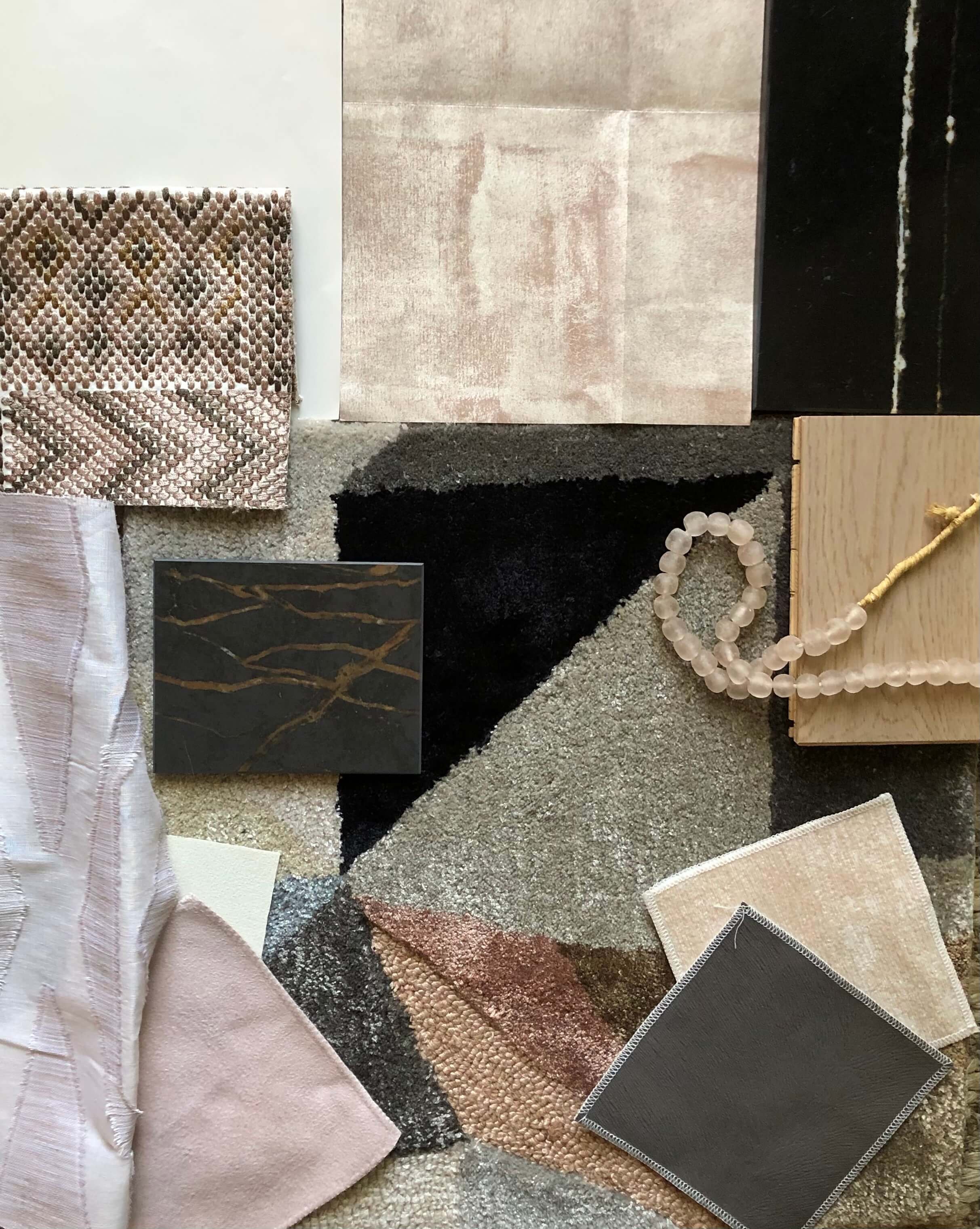
Seasonal Living Showhouse living room color palette | carlaaston.com
Not quite SW Redend Point, more blush really, but I see shades of it in the wallcovering and the rug.

Seasonal Living Showhouse Living Room | carlaaston.com

Seasonal Living Showhouse Living Room | carlaaston.com
I might use this color in a fabric or something, but it would take a unique client and situation for me to paint a wall or a house with it.
How about you? Do you like it or not?
Subscribe to my blog if you aren’t already. I’m heading to Highpoint in October and will be sharing all the latest design inspiration from the showroom floors right here!
Pin this to Pinterest to save for later and help me share my blog. :-) Thx!
