This bathroom was remodeled last year at this time, finished just as our stay-at-home orders were put in place. I recently was able to have it photographed and I’m so pleased with the changes made and the serene look we were able to achieve.
BEFORE PICS
I’ve shared some progress pics about this job in the past here on my blog, so you might remember seeing this photo.
The big problem in this bathroom was that the closet doors banged into each other when opened. It was very awkward and poorly designed.
The fully enclosed shower was behind the angled wall on the left.
BEFORE PIC - Bathroom remodel
You can see here how the closet doors would hit into each other if both were opened at the same time.
Closet doors opening back to back hit each other when opening. This was a big item to be addressed in the bathroom remodel.
The bathroom had a huge, oversized glass block window. I felt this needed trimming down so the bathroom vanity could be extended over a bit by the tub. It didn’t need to be so low either, especially when the homeowner was wanting a tall, beautiful free-standing tub.
Glass block windows like this are so dated and really telegraph the age of the home. If you are going to do a significant remodel in the bathroom, don’t leave a window like this today. It will be the “elephant in the room”.
BEFORE PIC - Bathroom remodel
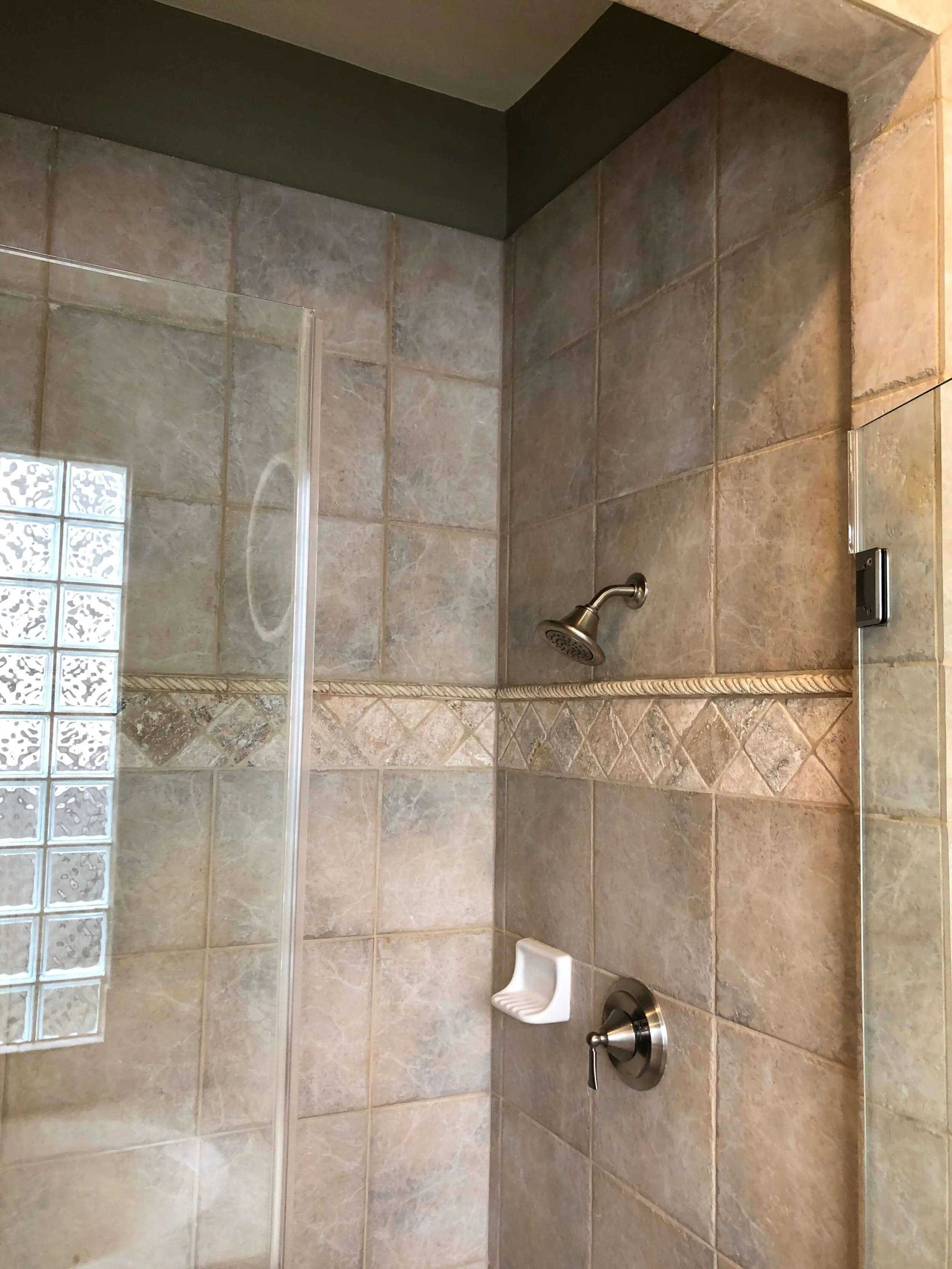
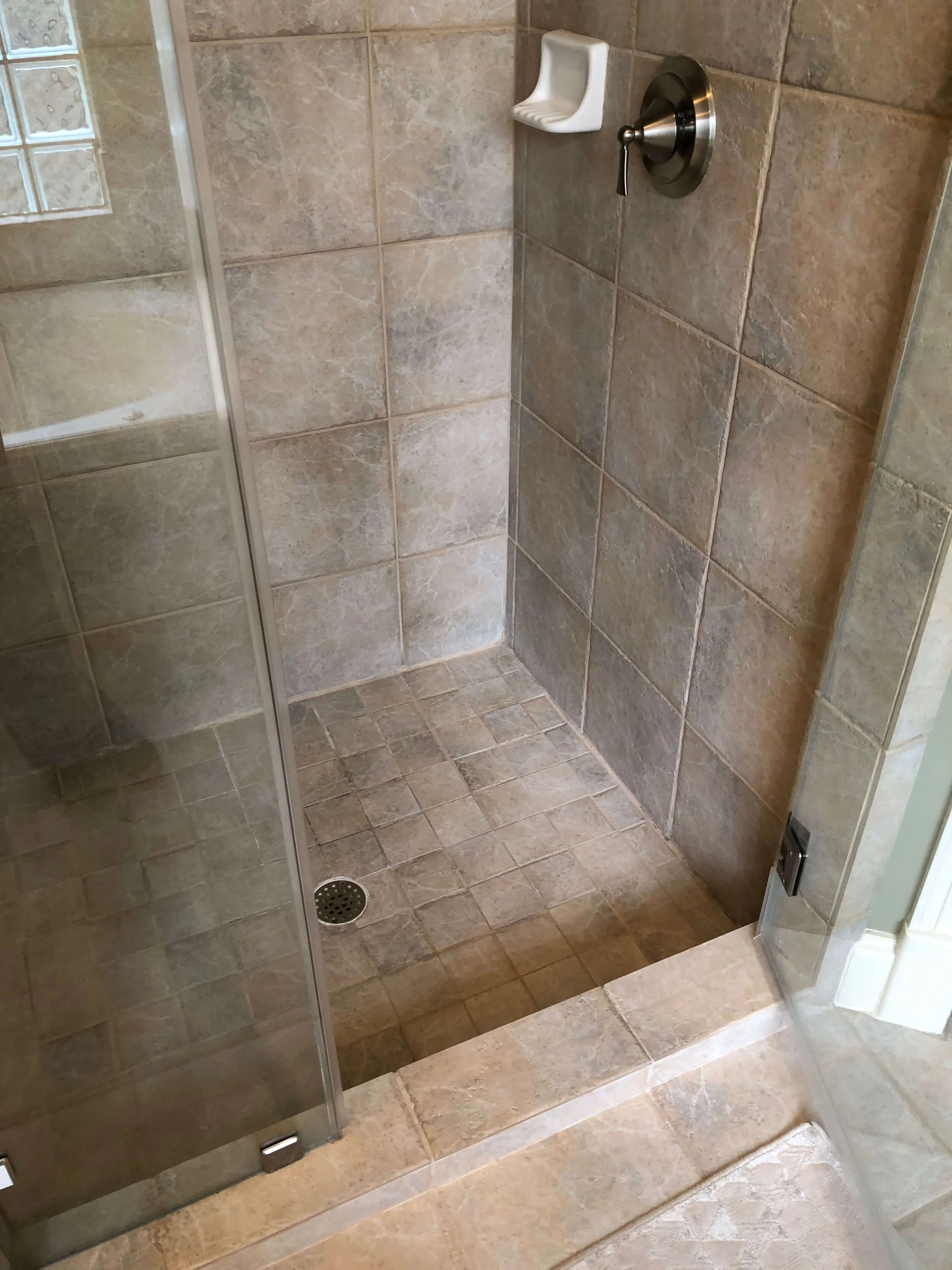
Here was the enclosed shower. In the remodel, the homeowners wanted to open this up for a larger, more luxurious look.
Dated, muddy tile lined the shower stall. The homeowner was looking for a more fresh look and an open shower to make the room feel bigger.
The shower floor was sunken so you had to step down. It was raised to the level of the floor in the new remodel.
The homeowners were weary of all the creaminess of the paint. They wanted a whiter, crisper look.
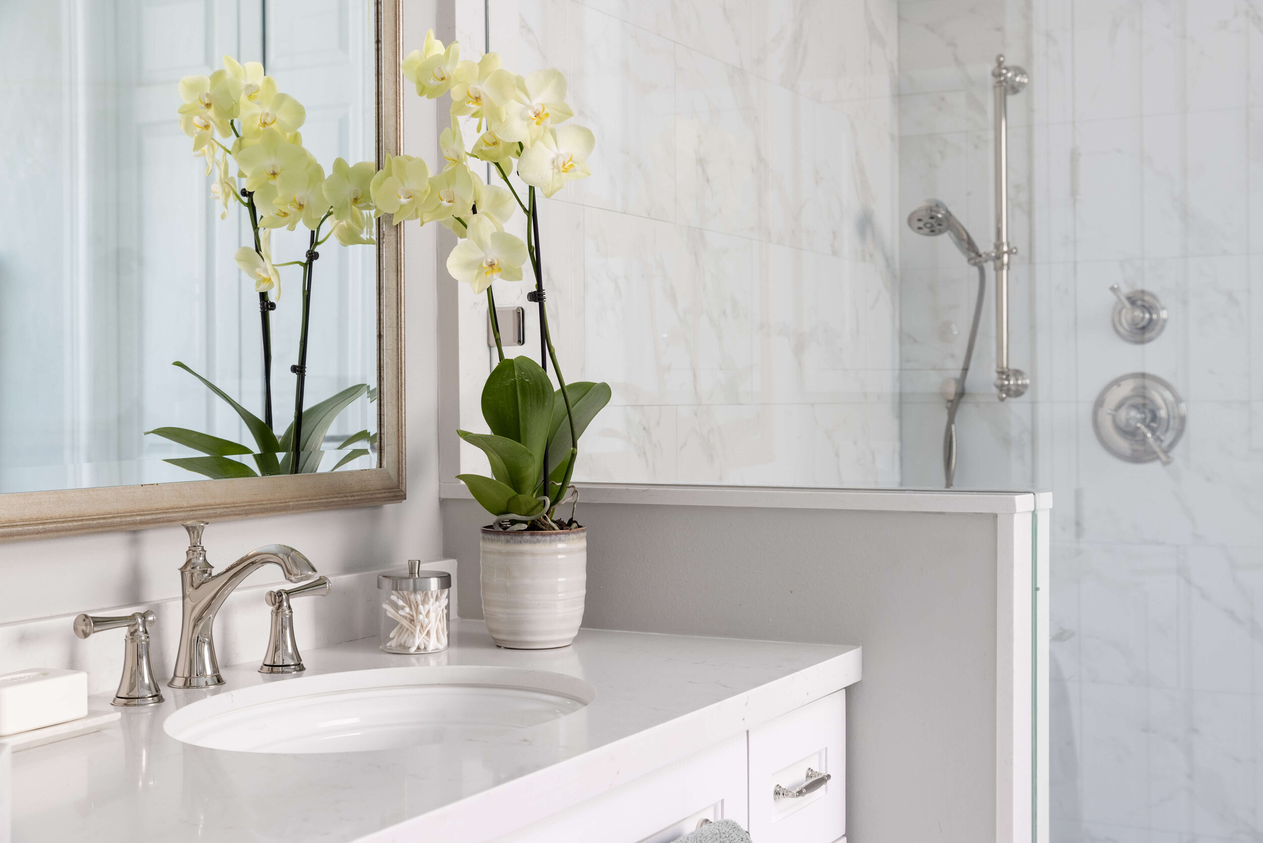
We keyed the white tone for the cabinetry off this really nice porcelain tile, a marble look from Arizona Tile. I used the 12 x 24 on the walls and then a smaller version in a herringbone pattern on the floor. I love the direction it gives and how it leads you through to the closet. This scale and pattern is great for traction too.
In-Progress shot, below:
Here is another in-progress shot, below, with the modification of the doors to the closet. We straightened the wall and did a double door entry.
It opens to a small vestibule that has a mirror. You go left for his closet, right for hers. This was a much better use of space and just worked better too!
The cabinets weren’t totally redone, but they were modified. The knee space wasn’t needed in her vanity and we did a full overlay cabinet door style. This updates cabinetry so nicely. Leaving the older version would have been another “elephant” left behind.
AFTER PICS
And here’s the final result! A beautifully serene bathroom remodel with doors that open without obstruction!
The curvy tub, pretty chandelier, and gleaming polished nickel details add the luxury this homeowner was looking for.
One of the changes required the air vent to be relocated from the ceiling to the wall above the door. I decided to make it pretty by adding the fretwork designed ventcover there. (Normally I would try to hide something like this, but here, it was just too front and center to ignore.) I love how it looks!
BEFORE AND AFTER BATHROOM REMODEL - This bathroom remodel opened up the shower area, added a beautiful free-standing tub and reconfigured the entrance to the closet for a much more workable solution. Carla Aston, Designer | Colleen Scott, Photographer
BEFORE AND AFTER BATHROOM REMODEL - The full height mirror hides a direct view into the closet and lengthens the look of the bathroom. Carla Aston, Designer | Colleen Scott, Photographer
BEFORE AND AFTER BATHROOM REMODEL - The curvy tub is a sculptural element in this bathroom and stands out nicely on top of the herringbone tile floor. Carla Aston, Designer | Colleen Scott, Photographer
BEFORE AND AFTER BATHROOM REMODEL - The gleaming polished nickel tub filler adds a touch of luxury to this remodeled bathroom. Carla Aston, Designer | Colleen Scott, Photographer
BEFORE AND AFTER BATHROOM REMODEL - The dated glass block window was removed and a textured glass window installed. Carla Aston, Designer | Colleen Scott, Photographer
BEFORE AND AFTER BATHROOM REMODEL - The knee hole space for the seated vanity was reworked and the sink relocated in the cabinetry modification. Carla Aston, Designer | Colleen Scott, Photographer
BEFORE AND AFTER BATHROOM REMODEL - The whiter finishes and paint made the space feel updated and fresh. Gleaming polished nickel added the sparkle. Carla Aston, Designer | Colleen Scott, Photographer
BEFORE AND AFTER BATHROOM REMODEL - This shampoo niche is tucked around the corner of the 1/2 wall to hide products and toiletries used every day. Carla Aston, Designer | Colleen Scott, Photographer
Kudos to the other pros on this job!
See the kitchen remodel that we did in this home too!
Pin this to Pinterest to save for later reference!


