I’m really excited to share a project reveal of mine with you today!
This project is special to me because I really do love the style and feel of this space, and I so love the complete transformation we were able to achieve.
This home went from being a very typical builder home — you know, it's nice...yet still very traditional and typical of the homes around here — to a cleaner, sleeker aesthetic; one that truly reflects my client’s taste and style. (I recently shared their pool table redo in this post.)
After all, if you remodel, and you go to all the trouble and expense to make it happen, shouldn’t you get exactly what you want? Of course! That's why I'm proud to say my clients got exactly what they wanted. ;-)
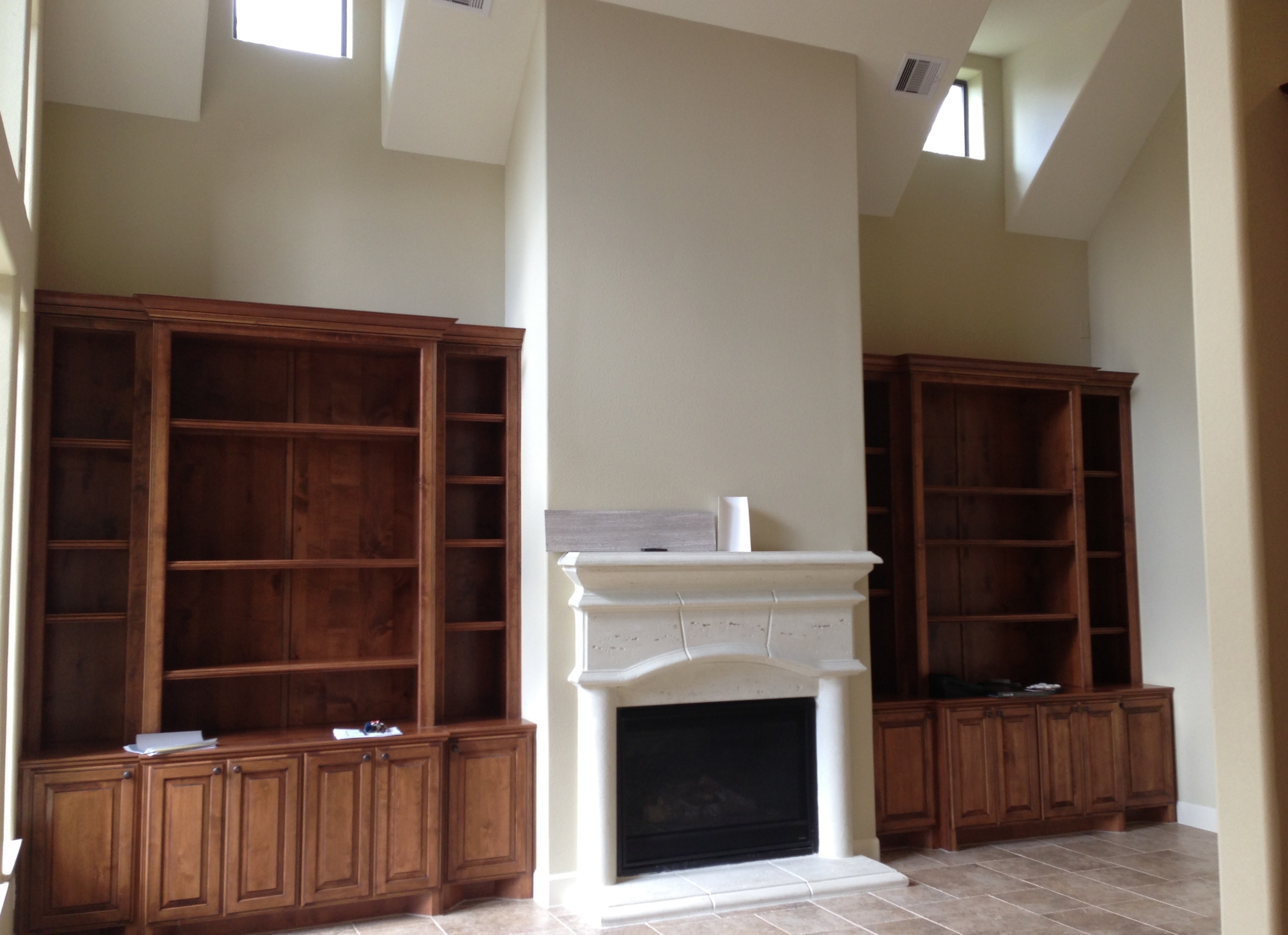
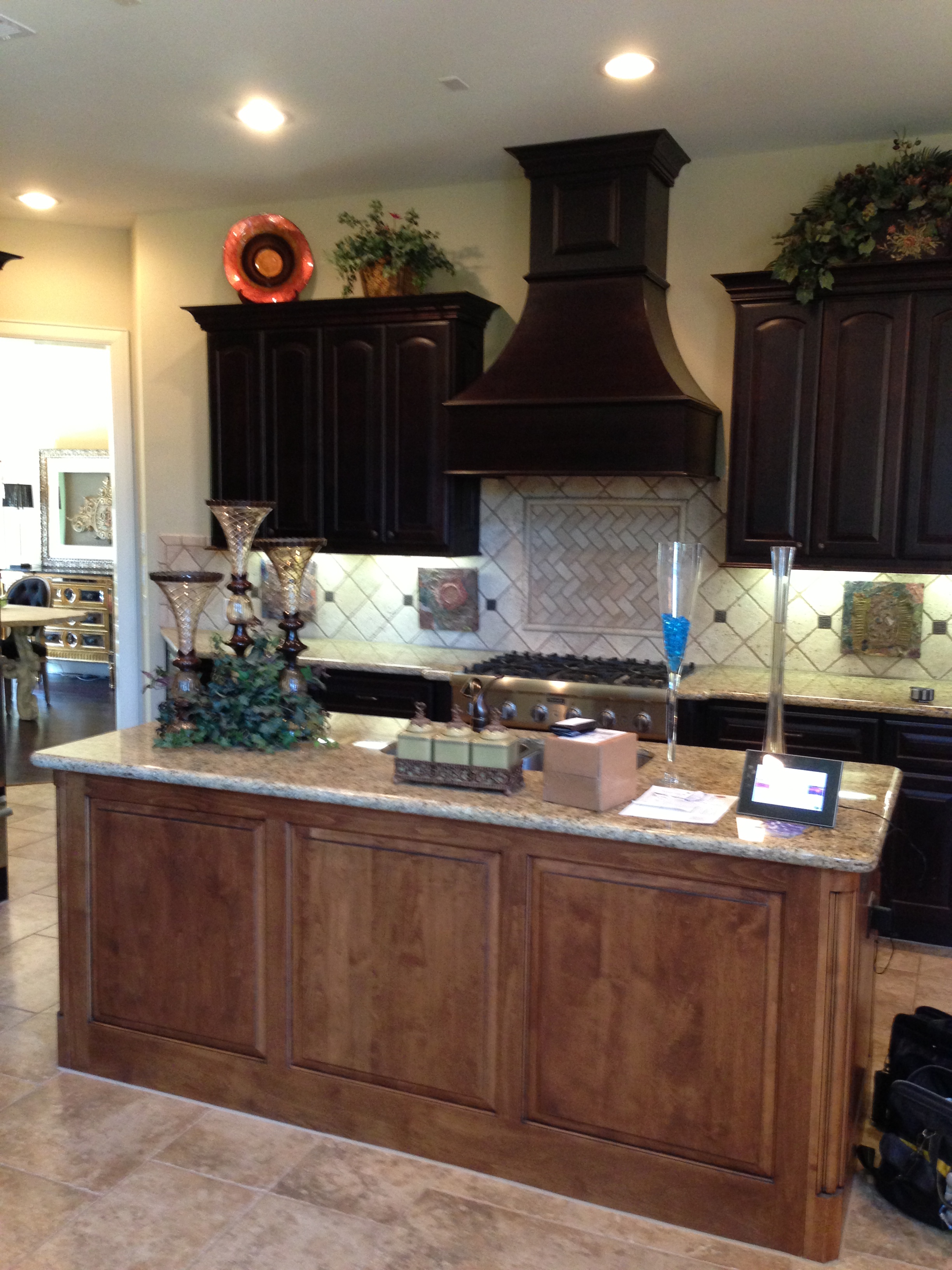
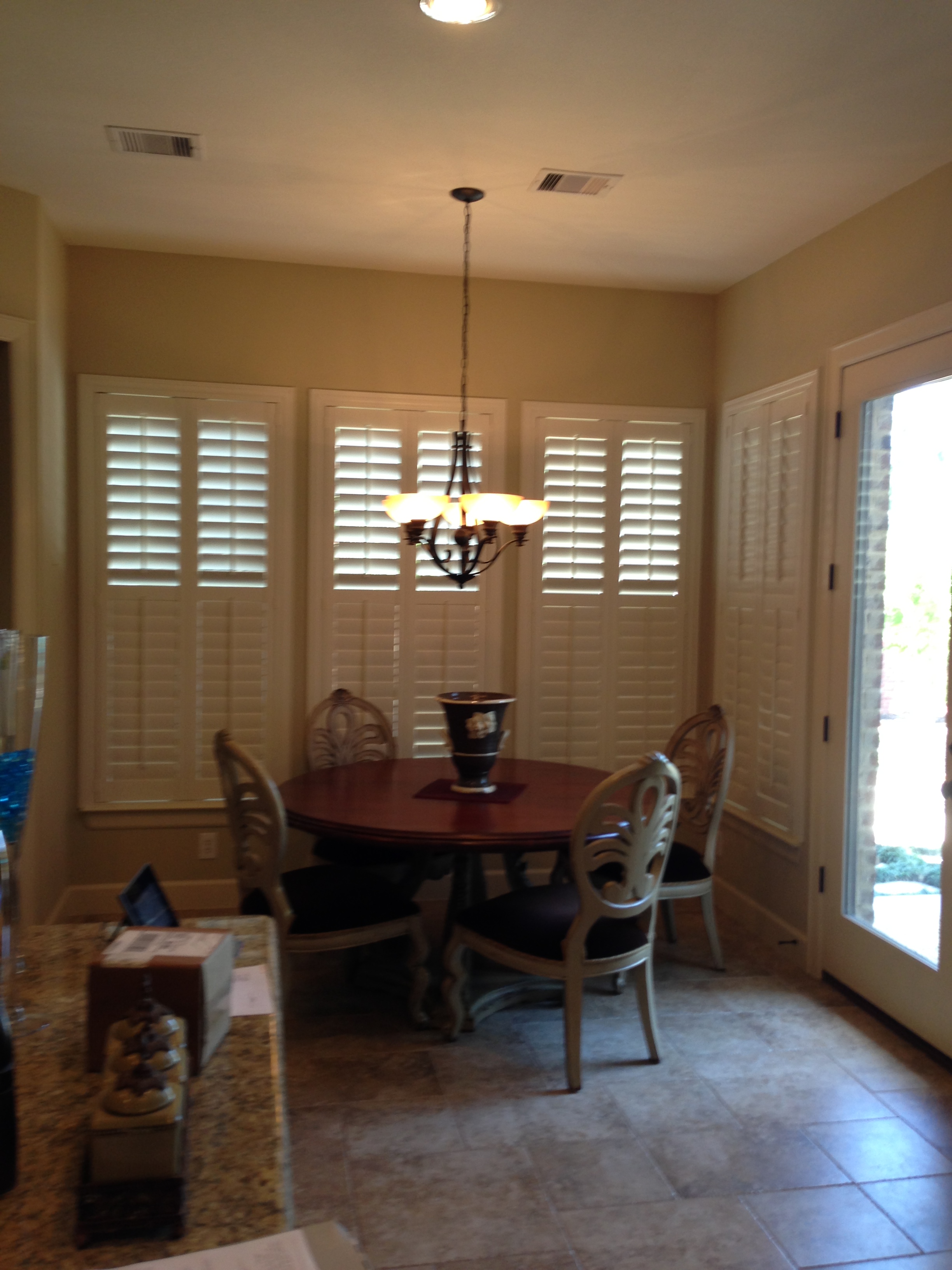
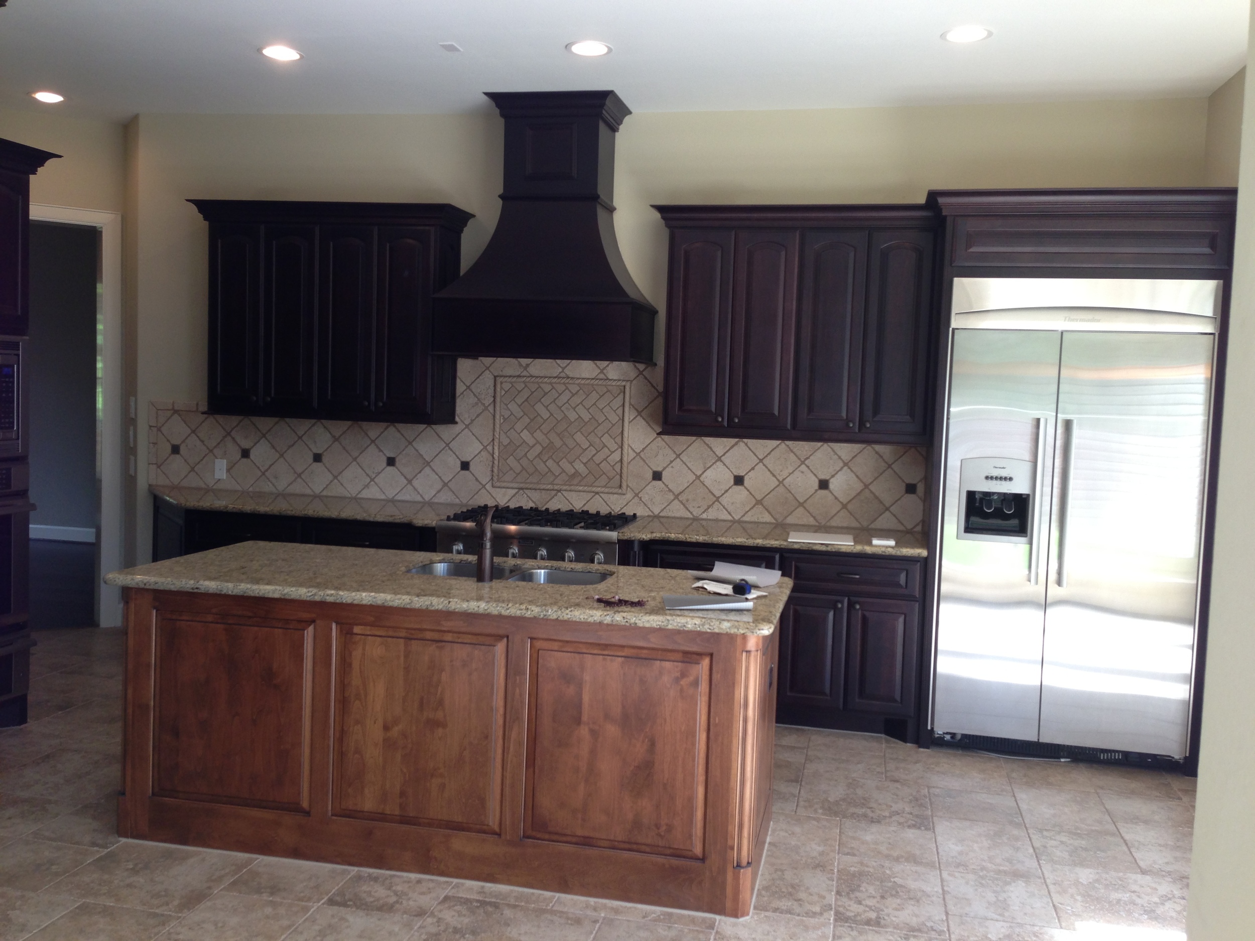
Let's take a look at how things looked before we got to work.
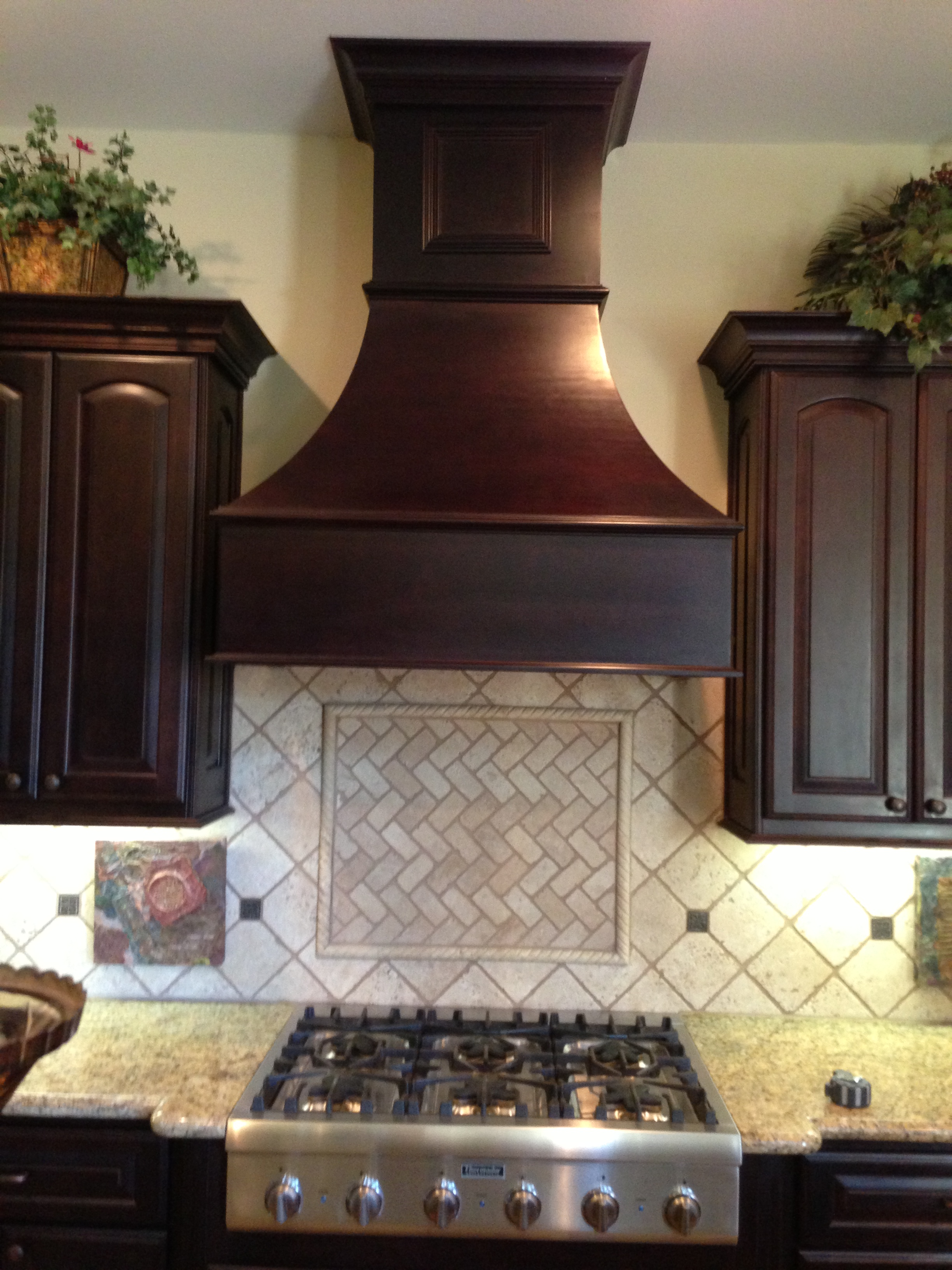
Sure, what you see doesn't look horrible (although a bit dated and muddy); but this home definitely did not represent my client’s style.
Before:
Now let's go over all we did to make sure the the after shots look much better than those befores.
Here's the floor plan:
Floor Plan:
And here's a breakdown of everything we did:
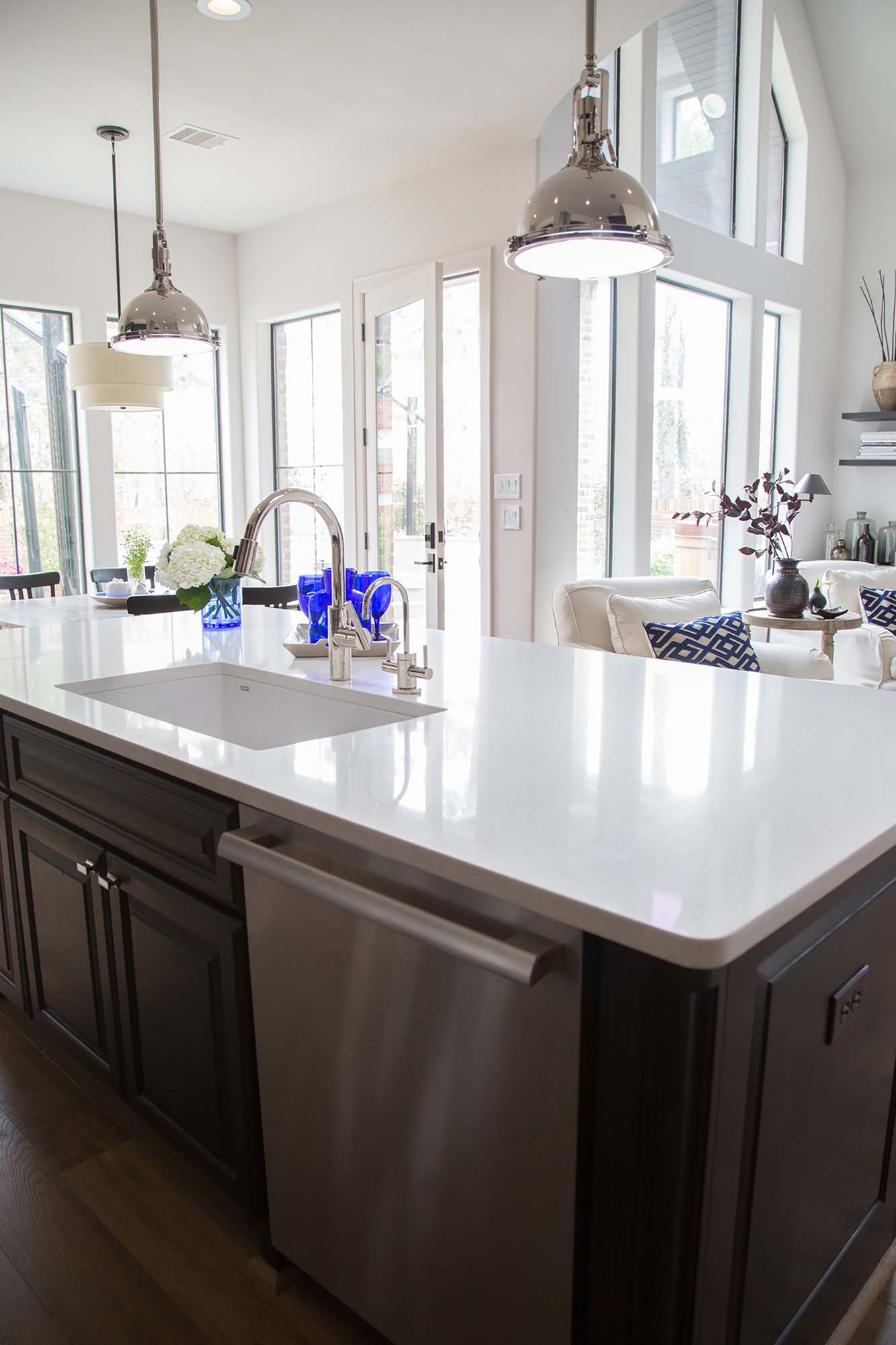
◆ Despite all the great windows in this space, the kitchen was rather dark and felt like it was cut off from the living room, so we removed the wall between the two spaces. By tearing down that wall (and yes, the proper beams were installed in the ceiling in order to do this), we doubled the size of the space and light came pouring in. We were then able to create seating space at the bar with a new, larger countertop on the existing island and, basically, spread the seating out a bit in the living room.
RELATED: Want to see how we took down the wall between
the kitchen and living room?
Click here!
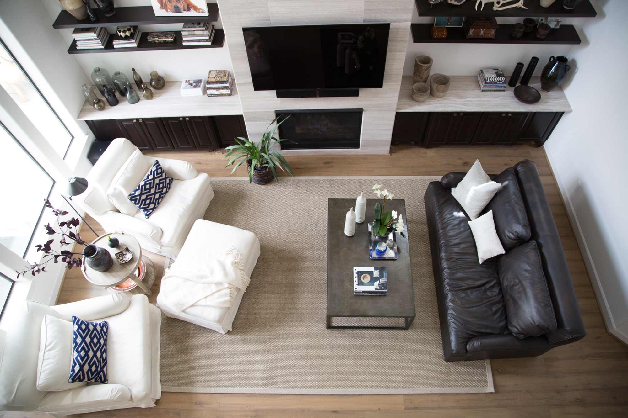
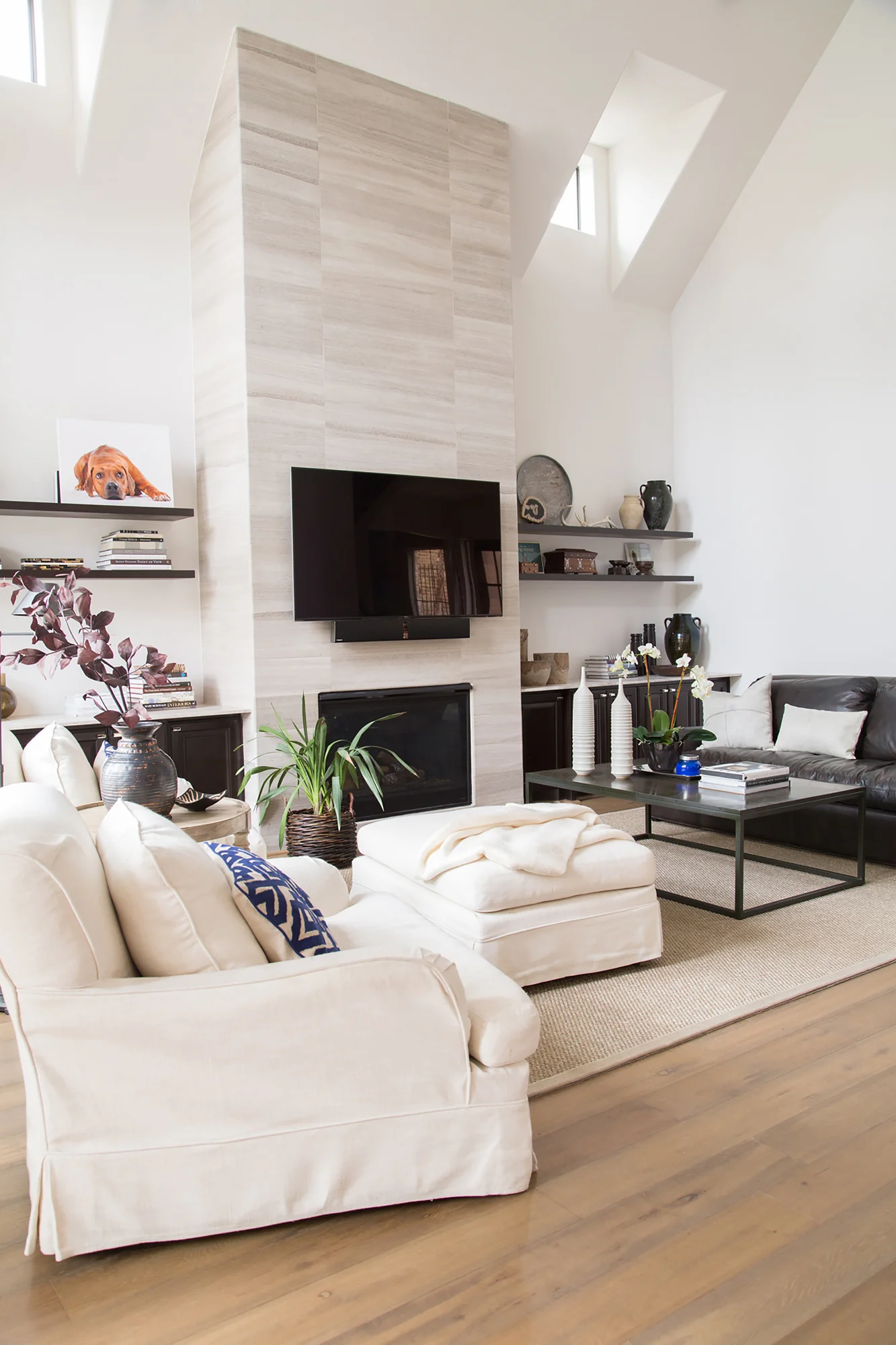
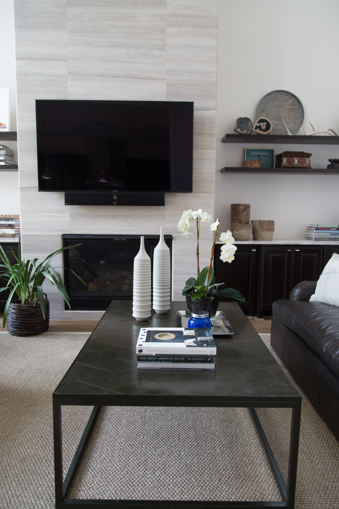
◆ We also updated the fireplace wall by removing the existing, traditional mantle and the upper cabinets in the niches. Then, in an effort to create a cleaner look, we went with a linear look limestone tile, all the way to the ceiling. I felt like the former mantel and bookcases sort of cut off the beautiful tall space and actually went against the architecture of the home. The angled, high ceiling and those clerestory windows work so well with the new design. I applied my theories about design of spaces with high ceilings here, by taking the travertine up to the ceiling. And, as you can see, it works. :-)
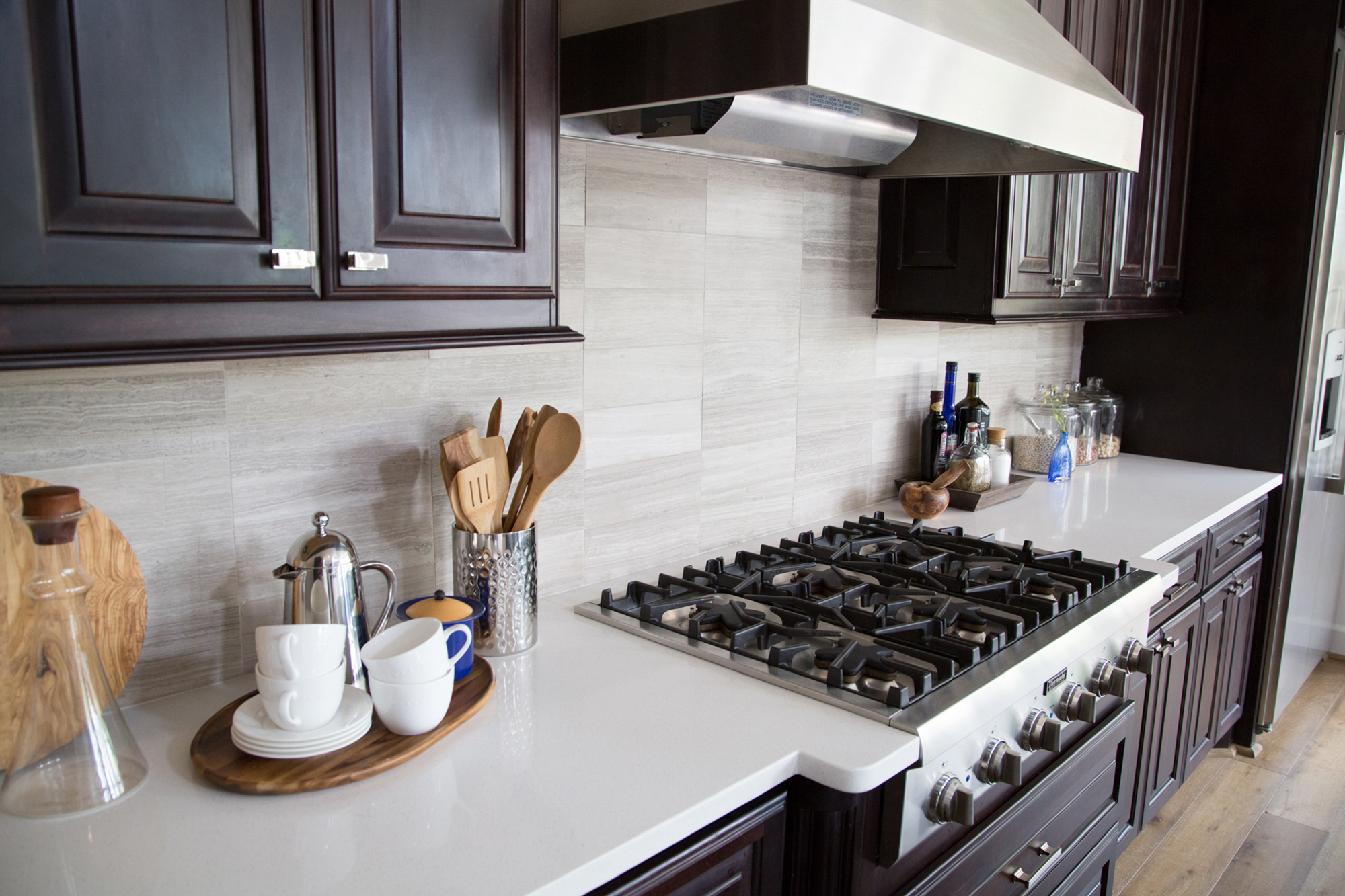
◆ In the kitchen, the island went espresso to match the cabinets on the wall. And with white Caesarstone counters, new hardware, a new sleek hood, and a backsplash that echoes the fireplace wall in material and layout (except on a smaller scale), we achieved a completely new look without having to opt for new cabinetry. I just love creating balance in a space by repeating materials around the room.
◆ A beautiful white paint color (email me below for that perfect white) on everything — walls, mouldings, doors — cleaned up the details and allowed the gorgeous new wood floor to stand out. That rustic, grey-washed floor — email me using the form below for that info, too — helped create the relaxed vibe this home exudes. LOVE IT! :-)
Want to see the after shots?
Ta-da! Scroll down to enjoy them all! ;-)
P.S. Stay tuned, alright! You’re not going to believe how the remodeled master bath looks. (Here’s a hint: It looks amazing!) I’ll be sharing it soon. ;-)
◆ All 'after' photographs shot by photographer Tori Aston ◆
Living Room:
BEFORE AND AFTER: The Extraordinary Remodel Of An Ordinary Builder Home | Interior Designer: Carla Aston / Photographer: Tori Aston
BEFORE AND AFTER: The Extraordinary Remodel Of An Ordinary Builder Home | Interior Designer: Carla Aston / Photographer: Tori Aston
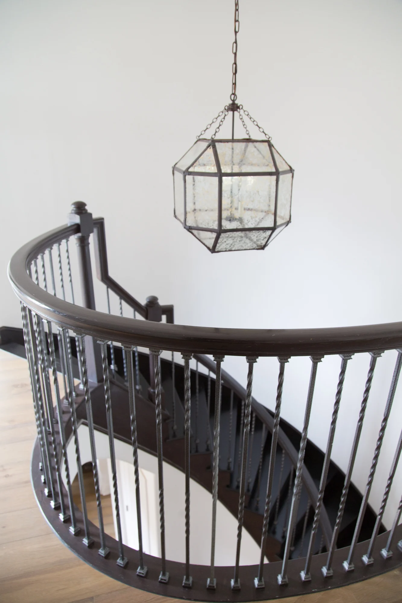
BEFORE AND AFTER: The Extraordinary Remodel Of An Ordinary Builder Home, circular staircase | Interior Designer: Carla Aston / Photographer: Tori Aston
BEFORE AND AFTER: The Extraordinary Remodel Of An Ordinary Builder Home | Interior Designer: Carla Aston / Photographer: Tori Aston
BEFORE AND AFTER: The Extraordinary Remodel Of An Ordinary Builder Home | Interior Designer: Carla Aston / Photographer: Tori Aston
BEFORE AND AFTER: The Extraordinary Remodel Of An Ordinary Builder Home | Interior Designer: Carla Aston / Photographer: Tori Aston
BEFORE AND AFTER: The Extraordinary Remodel Of An Ordinary Builder Home | Interior Designer: Carla Aston / Photographer: Tori Aston
BEFORE AND AFTER: The Extraordinary Remodel Of An Ordinary Builder Home | Interior Designer: Carla Aston / Photographer: Tori Aston
BEFORE AND AFTER: The Extraordinary Remodel Of An Ordinary Builder Home | Interior Designer: Carla Aston / Photographer: Tori Aston
BEFORE AND AFTER: The Extraordinary Remodel Of An Ordinary Builder Home | Interior Designer: Carla Aston / Photographer: Tori Aston
Kitchen:
BEFORE AND AFTER: The Extraordinary Remodel Of An Ordinary Builder Home | Interior Designer: Carla Aston / Photographer: Tori Aston
BEFORE AND AFTER: The Extraordinary Remodel Of An Ordinary Builder Home | Interior Designer: Carla Aston / Photographer: Tori Aston
BEFORE AND AFTER: The Extraordinary Remodel Of An Ordinary Builder Home | Interior Designer: Carla Aston / Photographer: Tori Aston
BEFORE AND AFTER: The Extraordinary Remodel Of An Ordinary Builder Home | Interior Designer: Carla Aston / Photographer: Tori Aston
BEFORE AND AFTER: The Extraordinary Remodel Of An Ordinary Builder Home | Interior Designer: Carla Aston / Photographer: Tori Aston
BEFORE AND AFTER: The Extraordinary Remodel Of An Ordinary Builder Home | Interior Designer: Carla Aston / Photographer: Tori Aston
Breakfast Room:
BEFORE AND AFTER: The Extraordinary Remodel Of An Ordinary Builder Home | Interior Designer: Carla Aston / Photographer: Tori Aston
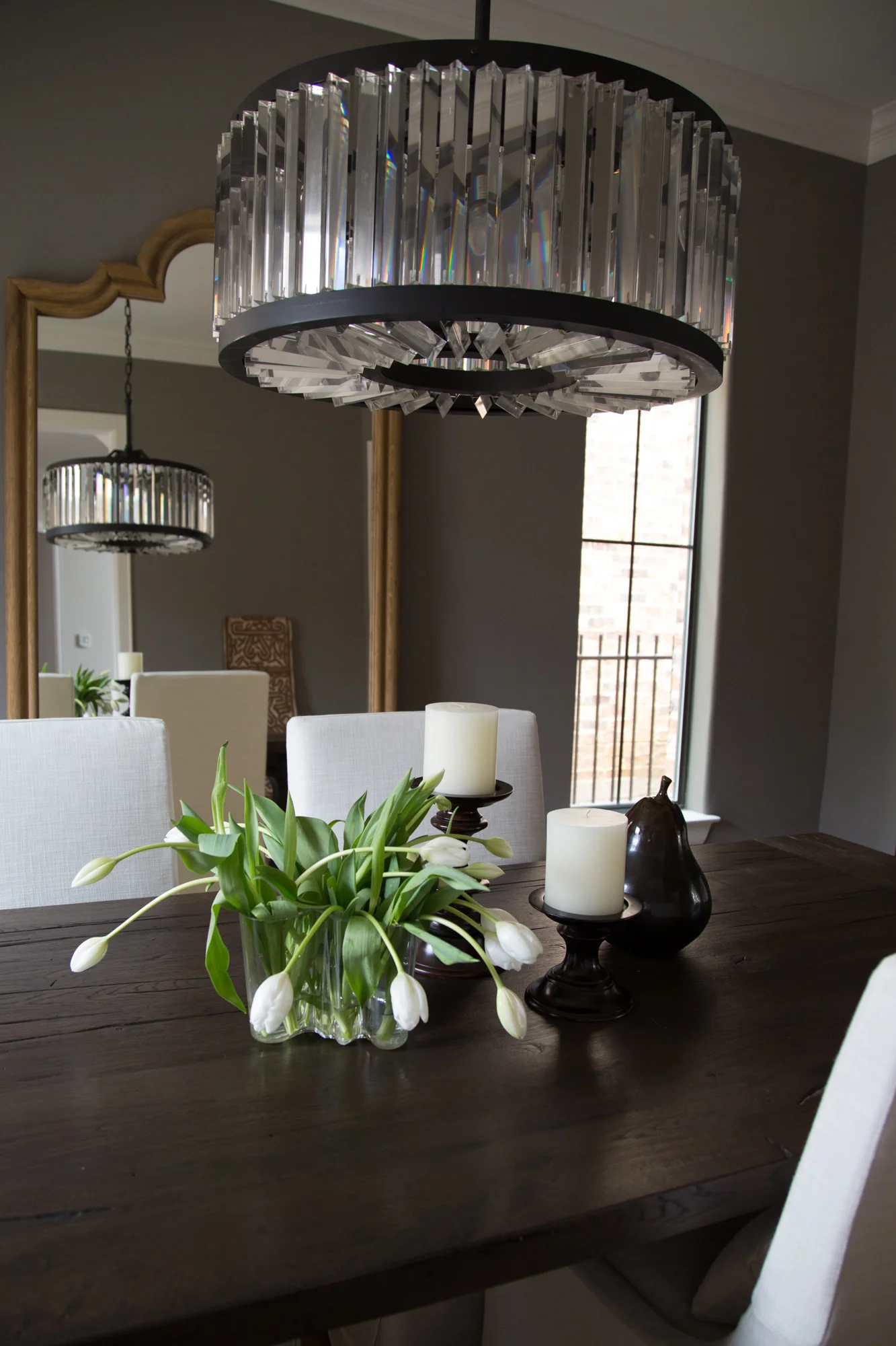
Dining Room:
BEFORE AND AFTER: The Extraordinary Remodel Of An Ordinary Builder Home | Interior Designer: Carla Aston / Photographer: Tori Aston
Here’s the link to the fireplace and backsplash tile, in case you missed it above. You can see it comes in several sizes.
Want to know the sources used for all these beautiful finish products? The wood floor, paint color, natural stone, countertop, etc.?
Using the form, enter your email address and the link to the source list will appear right here. ;-)

