I just ran across an old photo of a fireplace wall remodel I had worked on some years ago and honestly, surprised myself with the transformation. It prompted me to gather together some of my favorites done over the past recent years, for a round up post. :-)
Some of these have tvs above the firplace and some do not, it all is just what the homeowner wants and how it works architecturally and with the furniture layout in the room.
Fireplace Wall Transformation #1
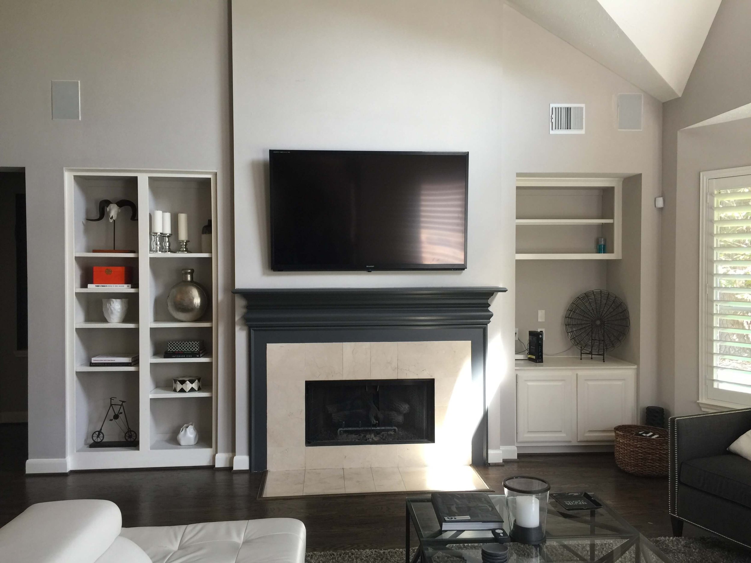
BEFORE - Basically a symmetrical look, but the built-ins were too different from each other. Homeowner wanted fireplace to be a more modern, clean look.
AFTER - Matching built-ins work well here since tv is mounted above the more modern look fireplace. Upgraded finishes elevate the room. Carla Aston, Designer
See more about this project at this link. >>> Before and After - A Fresh, Light, Family-Friendly Home Makeover
Fireplace Wall Transformation #2
When a wall is designed to be symmetrical, like this one below, and then it sort of falls short of that, then making it more in line with the architectural design purpose is in order.
Such was the case here. I didn’t like the little arches in the cabinet on the right side, it just fought the more horizontal look of this wall.
BEFORE - The arched cabinet openings needed a reworking to create a more symmetrical look.
This homeowner had also redone the stone cladding a few years prior and I felt that updating the right side cabinet and then painting the cabinets a dark color that would contrast with the stone so that it stands out more, would be the answer.
We used the blue color that was the same as their kitchen island and backsplash, in the adjacent space, to tie everything together. The walls, ceiling and trim in this room was already going whiter, which was a good direction here too.
AFTER - The dark, contrasting blue paint, the matching built-in design and the overall more white look feels so much fresher and designed. Carla Aston, Designer
See more about this project at this post. >> A Family Room and Breakfast Room Update Complete an Open Plan Space
Fireplace Wall Transformation #3
This is another of those angled wall situations. While the fireplace isn’t on the angle, the two adjacent walls are, creating a symmetrical look.
This room, below, was actually kind of an elongated octagon. Some openings on the opposite walls had arches, some didn’t, the arches were different sizes, etc. There was some crown wrapping the wall on that lower ceiling area, then no crown on those two walls at the tv and fireplace. It was all just rather awkward.
Such is a production home. The lack of thoughtful detail is mind-boggling to me, but I love to get my hands on a situation like this because the before and afters are just remarkable.
BEFORE - This wall needed some design and detailing to make it look its best and function with a tv over the fireplace.
I designed two equally sized sections for the angled walls. The left side, where we had more depth and could go back further than shown into the wall cavity, housed storage and media equipment needs. The right side had no depth really, so dummy panels were installed there to match the opposite wall.
The center wall received a stacked white stone cladding floor to ceiling with a floating wood mantel. It created a cleaner, more “designed” look overall. The substantial use of stained wood was nice to have since the floors are all travertine in this part of the house.
I just loved this outcome. :-)
AFTER - A more symmetrical look was designed with a built in on one side and paneling to match on the other and new stone cladding with a floating mantel. Designer: Carla Aston
Fireplace Wall Transformation #4
This home is in California, the homeowner moved back in after being away for over 25 years. This before photo was taken when they lived there previously.
BEFORE - A traditional look fireplace wouldn't work so well with a more modern, updated look in this living room.
They needed an update in this space and they wanted a more modern, cleaner look.
We also decided that they needed to get rid of the sunken living room and raise the floor so everything was all one level. (You think about things like this as you get older!) It made for a more flexible layout in the living room and was a smart addition to the remodel.
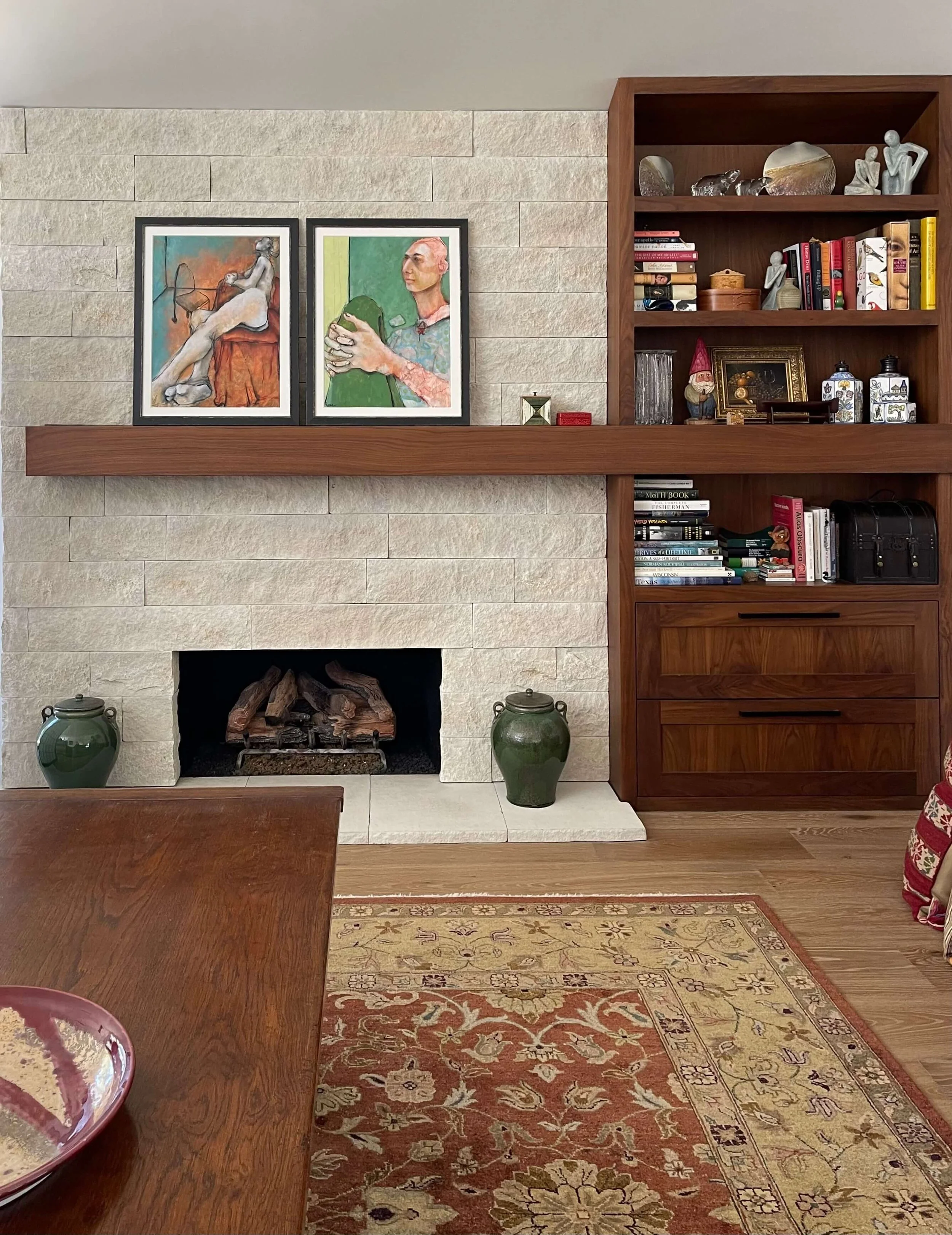
This homeowner loved stone and walnut wood so these two materials were incorporated here on the fireplace wall. While the other fireplaces in the examples above have a more symmetrical look, here, because we were extending the new sliding glass doors closer to the fireplace (on the left), asymmetry made sense.
And, it worked to keep the existing firebox in the same location!
AFTER - The gorgeous materials and clean lined details of this fireplace wall enhance the new living room's design. Designer: Carla Aston
This blogpost was thoughtfully written by me, Carla Aston, and not by AI, ghostwriters, or guest posters.
Care to see more fireplace wall remodels? These below are more minimally remodeled but still make a big difference.


Check out these 5 fireplace transformations that used minimal remodeling to make a big impact.