This master bath remodel was done over a year ago.
Unfortunately though, I didn’t get to photograph it myself. The homeowner moved back to New York and never lived in the house. Their work relocated them. The house is currently on the market.
It’s kind of sad when that happens, especially when something is very custom-designed like this bathroom was. I don’t think a homeowner ever experiences value in design unless they live in the space or use it after it is created.
There were elements I was in control of with this project and elements I wasn’t.
It was a bit unlike most projects I work on, where typically, my lead and recommendations are taken on all parts of the design.
In this project, I was really collaborating with the homeowner and was brought in to help this job move along and get some decisions made. Not exactly the most efficient way of working, nor one that I normally do.
In this instance, we were turning a traditional, Mediterranean style house into something more contemporary to really speak to the homeowner’s aesthetic. This was really difficult for me anyway. There is just so much you can do to totally convert the style of home when some of the major stylized architectural features are unable to be touched.
One of the features that really bothered me about the outcome of this particular space was that the homeowner couldn’t see that the traditional paneled doors worked heavily against the design we created here, especially in light of the new, exquisitely crafted cherry cabinetry made by Osborne Cabinets and Millwork.
While we could get away with keeping those existing doors in other parts of the house, unfortunately they just don’t work in this bathroom that went so contemporary.
So, while I’m so proud of how this bathroom turned out — accentuating the attributes of the space: the scale, drama, and volume — I do realize that the paneled doors that match the doors in the rest of the house — and you might want to read this to understand my stance — aren’t really the best choice for this bathroom. :-)
However, we were able to minimize their look by painting them to match the walls and overall, it turned out really well.
And, with that caveat, here it is:
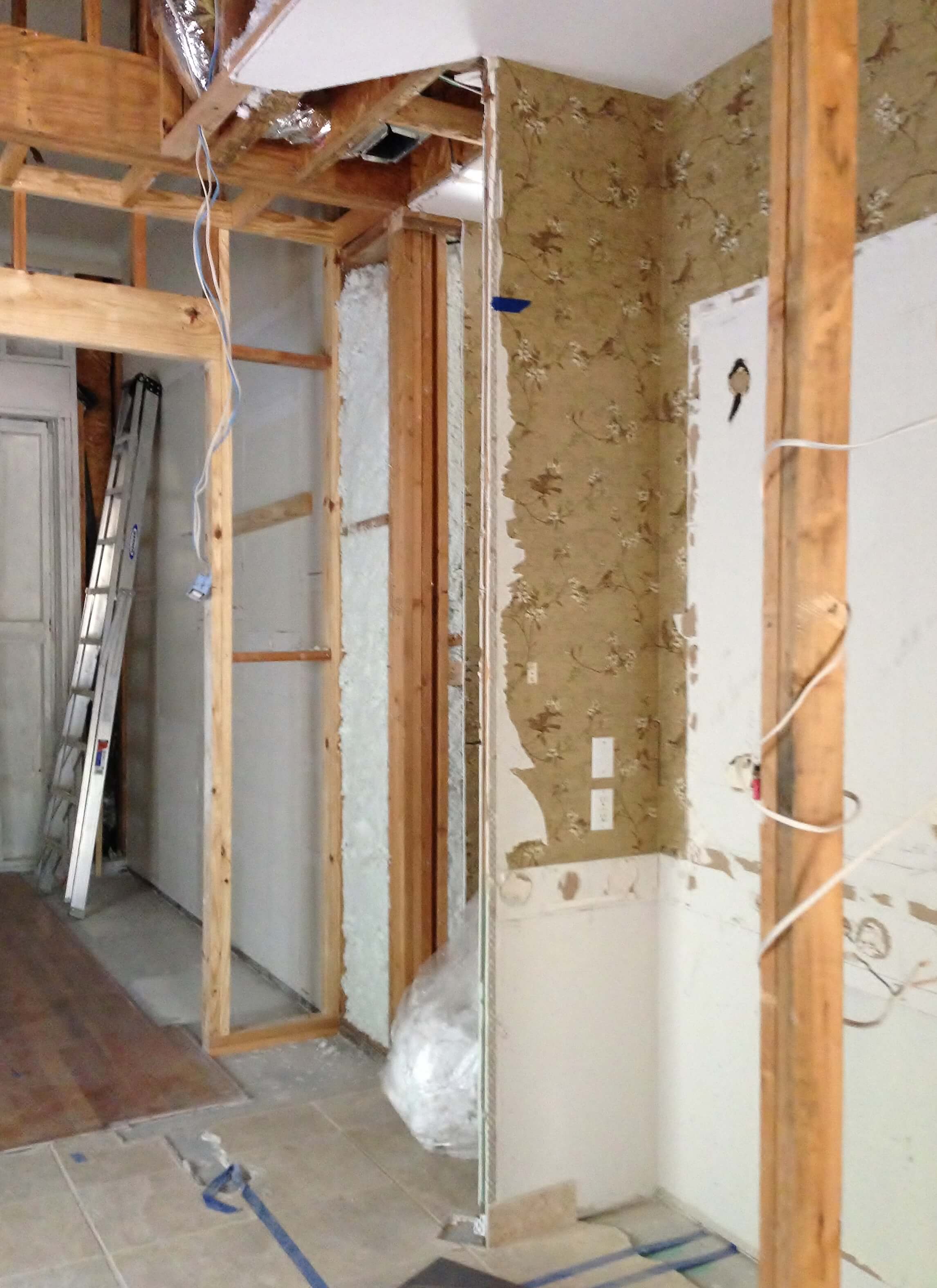
When I came onto the project, this space was gutted.
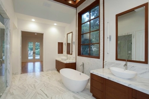
I could see that the real feature of this bathroom to celebrate would be the high ceiling that already had some stepped dimensional quality to it.
Before pics:
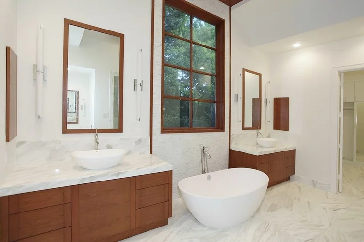
I proposed a tall window — in lieu of the short glass block window — done in a grid pattern, introducing the cherry wood and white marble combination that the homeowner loved. I designed tall cherry wood framed mirrors and low cherry wood cabinets to accentuate that feature and draw your eye upwards.
That was another feature that the homeowner chose to tweak, making the mirrors shorter, you can see they didn't turn out exactly the way they were drawn in my sketch, below.
You can’t see it in these photos, but the ceiling has a cherry wood grid in the center section, giving this space some heft and structure and relating to the window design.
The white marble is a deliciously organic element; and the curved tub and sinks complement the hard rectangular shapes nicely.
Striking and unusual, in my opinion. No?
These top three images are from Zillow.
And finally...
I’m throwing in a few more pics I took toward the end of the project, just to share a bit more:
Contractor: Shayne Clardy, SRC Construction
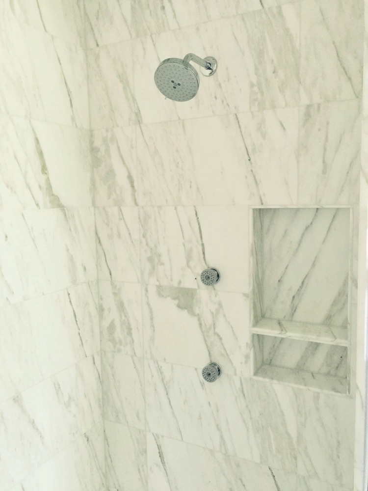
Master bath shower niche with Calacatta marble | Interior Designer: Carla Aston
Master Bath vessel sink with Calacatta marble | Interior Designer: Carla Aston
Master Bath Calacatta marble tile and wood trim detail | Interior Designer: Carla Aston
Here’s a few photos I took of a few other spaces we worked on. All of that simple, clean-lined design takes hours and hours of detailing! How I recall sweating over the design of this project! :-)
Guest Bath Shower w/ vertical glass tile inset stripe | Interior Designer: Carla Aston
Guest bath w orange tone wood contemporary cabinetry | Interior Designer: Carla Aston
Pool Bath - during construction w/ orange tone contemporary wood cabinetry | Interior Designer: Carla Aston
Pool Bath Detail - contemporary orange toned wood cabinetry and gray wall tile | Interior Designer: Carla Aston
I’ve got my handy Bathroom Design Guide to share here today. If you need some help planning your bathroom remodel, my project checklist can serve as your go-to source so you don’t leave anything out and can thoughtfully design the bathroom of your dreams!
Click Here >>>> Bathroom Design Guide


