"Aston Design Studio, DESIGNED" is the story of how I discovered and designed the interior design studio of my dreams.
A New Beginning Needs A New Studio
I’ve always dreamed of having my own design studio. A place where I can create interiors with all the tools and trappings of my work at my fingertips. An inspiring, beautiful, functional space where clients, vendors, and colleagues can come and share the creative joys of the interior design business.
Three years ago I was invited to occupy some free office space with a contractor and my dream of moving my office out of my home was coming true, I thought. Unfortunately, it didn’t work out. Honestly, the separation was probably inevitable, because I've always wanted to journey out on my own, be independent, and work freely with whomever I choose. Call me paranoid if you wish, but there's just this thing about depending on someone else for the well being of my business that made me uncomfortable.
Anyway, after my first arrangement didn’t work out I set out to find a studio I could call my own. Luckily, I found it just down the road.
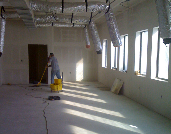
And the best part of it (to an interior designer) was that it was still under construction! I was going to be able to design it however I wanted!
Oh, I'm sorry! The phone's ringing. I'll have to come back to this story a little later. And when I do, I'll share some more details about the design of this place. -- Carla ;-)
Part 2 | My Search For A Studio That Shines!
As I searched for my new design studio I was determined to find one that had a lot of open space and natural light. Typically, those qualities aren't easy to find at a manageable price. Office space alone is quite pricey here in "The Woods", but with my requirements for a clean, open space that I could finish out the way I wanted, my search was becoming very disappointing. Nothing but traditional office setups seemed to exist.
And when I say "traditional", I don't mean they looked like their styles were influenced by designs featured within the pages of Traditional Home. I mean these units were all so cookie cutter!
Small reception area - CHECK
Conference room - CHECK
2-3 offices - CHECK
And a nice coffee bar- CHECK
Oh, and many spaces were in used condition with dull finishes at extraordinarily high rates (NOT including electricity).
I'm sorry, but while this may be the perfect setup for some, it just wasn't going to cut it for my business. I really had my dream design studio in mind. And because I'd just recently been on a studio search several months before and never again wanted to have to go on another, I was determined to find a place I felt to be perfect. A place I'd never want to leave.
And I did ;-)
As I mentioned above in part one of this series, A New Beginning Needs a New Studio (click link to open in new window), I found a space that would satisfy my every need!
Just look at all that space! I had plenty of room to move around and grow.
And those windows! Look at all that sunshine pouring in!
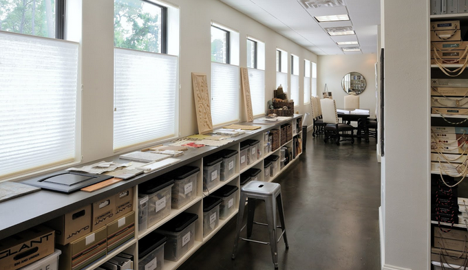
Without a doubt, the windows were definitely one of the best aspects about the space. I fell head over heels in love with their repetition along the wall, and wanted to make sure that vista you see from the front to the back created a light, loft-like energy that would make the entire place feel as spacious as possible.
Good vibes -- That's what I was getting from this space I was about to be able to call a “design studio.”
...Aston Design Studio, that is ;-)
Part 3 | Let's Talk Details...
◆ Scroll up or click here to enjoy PARTS 1 & 2 of this series ◆
So you want the grand tour of Aston Design Studio? It would be my pleasure to show you around ;-)
You walk into the open conference/reception area and the hallway in the space is on the exterior side next to windows, providing that vista I desired.
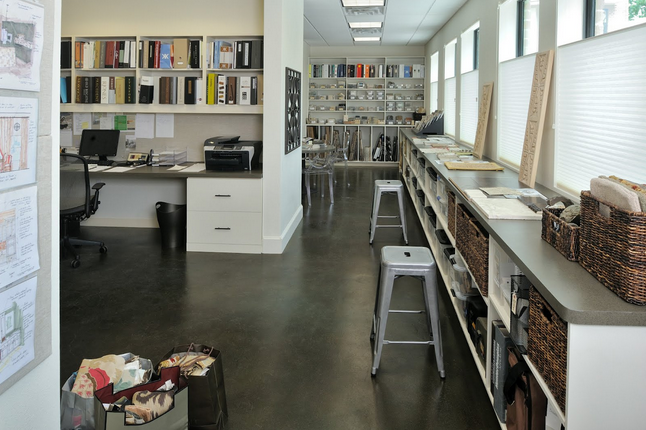
I also wanted a long surface just under the windows to lay out projects in progress. I love to see what I’m working on throughout the day, walking past it, getting glimpses of things in different qualities of light, reviewing choices when I’m in a different mood, editing throughout the course of a project.
Our desk area is in the middle, sample room in the back with a coffee bar. At about 900 s.f., it’s just right (for now).
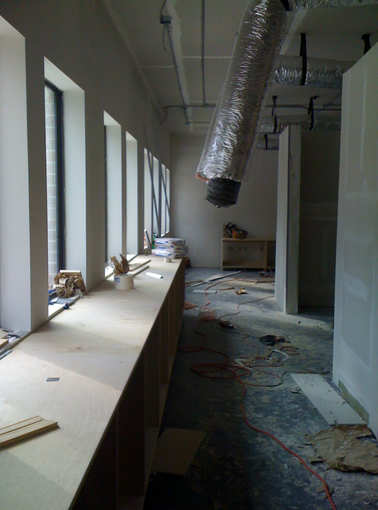
Below: Construction in progress here, that long line of cabinetry is perfect!
Above: Looking back toward the conference area.
Here's a niche behind the reception desk.
I had some leftover wallpaper with a pretty pattern I wanted to use there. Something to make this commercial space seem softer and more residential in feel.
I love high contrast in spaces. I think it makes for some great drama. I kept the floors and counters very dark, and the walls and cabinets very light. I wanted to ground the space, but have it feel light and fresh. A modern edginess but with a quiet sophistication.
All the cabinets are really plain.
They're just open, simple shelving. But in the back we did something special for tile. This storage is great for boards, large samples of tile and wood flooring.
The table and chairs I purchased for my old location worked well in my new location too.
The contrast of light and dark was repeated on the chairs, and my signature “A” was subtly monogrammed on the backs.
This is dining furniture. But when sitting at the table in a commercial space, looking at residential house plans or comparing fabrics and furnishings, I thought it was most appropriate. They bring in that softness and quiet sophistication I was going for.
One of the biggest challenges in this design was the color of the floor.
I wanted a stained concrete, and it had to be just the right color. Let me tell you: There is no easy formula for getting a stained concrete color just right. You add a little of this, a little of that, spray a little, let dry, add a little more of this, not so much of that, spray again ... and repeat. Eventually you come up with the perfect color, like I did above, but...
Then something went wrong.
I hired a contractor to come in and do the floor for me. It was perfect.
But during the job, the floor was damaged and ultimately had to be redone.
When it was redone, it was sprayed with a plain black for reasons I’ll not share here. Obviously, plain black isn't necessarily a bad thing. But when you take into account the paint colors and countertops I'd be using, everything would have looked terrible.
Right: See, very cold black.
Ugh! Everyone told me to leave it. "No one would notice", they said.
Are you kidding? People would think I was colorblind! I considered putting in carpet, but not for long. I'd come this far and knew what I wanted, so changing my mind wasn't going to be an option.
Finally, the floor was redone, in the perfect color again, at MY cost this time. Ouch!
Finally, I was able to move in and get to work!
I’ve been here three years now and every single time I come here, even on Sundays, I feel excited, stimulated, lucky, happy. This place, my haven, makes my heart sing. It's a designer's dream come true ;-)


