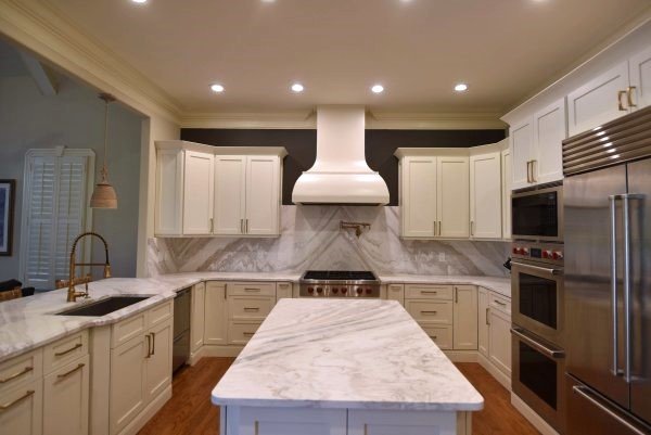
In a recent Designed in a Click consultation, this homeowner was not happy with her relatively new white kitchen.
First of all, the hood was cracking and needed to be replaced. However, she felt it was all sort of floating and there wasn’t enough going on to sort of “ground it”. She wondered what design tweaks I might suggest to help remedy this.
Here were a few more of her questions:
The repair of the hood was looking pretty bad, so she wondered what design size and style might work better here.
She didn’t like the transition between the marble and the wall around the hood. Could that be softened? (That dark charcoal gray color matches the built-ins in the adjacent living room.)
She wondered about adding top cabinets to the uppers to go to the ceiling. Also, how should the top trim of the hood look and how should it blend with the current crown molding in the kitchen?
I could definitely see some design tweaks that could be made here and couldn’t wait to get started.
My blog contains affiliate links. Any purchases, at no additional charge to you, render me a small percentage, are most appreciated and make this blog possible. :-)
Photos of the White Kitchen
My design REcommendations:
I do think a new hood will put you on the right track there.
While it would be nice to take the cabinets to the ceiling, that would be a bigger investment, since you would likely need to address the tall oven cabinet and fridge cabinet too. That's great if you want to do that, but I think you can get away with leaving them as is.
First, you need to reduce the high contrast you created with that dark wall paint. Your eye immediately goes to the wall above the cabinets and the T shape it creates. You have a lot of other things that should be getting attention that are more valuable in this kitchen, like the marble backsplash and the new hood. :-)
I would paint over that dark gray above the cabinets. If you go with the color you have on the walls now, it will be softer and not distract your eye from your more expensive finish materials.
For the new hood, I think you need to go with a metal finish here. It would help to break up white cabinetry and really create a focal point in this kitchen.
Vent-a-hood can do just about anything and you can have the new hood go the ceiling too. They have an customization platform on their website, or you can go to a local distributor in your area, like Ferguson's Enterprises, which might be best with a custom order.
I love the idea of a wide hood that spans the width of the opening and goes to the ceiling.
Here’s the style I would recommend.
I like a stainless finish to work with your other appliances and then the addition of some brass straps like this to add some customization and tie into your brass cabinet pulls.
The nice thing about going big with this hood is that it is really making a statement and I think it minimizes the fact that the upper cabinets don't go to the ceiling.
I do feel the kitchen is all really light though, like you mentioned, and think you need some darker charcoal elements for a little contrast.
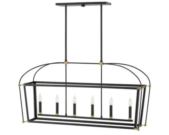
To add these darker elements in, I'd paint the island your dark gray color and then add lighting that has some black and brass to get some definition up there in the upper part of the kitchen.
I like this chandelier or the lantern as they both combine these two finishes nicely. I wouldn't do anything with big shades, as I'd like to have a good view of the new hood. :-)
I don't really like the pendants hanging on the moulding there at the sink peninsula.
Since you do need good lighting above the sink and you can't really do something like LED recessed lighting there, I would try some flush mounts like these.
I just would rather see your lighting creating interest in the white kitchen space rather than at this counter. Anything hanging off a lower wall like that just feels a little awkward. I would typically hang pendants from tall spaces, not shorter spaces like the underside of a wall opening like this.
Your question about the top of the marble backsplash is solved here, because of the new, wider hood.
Regarding the question about the crown, you can just die your crown that is on the wall into the side of the hood, don't put a crown around the hood.
It would be best if the crown that is on the cabinets dies into the hood too, but you would have to make sure the hood is deep enough for all of the crown there to die into it. If the crown would stick out, then change out that crown to something smaller that doesn’t protrude as much.
One extra consideration, if your appliances brand has this option, is you could change out the handles or the fittings to brass. That way all the appliances could have a touch of that brass finsh.
For example, Café Appliances has brass handles you can purchase separately.
Here’s a mock up of these items discussed for your kitchen.
Mock up of white kitchen design tweaks | Carla Aston, Designer
I really love the bigger metal finish hood and think it solves a lot of the concerns!
See more examples of kitchen consultations I’ve done, below!
This blogpost was thoughtfully written by me, Carla Aston, and not by AI, ghostwriters, or guest posters.


This recent Designed in a Click consultation was a tough call for me, would a partial kitchen remodel suffice here or should they go with a full reno?