One of the reasons someone calls a designer in to help them on a kitchen design project is to get a more custom and unique outcome.
Of course, they want all their functional needs addressed and all the basics taken care of, but they can do that with a kitchen cabinet showroom and one of their staff designers. I see it all the time, a basic, decent layout and elevations done by cabinet vendor showrooms that answer all the needs but really, aren’t all that special.
It’s like this kitchen in a Designed in a Click™ consultation recently. The plan was there, but it needed some tweaking to make it feel special and “designed”.
Sure, some of those thoughtful details add dollars to the design, but if you are spending the money, do you really just want a builder grade look? Something that is new but looks just like everyone else’s kitchen?
Today I’m sharing a few ways that you can take some rather plain kitchen elevations and up-level the look by adding some interesting features.
5 unique ideas to make Kitchen cabinets Look Custom
1) Add more space between countertop and upper cabinet to a section of cabinetry.
You’d be surprised at what adding a few inches in the space between the countertop and upper cabinetry will do for breaking up a long, boring row of upper cabinets.
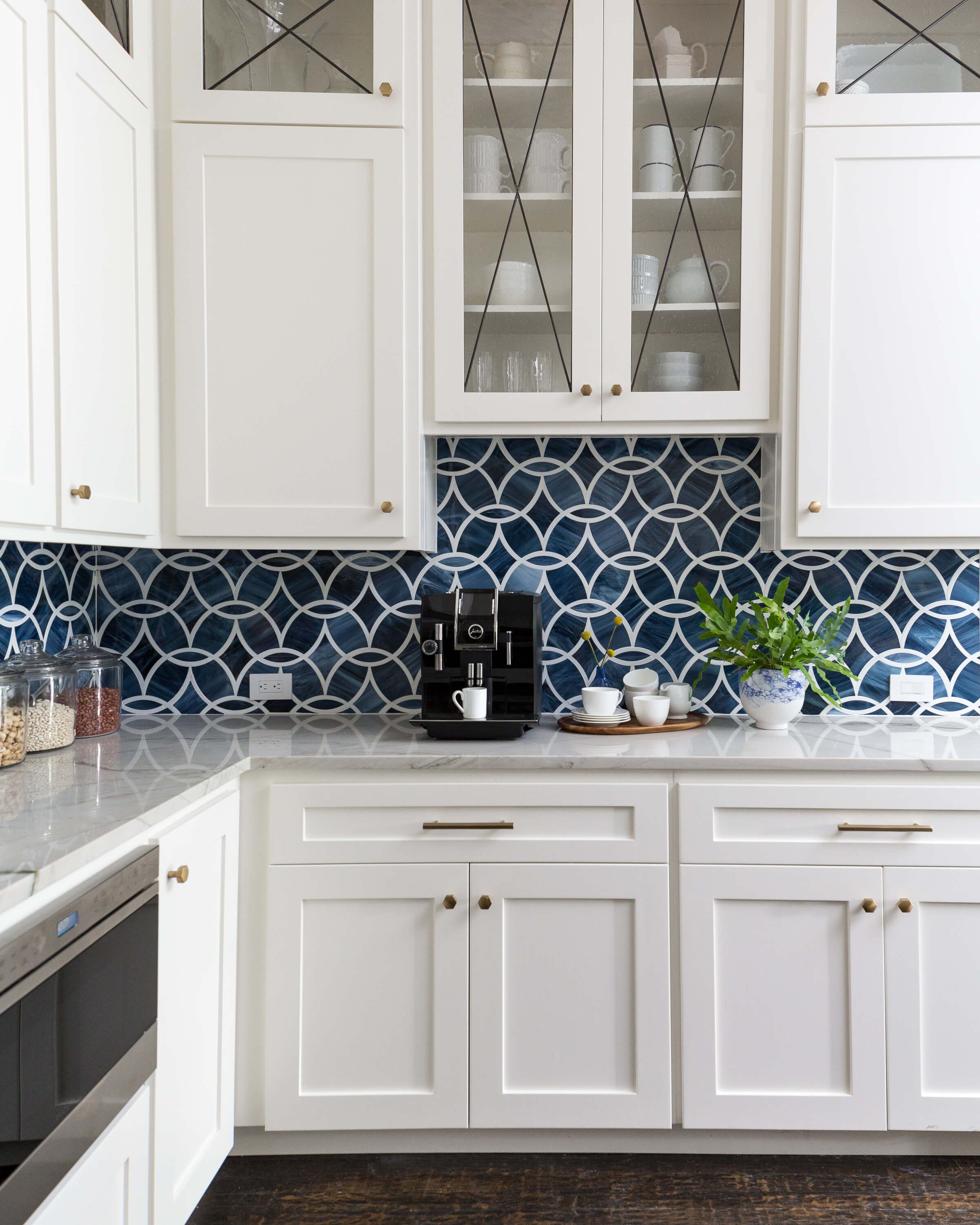
In this kitchen below, a nice coffee machine took center stage. I wanted this area to feel special and give this space a more coffee bar centered focus.
Raising the height of the upper cabinetry there actually gave more space to access the machine and with the beautiful backsplash being such a prominent feature, gave a few more inches to appreciate that feature too.
It doesn’t feel like an average run of upper cabinets, does it?
The cabinet above the coffee maker was raised to allow more access and to highlight the tile backsplash. It visually broke up a rather ordinary run of white cabinetry for a more interesting look. carlaaston.com
Previously, it had been an opening to the entry hall, which really served no purpose whatsoever, so we were providing even more storage anyway than what the homeowner had before.
BEFORE Kitchen - The opening to the entry hall from the kitchen served no real purpose, so it was filled in to have new cabinetry. 5 Unique Ideas to Make Your Kitchen Cabinets Look More Custom | carlaaston.com
2) Add more depth to a cabinet or recess a section of cabinetry to create more interest in the kitchen elevation.
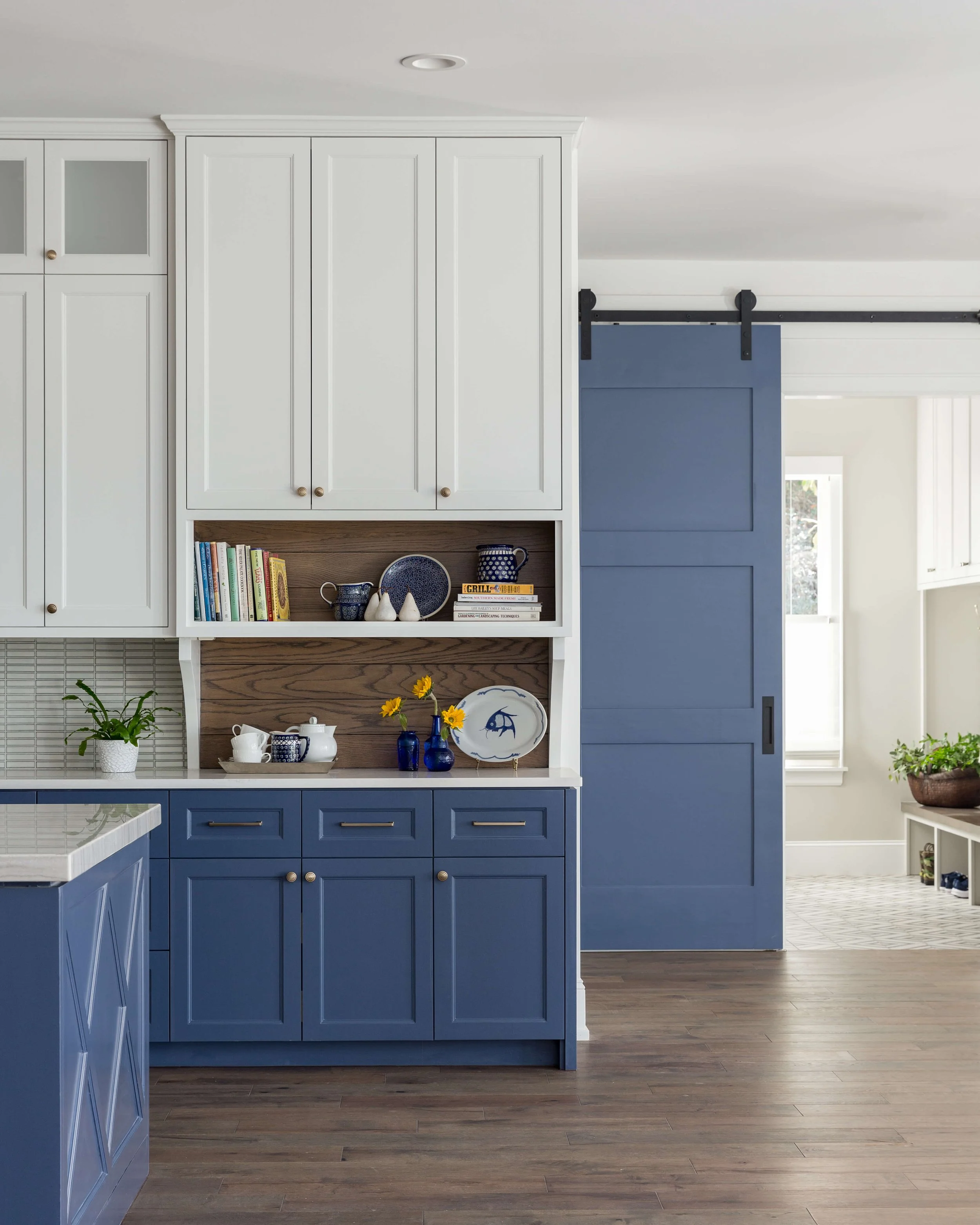
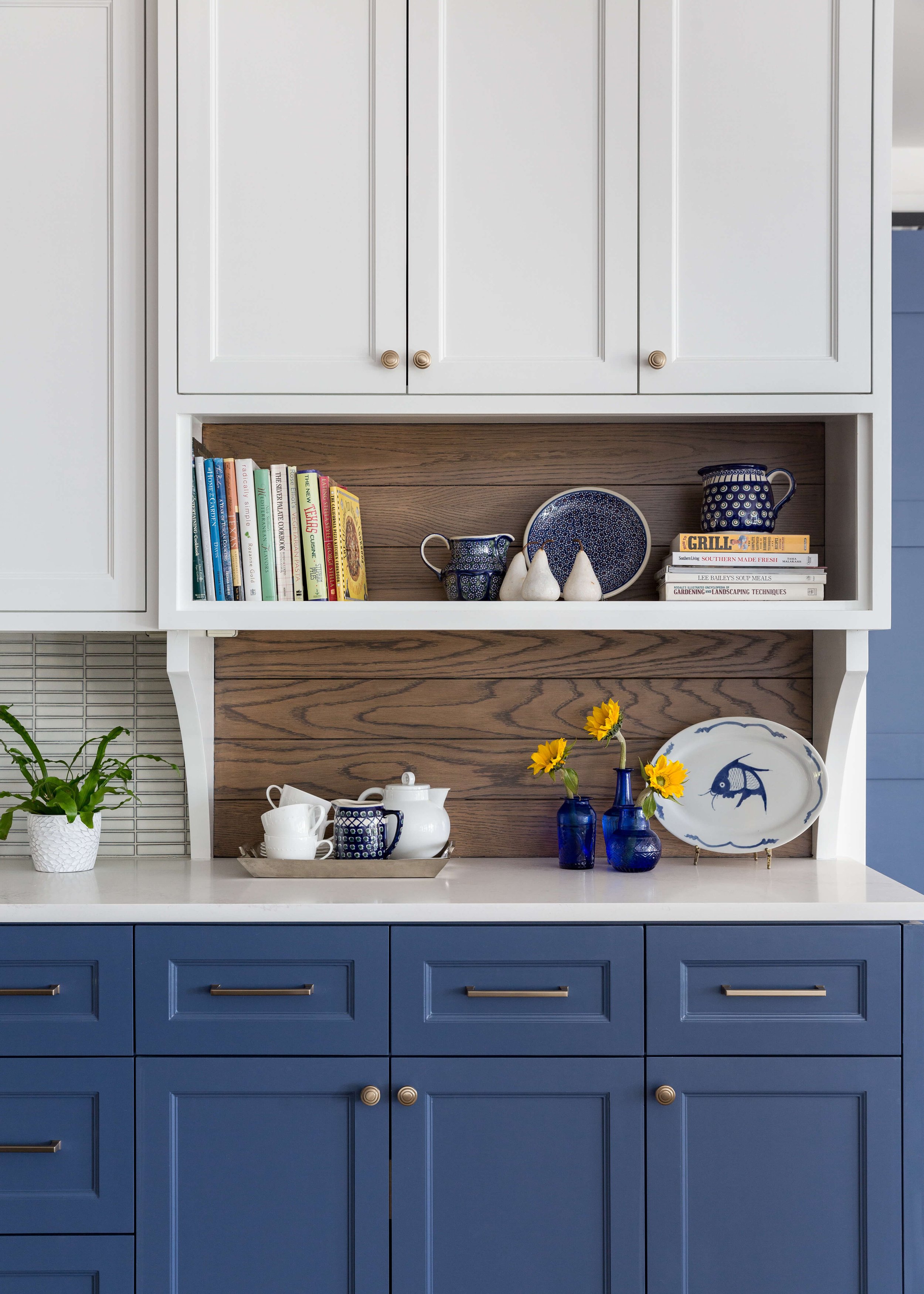
I often add a few inches of depth to cabinetry as well, when faced with a long, boring run of upper cabinets. That added depth can create a perfect place to break up the finishes, like in creating a two tone kitchen, and adds a vertical element to a more typical horizontal run of cabinets.
In this kitchen, below, the added depth at the end of the cabinetry run broke up a really long section of upper cabinets. It then gave the opportunity to embellish that section with end panels/brackets that extended to the countertop and provided a way to transition to a wood paneled backsplash, which also helped break up the look.
5 Unique Ideas to Make Your Kitchen Cabinets Look More Custom | carlaaston.com
5 Unique Ideas to Make Your Kitchen Cabinets Look More Custom | carlaaston.com
This kitchen design below is getting two walls of cabinetry with some of the uppers being deeper. The open shelving wood finish cabinet on one side is a few inches deeper and the armoire style top is almost 10” deeper than the cabinetry on each side.
This project is currently being finished up and I can’t wait to get final pics to share.
5 Unique Ideas to Make Your Kitchen Cabinets Look More Custom | carlaaston.com
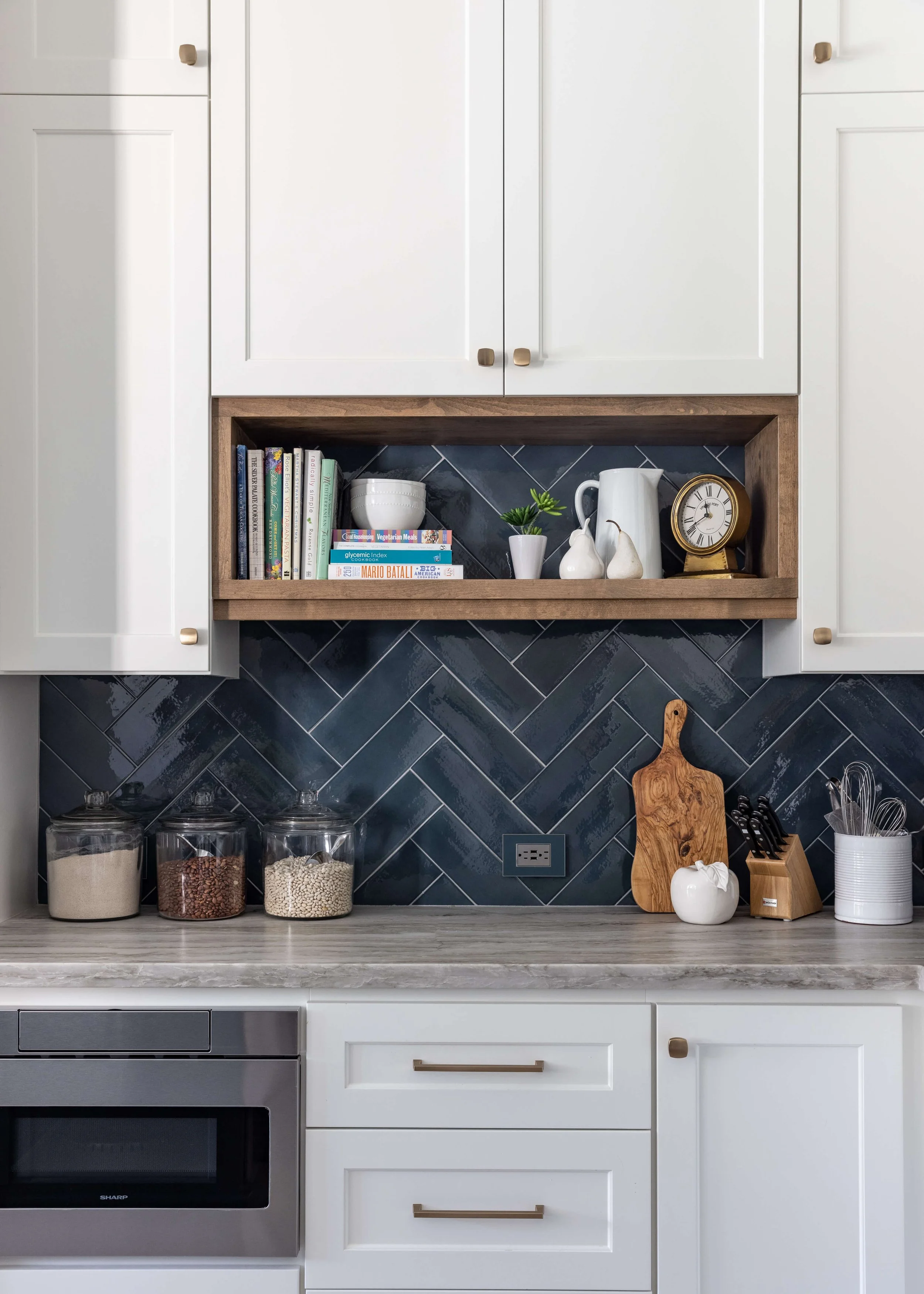
This boxed open shelf unit, pictured below, is slightly recessed from the face plane of the upper cabinetry. That variation in depth provides a great place to change materials from painted wood to stained and makes this elevation of cabinetry more interesting.
You can see we also incorporated some additional height between the counter and shelf (item #1 above).
5 Unique Ideas to Make Your Kitchen Cabinets Look More Custom | carlaaston.com
3) Add onlays or glass panel doors to a section of cabinetry.
Glass panel doors or even onlay designs on cabinetry can break up a wall of cabinets too.
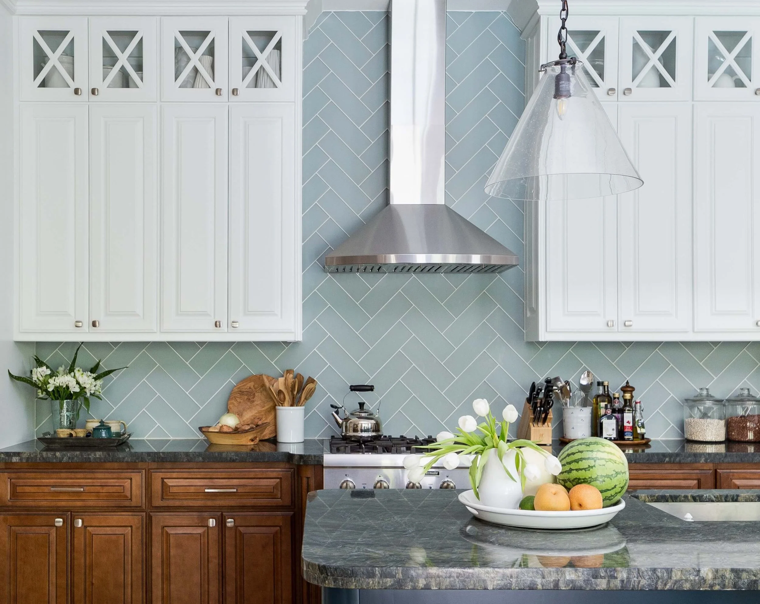
I definitely love adding some glass panels when doing cabinets to the ceiling with the extra box of cabinets above the main uppers. Whether it is in the cabinet above or the cabinet below, it helps to visually break up the tall height.
5 Unique Ideas to Make Your Kitchen Cabinets Look More Custom | carlaaston.com
There were already glass panels on the cabinetry in this kitchen, below, so when we added additional cabinets on top of the existing to the ceiling, we just did paneled doors to match. The combination looked nice though and definitely intentional.
5 Unique Ideas to Make Your Kitchen Cabinets Look More Custom | carlaaston.com
5 Unique Ideas to Make Your Kitchen Cabinets Look More Custom | carlaaston.com
4) Add open shelving in lieu of upper cabinets in an area of cabinetry.
There were a lot of cabinets in this kitchen and we were going to the ceiling with the fridge and oven cabinetry and adding more on top of the cabinets on the hood wall too. We decided on open shelving for this area by the breakfast bar, as it felt more homey and interesting and gave us a peek at more of that pretty coastal color palette.
White upper cabinets here would have been too repetitive of the hood wall.
5 Unique Ideas to Make Your Kitchen Cabinets Look More Custom | carlaaston.com
5 Unique Ideas to Make Your Kitchen Cabinets Look More Custom | carlaaston.com
We had two big bulky upper cabinet sections in this kitchen below and eliminated one side completely for an open shelf look.
BEFORE Kitchen Remodel - Lots of upper cabinets on both sides of the sink dominated this kitchen. Eliminating one side opened up the kitchen sink area and made for a more pleasing look with open shelving. 5 Unique Ideas to Make Your Kitchen Cabinets Look More Custom | carlaaston.com | carlaaston.com
It provided some nice contrast in the kitchen and created interest with the objects and decor. It also made the sink area feel less crowded to eliminate that one side of 12” deep upper cabinets.
AFTER Kitchen Remodel - Open shelving created a nice focal point on the end wall of this white kitchen. 5 Unique Ideas to Make Your Kitchen Cabinets Look More Custom | carlaaston.com
5) Change the cabinet color or finish to break up the run of cabinetry in a section.
I’ve always been a fan of a two toned kitchen, as you can likely tell from the photos above. I generally like keeping uppers light and lowers dark, but then when you have full height cabinetry, you have to make a decision as to which finish to go with.
Typically, I pick the lower cabinet finish, but I can’t promise I would do that in every scenario. :-)
5 Unique Ideas to Make Your Kitchen Cabinets Look More Custom | carlaaston.com
In this kitchen, below, I just designed the upper cabinet doors as a contrasting finish. It related to the stain on the island, but didn’t overwhelm the kitchen and kept the main focus on the lighter rift cut oak look.
It definitely made for a more interesting details in this big, open space, especially since the homeowner did not want pendants over the islands.
5 Unique Ideas to Make Your Kitchen Cabinets Look More Custom | carlaaston.com
5 Unique Ideas to Make Your Kitchen Cabinets Look More Custom | carlaaston.com
Save this for later reference! 5 Unique Ideas To Make Kitchen Cabinets Look More Custom | carlaaston.com
In most of the examples above, you can see several of these methods utilized within each kitchen. Mixing up design elements in a space makes things more interesting and gives a you more customized look.
And isn’t that what you want at the end of a kitchen project? Something special, unique and made just for you?
I’ve got a guide all about kitchens!
It’s full of great info. It can be a big help to anyone considering a kitchen design project, from a partial remodel to a full kitchen in a new build custom home.
Link Here > Kitchen Design Guide
This blogpost was thoughtfully written by me, Carla Aston, and not by AI, ghostwriters, or guest posters.

