No matter what market we attend, designers often notice color trends the most.
Especially if you take lots of photos, like me, scrolling through them is easy to see similar color schemes and determine which ones feel more prevalent that others.
(All images below were taken by me. Pin some to Pinterest to save these sources for your next furniture purchase. All vendors are linked below.)
4 color trends stood out at this recent Highpoint Market
Green Was Everywhere
Case goods, backdrops, upholstery, there was green everywhere and many designers are posting about it after market now. I would say that there will be an abundance of this color over the next few years in retail home furnishings.
This beautiful cabinet from Century furniture in emerald green is featured with the rich caramel leather that I shared in my design trends report. So handsome, right?
This image below just gives me goosebumps.
This is the Tommy Mitchell showroom. He makes exquisite wall decor, lighting, and furniture. He shared the paint color he used for this space with me, Colonial Verdi Gris from Benjamin Moore.
This gorgeous green grasscloth backdrop featured the new light fixtures designed by Denise McGaha from Currey and Co. I love the white boxy fixtures against that color with touches of gold.
These barstools from Fabricut were featured in some rich green upholstery. Pairing these greens with black, white and brass works really well to bring this color an up-to-date look.
This backdrop from Woodbridge Furniture in a warm light olive color, gives this wood console and black and white photo a real richness.
If this vignette in Century Furniture hadn’t had this rich velvet drapery, it likely would have come across as visually pretty weak. However, that strong color highlighted the light neutral furnishings and made for an outstanding vignette.
And here is a lovely pine green on this interesting patterned console from Selamat. Paired with a brass base on the black and white rug, it was a stand out.
Blush isn’t going anywhere.
Blush or millennial pink is still alive and well! I saw it in many vignettes at market and I have to say, it is growing on me. This one below, from Thibaut.
This entire room in the Woodbridge Furniture showroom was painted blush and had a large leopard rug. What a gorgeous, feminine combination.
A beautiful vignette from Bungalow 5 in blush pink and gold.
The blues are also still going strong.
Navy and other blues were featured as a go-to color on products and pair nicely with all the warm woods vendors presented this market.
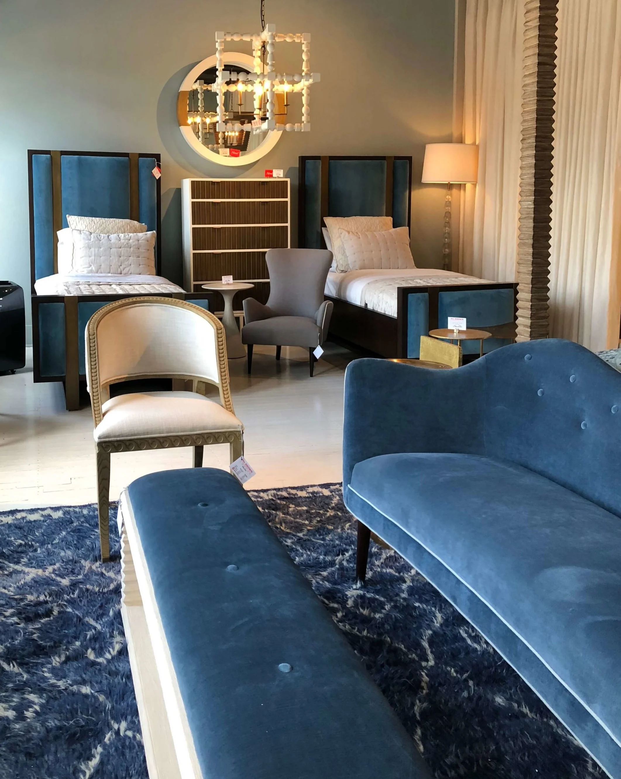
I’m such a blue lover anyway, I almost seek it out. The Mr. Brown Home showroom was a stand out for me.
This small chest and the navy backdrop make the white light fixture really stand out in the Currey and Co showroom.
I loved this blue leather sofa from CR Laine.
Union Home’s space was painted all navy blue and their warm wood furniture complimented the color beautifully. Loved this white marble and brass console with navy as the backdrop.
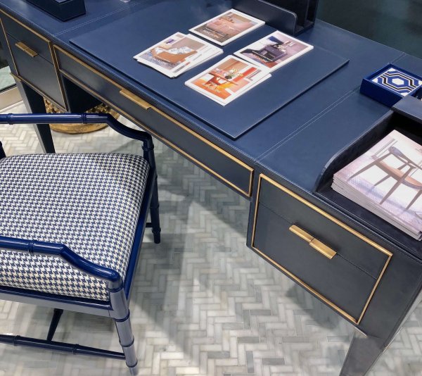
Here’s a beautiful desk wrapped in blue leather with brass trim and hardware. Note all the blue leather desk accessories too, all from Bungalow 5.
Yellow was another recurring color story.
I shared this sofa from Nathan Anthony in my previous post on design trends. It was one of the first color statements I saw and it definitely created a buzz.
This yellow cabinet in the Thibaut showroom looked great with the gray, black and white on this wall.
I love them all.
That’s the nice part of this job, even though I might not use some of these colors in my own home, I get to enjoy them in these beautiful showrooms and in my client’s homes. (I just installed a home with navy blue as the dominant color and it is really gorgeous!)
BTW, I used Linda Holt’s new photo editing service for a few of those photos up there and I love them now! She removed some big hang tags and brightened them up a bit. Soooo much better!


