I’ve had more than a few of my email consultations over the years send me this question about how to arrange art or wall decor on a wall.
I imagine there are lots of people right now sitting around in their home or apartment doing a little staring at their walls, wondering the same thing. :-)
I’m sharing 3 tips today to help you be able to deal with your big walls a little more successfully. I’ve also gathered together some of my posts below, as sort of a round up of ideas.
Send me a pic of your troubling wall - I’ll be doing a Q&A on my Instagram Stories where you can submit a pic of a wall that might be giving you trouble and I’ll give you some suggestions there, published in my stories on the weekend.
Send me a wall you are struggling with by uploading in the comments below or submitting via my email. Again, I’ll be answering these publicly via Instagram stories, or I might also do a second blogpost. So your image will be shared online.
Tip #1 - Break up a big wall with furnishings first
Using furniture groupings and lamps, to help break up a wall space into workable expanses, is a good way to address big wall spaces.
Here’s a job of mine where there was a long open wall. The homeowner had one large piece hung there, but because the wall was so long, it made the art look small and randomly placed.
The furniture was floated in the room so we couldn’t really break up the wall by hanging art over a sofa that was pushed up against the wall or anything like that. There was an open pathway behind the sofa that led to the back door and another room.
Long wall with one large piece of art looks lonely and out of scale.
BEFORE - Family Room Refresh
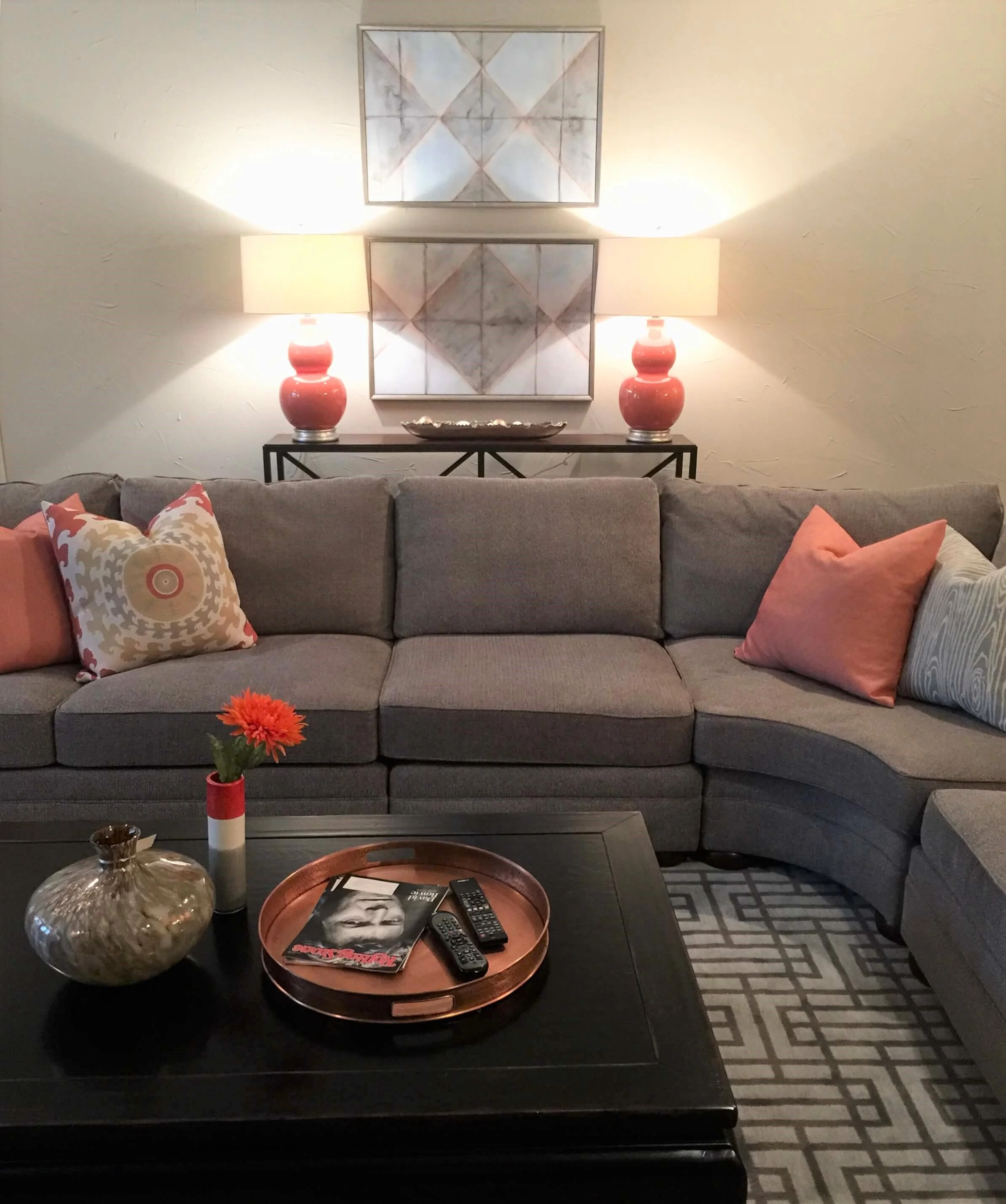
We added a console, lamps and then two pieces of art, stacked vertically, that helped anchor and balance that wall. It made that wall decor feel like it was more married to the seating grouping and therefore then extended the feel of the family room over to that long wall.
AFTER - Family room refresh with art stacked, vertically, above the new console.
AFTER - Family room refresh with art stacked, vertically, above the new console.
We could have even gone further with wall decor placed on each side of this grouping, maybe some smaller, stacked framed pieces, but this worked well to help get this homeowner started.
Grouping wall decor above a sofa and between two lamps
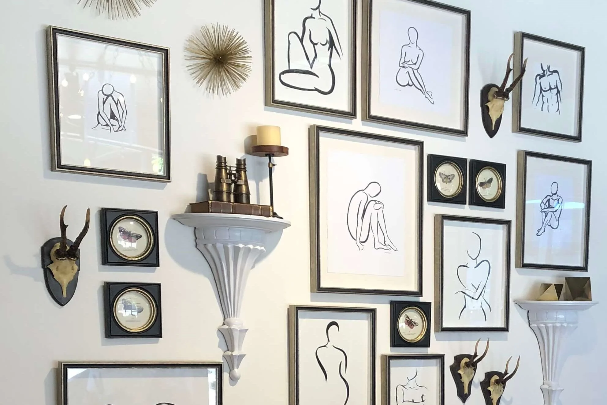
This large wall, below, in a showroom in High Point Market last fall, had a lovely grouping of art and collectibles, also centered between lamps and leaning mirrors, on each side of the sofa.
It’s a similar concept…. to have the furniture in front to dictate the art placement.
This beautiful gallery wall is framed in nicely by the mirrors on each side. Use furniture to help divide up the wall space to make wall decor placement more manageable.
This beautiful gallery wall is framed in nicely by the mirrors on each side. Use furniture to help divide up the wall space to make wall decor placement more manageable.
This email consultation I did below, shows how I grouped the art with the furniture in front.
BEFORE - What to do with blank wall behind sectional sofa and round table?
This empty wall was rather large and the sofa appeared to be really pushed off to the side. Art placed just over the sofa would feel a little unbalanced and lost.
An asymmetrical wall layout with the large mirror behind the round table made this wall much more pleasing to the eye. Adding a sofa table behind the sofa gave a place to style some accessories too. It helped marry that wall decor to the seating group.
Proposed solution with wall decor - Dividing up the wall into sections using wall decor helps make big wall decorating more manageable.
Tip #2 - Use organic shapes and an irregular pattern
Organic shaped pieces can help spread out the art installation on the wall.
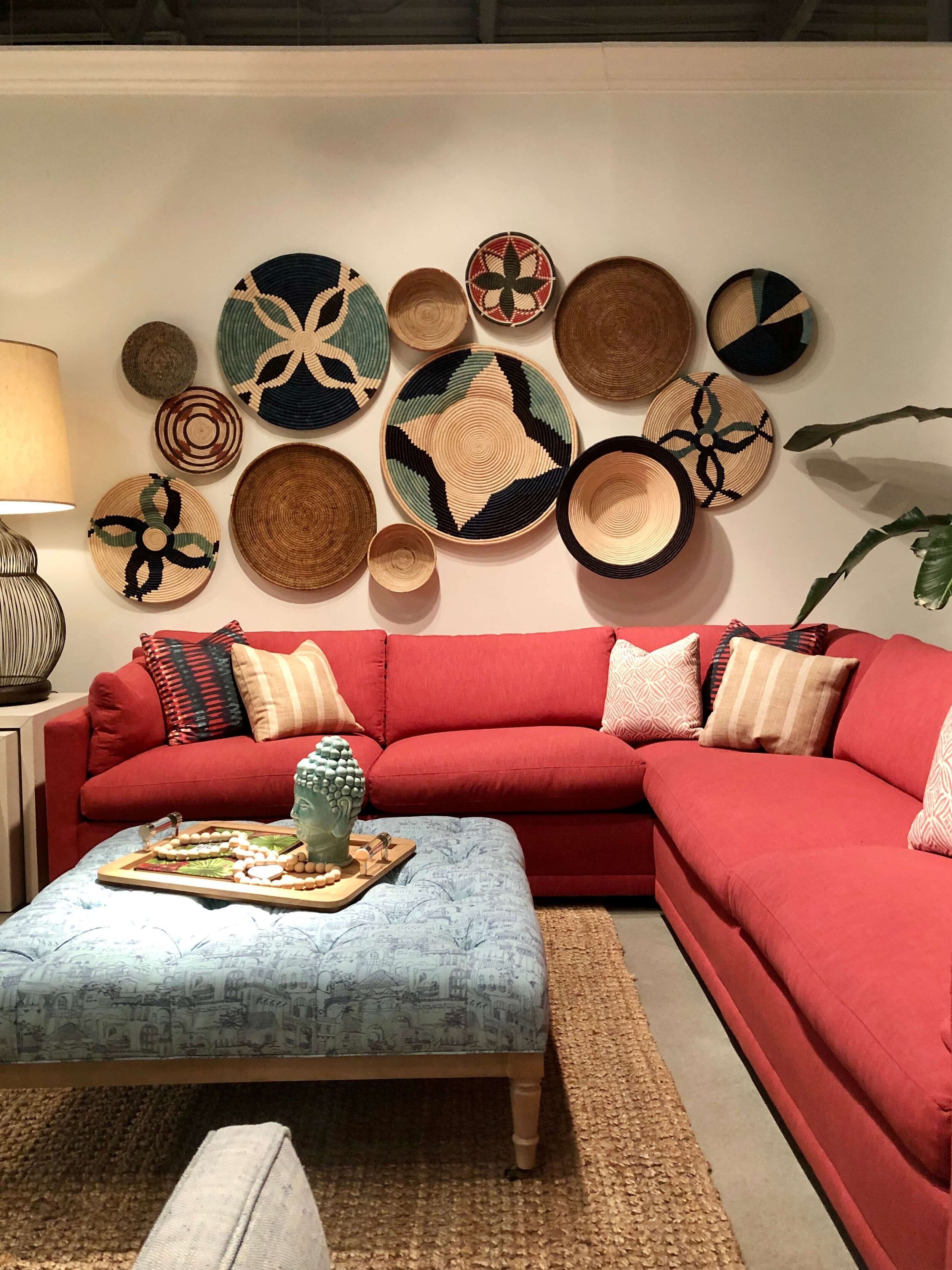
Round plates, baskets, sculpture, and organic textural pieces arranged in an irregular pattern can create an larger appearance on a wall.
You can randomly place them so that they can really adapt to the wall area you have too, giving you lots of flexibility.
Organic shaped art glass by Doug Frates Glass seen at High Point Market.
Glass art sculpture pieces decorate the walls of the ASID 2019 River Oaks Showhouse. Designer: The Design Firm
Baskets as wall decor in an organic shape seen at High Point Market in the Rowe showroom.
Wall Decor Tip - Striking, organic shapes made with unusual baskets and plates can fill a wall nicely and be added on to later as time goes on.
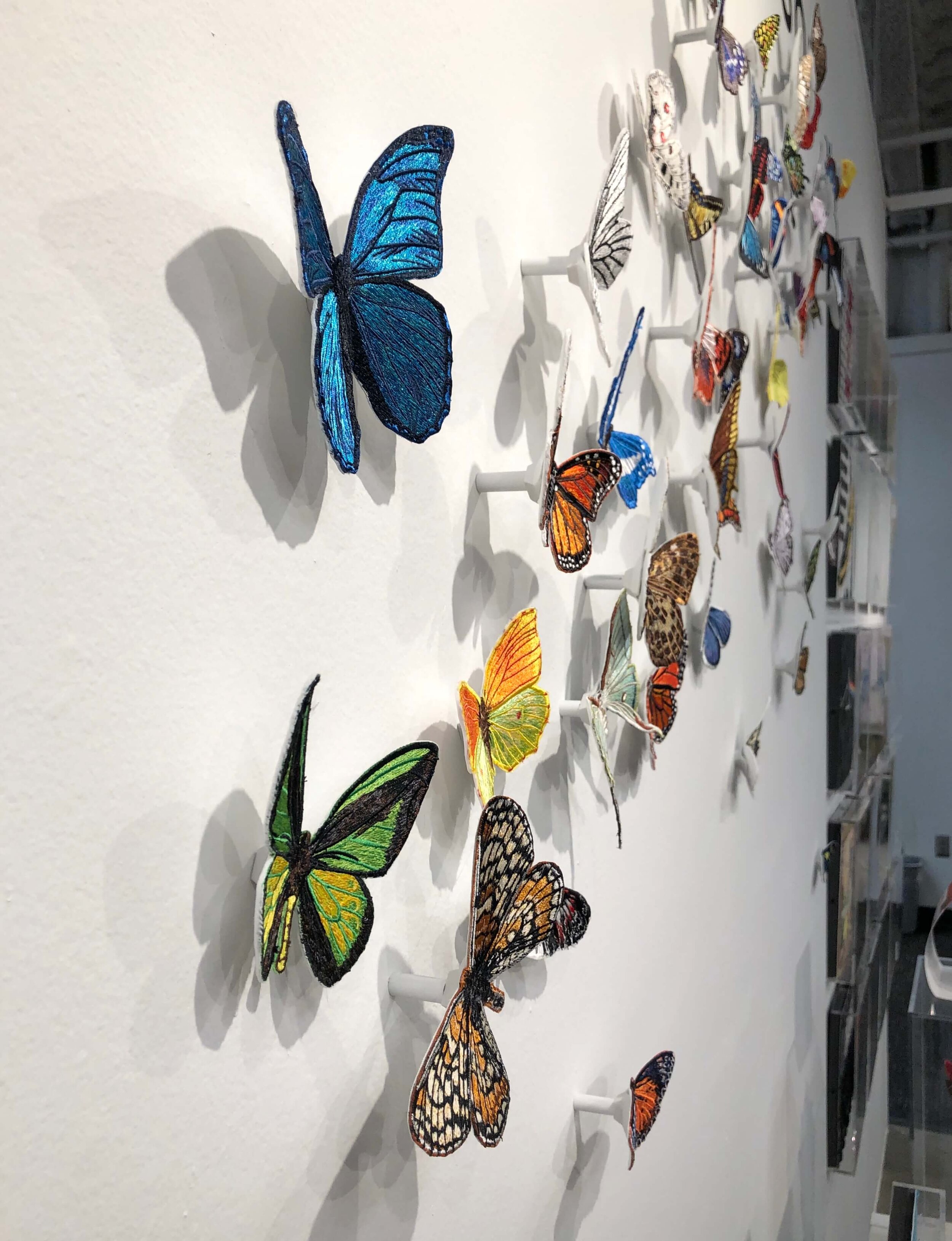
This wall decor by Stephen Wilson, seen at High Point Market last fall, can be installed in all kinds of creative ways. The vivid colors of each butterfly are created with embroidery.
These embroidered butterflies take on a fresh, light organic look and fill a wall nicely with a creative shape to it’s wall decor.
See how the butterflies are easily mounted to the wall to create this lovely wall decor pattern.
Tip #3 - Go with one single item for impact
Sometimes the best way to deal with a big wall is to go small with your wall decor, with one single piece. Sometimes that is just enough, especially in a symmetrical situation.
Single item wall decor to make an impactful statement.
I’ve always loved a single sunburst mirror centered over a bed, especially if the headboard is arched like this one.
Need more help with your wall decor? I’ve written a comprehensive guide for your library. :-)
Some of these pics above are included in the book, but you’ll find lots more in the 136 pages with lots of case studies, tips and tricks!


I’m back with some more ideas about how to decorate with what you may already have.