You know those typical 4” high granite backsplashes that many kitchens with a granite countertop have? The ones you automatically get when you order a countertop at Home Depot or Lowe’s or your local granite fabricator?
You know the one that I have BEGGED you NOT to leave on when you go back in later to install a tile backsplash???? >>>> (HERE IS THAT POST.)
Well, I found an example of an idea I’ve been trying to sell some of my clients who have had a hard time believing this is a thing.
It doesn’t matter what I say here on this blog or anywhere else for that matter when it comes to one-on-one design with a client, 9 times out of 10, they have a hard time jumping on board with a new idea. Not only that, they kind of look at me like…….”Whaaaaat?” (in that high, monotone, long, drawn out sound that a teenager makes.)
Well, I get the impression that’s what they’re thinking, anyway. :-)
Sometimes, they take a little more convincing.
In that case, I go to Pinterest, to capture some similar concepts or ideas to show them and if I can prove my point, then hopefully we’re good to go.
However, if you happen to be presenting something a little different or something not too common, then it can be hard to find images with examples of exactly what you’re talking about. As a matter of fact, I usually kind of hope I DON’T find too many, cause I like to think of myself as having a creative and unique idea every once in awhile. :-/
So, here it is.
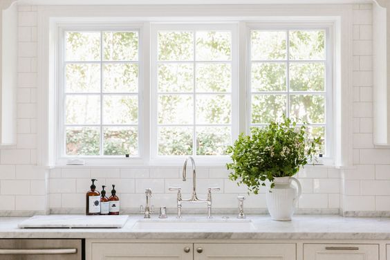
The backsplash example I’m talking about today is an UNDERSIZED version of the 4” splash.
Yay! Finally found a great pic on the internet!! Wooo!
Image via: Rip and Tan, Jenny Kayne, Designer: Erin Fetherston
Now, this works. This is something that I like. This is a backsplash idea that can help solve lots of your problems without going with that oh-so-typical 4” variety. I recently did this in a job (still to photograph) at the desk in the kitchen.
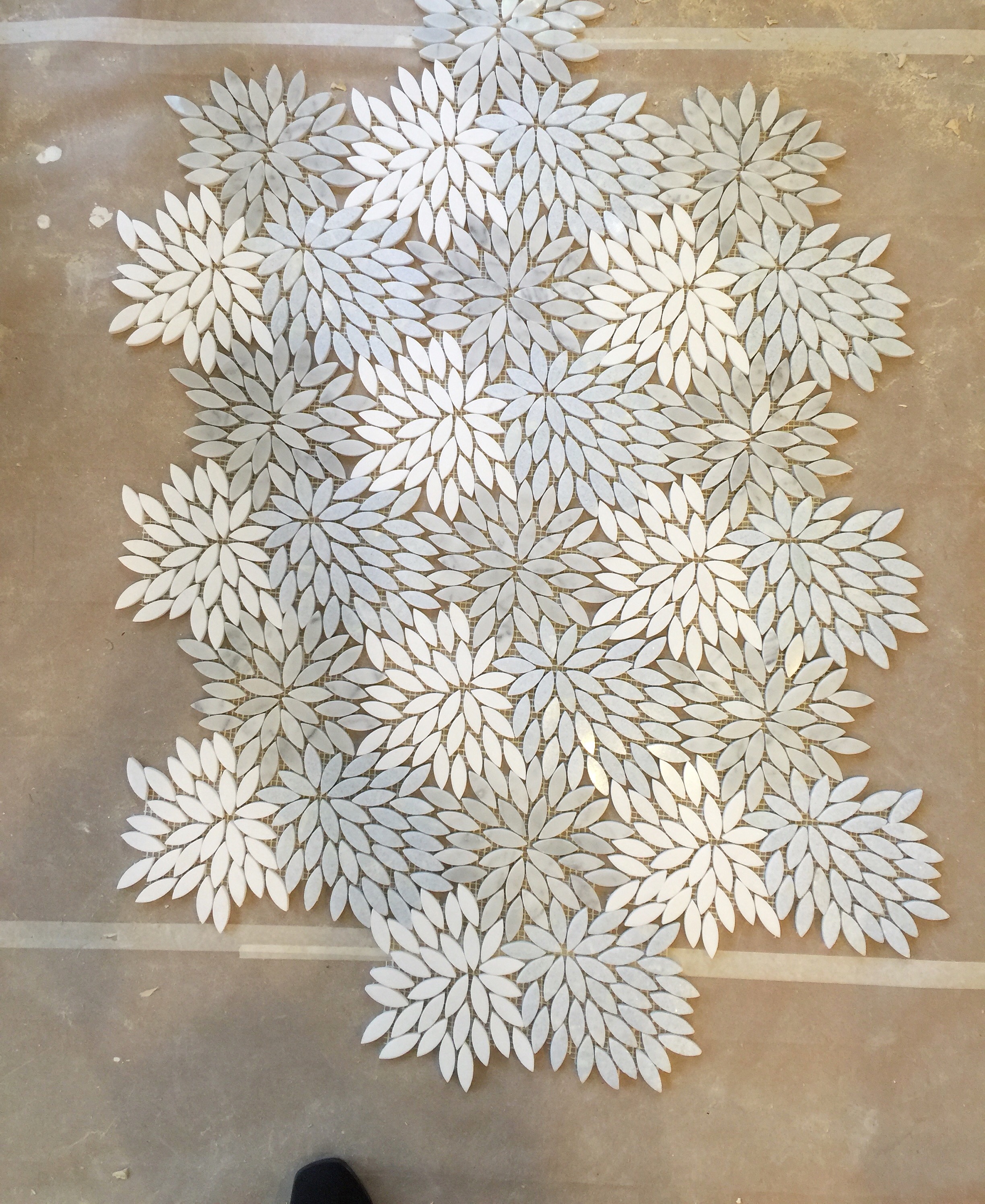
We had beautiful tile mosaic elsewhere for the kitchen backsplash on a feature wall and we also had a slab splash out of the same quartz material on the sink wall that had an eating bar on the opposite side, 6" above.
In that project, the feature mosaic tile was uber pricey and I didn’t want to use it on the 6” high space between countertop and bar top at the sink area. It would take away from the “specialness” (Yes, that’s a word. I looked it up.) of the feature wall and besides, a slab splash there behind the kitchen sink is so easy to clean.
Our gorgeous marble mosaic installed in the kitchen on the feature wall. :-)
We also did a slab material on the kitchen desktop and I didn’t want to use a big slab backsplash there (overkill), or the mosaic ($$$$ and also overkill). It was a desk, so wall protection wasn’t really necessary and a backsplash there would look kind of dumb.
I really wanted to do a tackboard there, which we will be doing, but I wasn’t sure, when I designed it, if the client would do that. I wanted to finish that top off nicely so that it could live without the tackboard, if that never happened.
So, we did a 2” slab backsplash and it looks perfectly logical. (Pics forthcoming!)
The beauty of a 2” slab splash, is that it’s insignificant.
This one is maybe about 3" or just under. Same idea. Pretty unnoticeable, because this bathroom is all about the wallpaper and the gold and gray color scheme. | Carla Aston Designer
That’s right, it visually blends into the top. It looks purposeful. It’s not “standard”. It’s there for wall protection or joint coverage or whatever reason. It’s intentional.
It quietly does its thing without drawing attention to itself, without taking up half your backsplash area, without looking like you just forgot to remove it before you applied your tile above.
I like that. Matter of fact, I LOVE that.
So, if you are having any NUMBER of odd scenarios with your backsplash and goodness knows, I’ve almost seen them all (check out the comments in this post and this post), then this could be just the solution you need.
For example:
It's great for a situation when your fabricator leaves a big gap between the wall and the counter and there is a ½” gap of silicone or caulk hanging in there. Ewww.
It’s great for a situation where you need a bit of side splash for water splashing or pooling at the wall when you have a sink close by. (Of course, you know a full side splash is not the most desirable solution.)
It’s great for when you have weird corners to wrap around or funny penetrations in the wall at the backsplash and you can’t figure out how to tile that.
AND…”ding, ding, ding, ding”….it’s great for when your upper cabinet just stops short on the wall above your countertop and your tall backsplash would look weird traveling on down the wall by itself, perhaps like what often happens with a peninsula kitchen. Because the 2” splash can just unobtrusively keep on going until the end of the countertop and not look out of place, while the tall tile part can just stop right there at the upper cabinets. And my gosh, we all know there are many of those types of scenarios.
Yes. It’s a good option to have in your back pocket. And I’m so glad I found this beautiful kitchen to share as a perfect example. :-)
Image via: Rip and Tan, Jenny Kayne, Designer: Erin Fetherston
Update to this post 8/24/18:
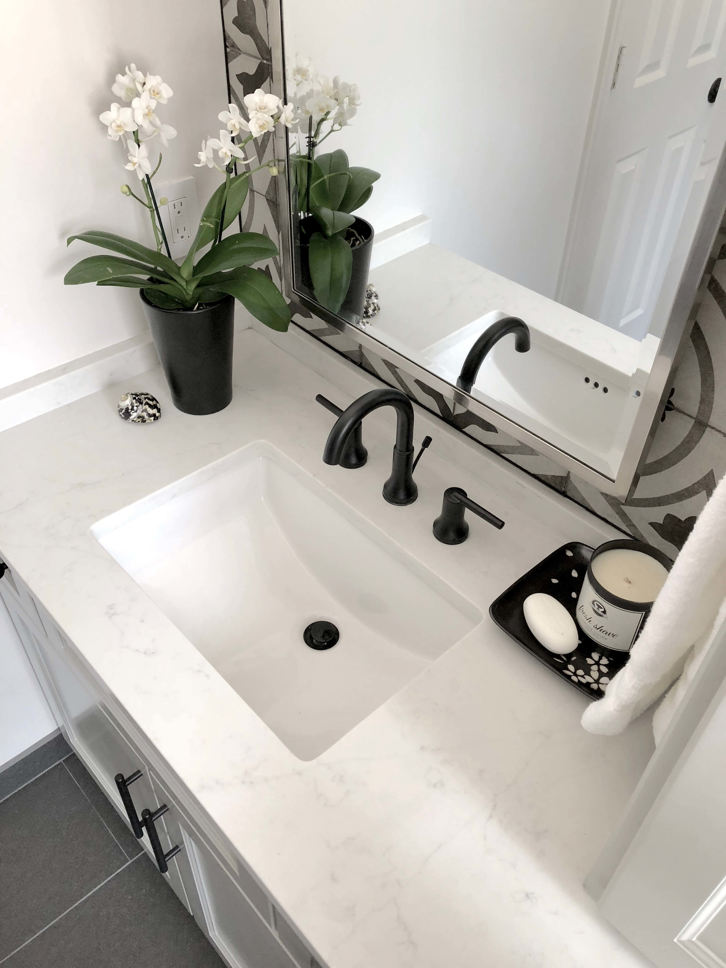
I used this specific backsplash detail that I'm talking about here in this bathroom remodel below. We did a 2 1/2" high slab splash to wrap from back to side.
I had a striking wall of tile to use on the back wall of this vanity area, but didn't want it to wrap the sides although we needed a bit of protection from water that might be standing on the countertop.
This was the perfect solution. :-)
Quartz slab backsplash wrapped from back wall with patterned tile above to side wall with no tile above. Designer: Carla Aston
Quartz slab backsplash wrapped from back wall with patterned tile above to side wall with no tile above. Designer: Carla Aston
Quartz slab backsplash wrapped from back wall with patterned tile above to side wall with no tile above. Designer: Carla Aston
SEE MORE about this striking bathroom remodel at this link.
Need more help on backsplash design?
Where to end it? How to transition materials? What design might work best for your situation?
I have a collection of links to all my blogposts, including my Q&A posts, written about backsplashes, right here.
Click on the pic to buy your Backsplash Bible.


