Here’s a post I published in Jan 2023 and it still holds value today. If you are thinking of doing a partial kitchen remodel, consider these features that you might want to update.
Oftentimes people only want to partially remodel. I understand, remodeling is expensive, messy and time consuming. It isn’t an easy process, especially if you are trying to squeeze the most bang for your buck out of it.
However, if people have these following features in their kitchen, I do recommend they address them in the remodel because otherwise you might be disappointed in your result. These features really telegraph a dated or lower end kitchen and if you are spending a lot of money anyway, it is a shame not to get rid of the elephant in the room.
Now, you may have one or two of these features causing you to want to update, or you may have more. Obviously, you have to weigh what bugs you the most, what you can afford and make some decisions about priorities if you are doing a partial remodel.
10 Outdated Kitchen Design Features To Address When Remodeling
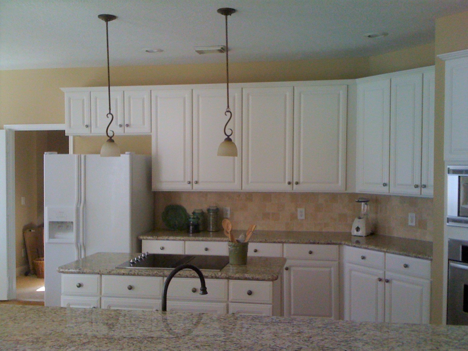
Short upper kitchen cabinets
Varied height upper kitchen cabinets
“Framed” look tile backsplash above cooktop or range
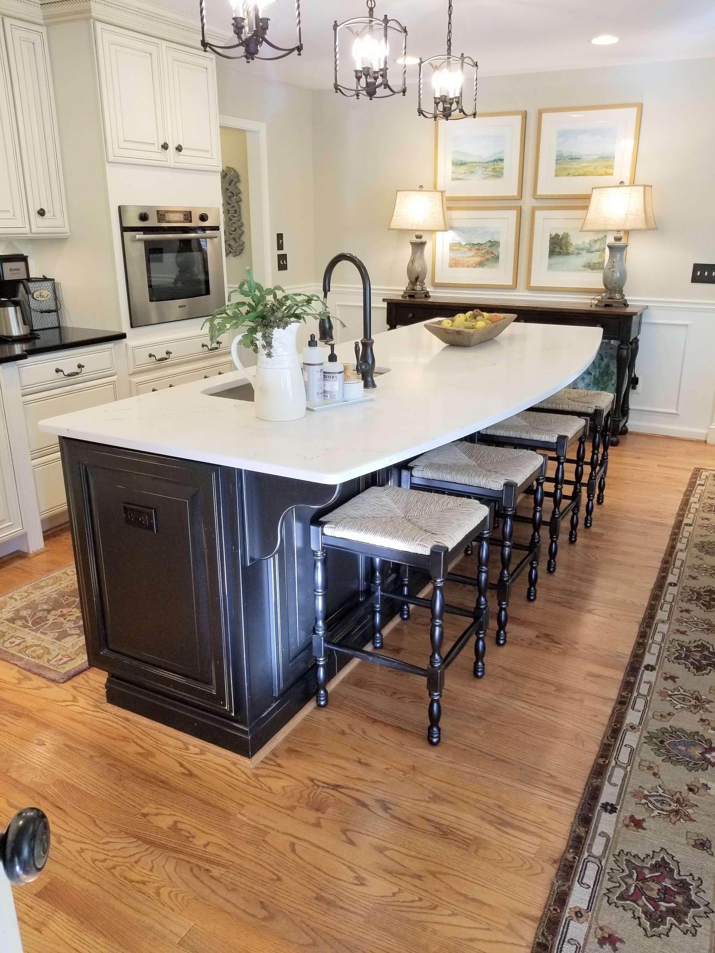
Wonky kitchen island or peninsula
Venting microwave over cooktop or range
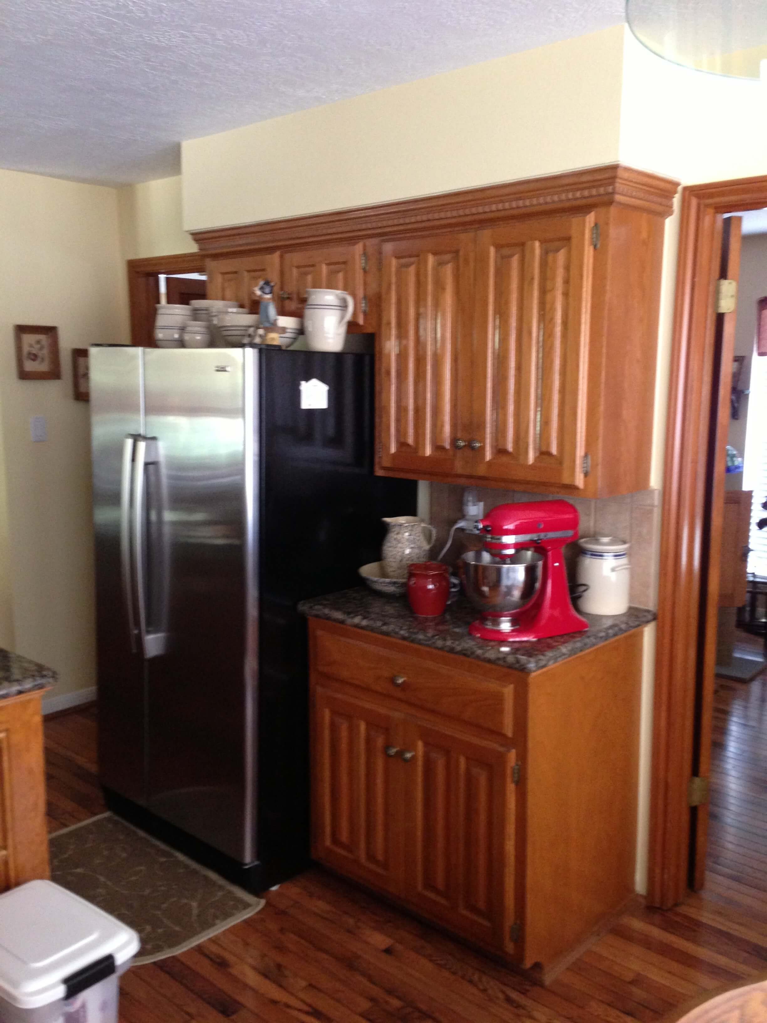
Refrigerator not framed in with cabinetry
Spotty granite countertops
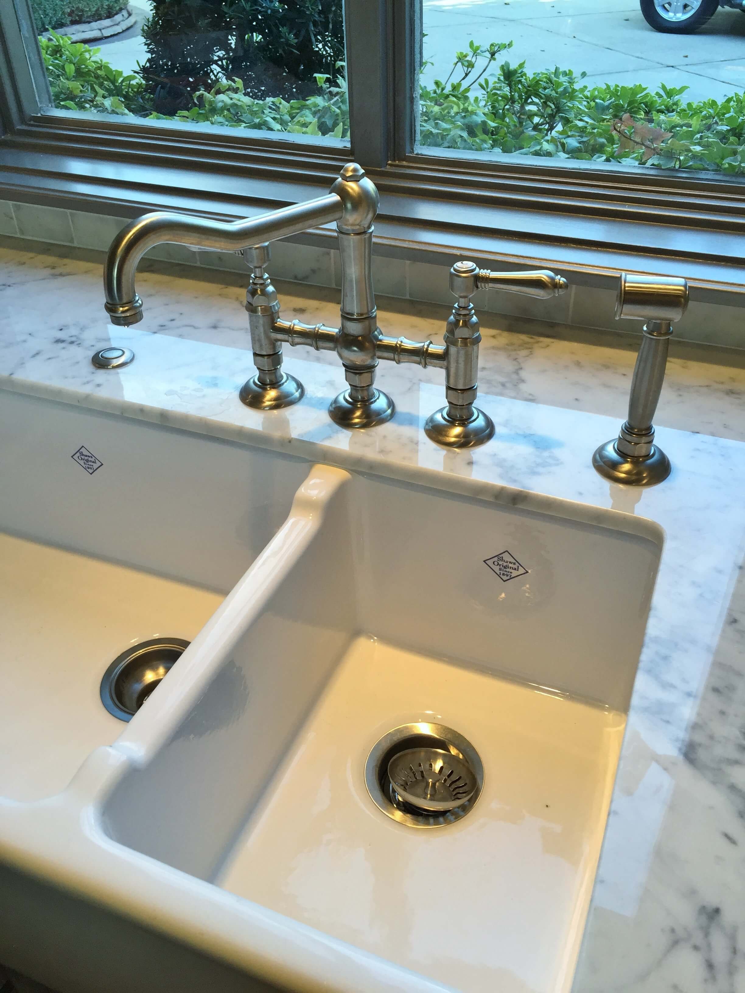
High divide kitchen sink
Heavy traditional details like rope trim, fluted mouldings, highly detailed corbels and curly decorative onlays.
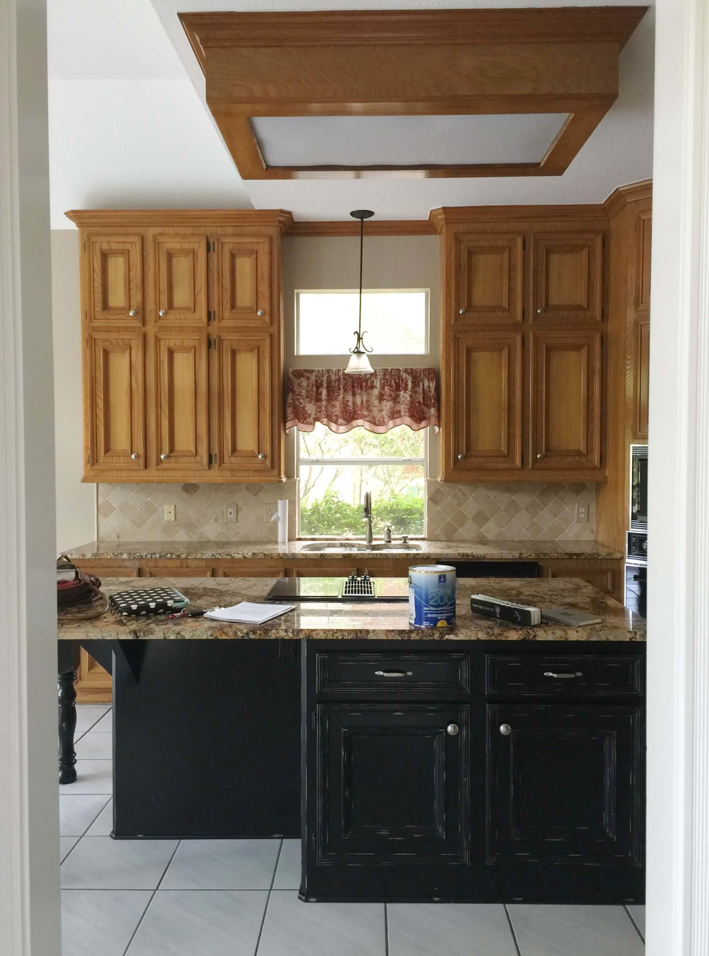
Fluorescent lightboxes and dated light fixtures
1) Short Upper Cabinets
I saw an influencer on TikTok ask if she should leave her cabinets as wood cabinets or paint them, since wood cabinets are coming back in style. Either way, her short upper cabinets telegraphed the dated look of her kitchen and painting those without addressing the heights would likely make her kitchen still appear dated.
With these kitchens, below, I felt that not addressing the height was going to be a regrettable decision in their remodel.
I recommended this kitchen add a set of boxed cabinets on top of these existing in a consultation. I think it will make the space feel more grand and high end, along with the other mods they were planning on. carlaaston.com
Here’s a kitchen, below, where the cabinets were almost to the ceiling, about 12”-15” away. We were doing a partial remodel where the cabinets would be painted, so modifying them by adding a section on top to go to the ceiling, was totally doable. See the results, below.
BEFORE - Kitchen to be remodeled | carlaaston.com
Cabinet modifications, removing the big crown and taking the box to the ceiling. carlaaston.com
That modification makes a much nicer look. carlaaston.com
This project was done over 10 years ago and was wildly popular on Pinterest. You can read my blogpost about the project here.
Kitchen remodel reusing some existing cabinets, taking them to the ceiling. carlaaston.com
2 ) Varied Height Upper Kitchen Cabinets
Usually kitchens that have varying height uppers have some short cabinets, so this is a problem both ways.
This was a trend in the 2000-2010, as builders were coming around to making kitchens look higher end. Offering multiple heights were a way to make a kitchen look custom. People were just not taking cabinets to the ceiling yet.
I’d actually prefer dealing with short cabinets all one height, because then you can add cabinet boxes on top of those. With varying heights, it makes it more challenging to be able to reuse these and not have it still look dated.
Especially if you have dark cabinets and light walls, it just looks choppy.
Variable height upper kitchen cabinets can have a choppy, disjointed look in a kitchen, especially when there is high contrast between the upper cabinets and the walls. carlaaston.com
This kitchen with variable height upper cabinetry has a dated look. carlaaston.com
Upper kitchen cabinets with varying heights can give a really dated look to your kitchen. carlaaston.com
The one instance where upper cabinet heights can sometimes be addressed without changing them all is if they are at least 42” tall and you can do a taller hood or taller refrigerator and oven tower cabinets.
3) backsplash w/ “Framed” look, 4 x 4 travertine with dots, linear glass tile mosaic
With regard to the “framed look”…..yes, I’ve been guilty of this in a project or two, back in the day. However, I have not done this on a job in years as I now prefer a cleaner look in a backsplash, which is very on trend.
I’d also redo a backsplash that had the “dots” look, kind of a Tuscan style with travertine we did back in the day. After that came the glass linear mosaic, which I would also update.
Luckily, if you have any of these backsplashes, they are not the most expensive feature in the remodel. Also, if you change your countertops you will likely change your backsplash and usually countertops are some of the most often requested changes and even THE reason for a kitchen remodel in the first place.
I usually recommend that a backsplash is the place to add color or go a little trendy because it can be less pricey than even having a professional paint job on your cabinets. It usually makes a big difference, visually, too.
A framed out look above the cooktop is a bit of a dated design feature these days.
This was a before pic of one of my jobs. These cabinets were painted and a new mosaic tile solid backsplash installed with new countertops for an updated look. carlaaston.com
This rope trimmed tile inset is a dated look for backsplashes today, along with the dots and the framed in look above the cooktop. carlaaston.com
The backsplash with travertine tile and the dots was changed in this remodel project. carlaaston.com
4) Wonky island or peninsula kitchen
I have seem some doozy kitchen islands. I think this is the place where many builders let their carpenters get after it on the job site, following the perimeter cabinet layout. I always prefer an island that is a more traditional shape.
This triangle island might have had a lot of storage, but it just looked odd in the room.
Here’s an island below that had to go in this kitchen remodel.
BEFORE - This kitchen island was awkward looking and didn’t function that well with the cooktop on the side away from the sink. carlaaston.com
AFTER - We moved the downdraft cooktop to the wall and gave a new island a more traditional shape. carlaaston.com
This rather wonky kitchen island below was not helping sell this house, that had been on the market a few months.
We modified it by building a more up-to-date raised bar and getting rid of one of the angled ends. You can see more about this remodel here.
BEFORE - This island was one of the items that was keeping this house from being sold.
AFTER - Modification to the island shape helped it look more up to date. carlaaston.com
Peninsula kitchens are typically a bit dated looking too, I find people rather prefer islands. Sometimes the kitchen isn’t wide enough. But when it is, I like to use an island.
Here was a consultation I did where I shared an option to open up the kitchen as a room more by getting rid of the peninsula and doing a small island. The breakfast area could be nudged down a bit too by doing a banquette in the corner.
Peninsula kitchen from one of my kitchen consultations. carlaaston.com
The breakfast area in the kitchen was quite tight because of the peninsula bar.
This kitchen layout opens up the room more for a better flow. carlaaston.com
5) Venting Microwave above cooktop or range
I have a blogpost I wrote years ago about this topic. It is rare that I would leave a venting microwave in a kitchen, especially in home.
I typically prefer to move the venting microwave and do a drawer style model elsewhere in the kitchen, if at all possible.
Here’s a project, below, where the microwave was above the range. We did not redo all the cabinetry, but modified it to have a drawer microwave and a new venthood cabinet. You can read more about this partial remodel project here.
BEFORE - The microwave over the range was to be moved to get a new hood. carlaaston.com
AFTER - Here’s the remodeled kitchen with the microwave drawer and a new cabinet for the venthood. Painting the cabinets and a new, simpler backsplash updated this kitchen nicely. carlaaston.com
I’ve left the one in my son and daugher-in-law’s townhome where it was when they remodeled. We just didn’t have another place to put it and the budget was getting too tight. His neighbors all had the same kitchen situation with venting microwaves, so it was typical of that style build in that area.
Sometimes you just can’t do it all, but we did do new, taller upper cabinets, paint, counters and backsplash for nice refresh!
I love the way this remodel for my son and his wife turned out, but I would’ve loved to have moved the microwave to a drawer model. We just didn’t have the room for the change in this townhome. carlaaston.com
I totally realize people sometimes cannot do everything, this list is just meant to help guide you in your decisions for a scope of work, in case you are considering a remodel.
6) Refrigerator w/o cabinetry surround
These little cabinets above refrigerators are pretty unusable. They are hard to get to and usually people stack stuff on the fridge in front of the cabinet.
The tiny cabinet above this fridge is hard to get to and pretty unusable. carlaaston.com
A refrigerator enclosed with cabinetry makes for better storage and a more finished look. Those little cabinets above this fridge are hard to reach for most. carlaaston.com
I highly encourage all my remodeling clients to get a cabinet surround for their fridge. It looks so finished and vastly increases the amount of usable storage in a kitchen.
Here’s mine after I redid my own kitchen. I love that space and consider this one of my best kitchen investments.
The upper cabinet above my refrigerator is a much used storage space. carlaaston.com
This cabinet above the fridge is a great place for vertical storage like platters and cookie sheets as well as larger items not often used. carlaaston.com
This consultation client kitchen, below, had a small upper cabinet above the refrigerator that was far back and hard to access.
BEFORE - Kitchen to be remodeled with new cabinetry taking cabs to ceiling and housing the fridge in a tall cabinet. carlaaston.com
Here are the new cabinets, installed. There is so much more accessible storage now, above the fridge, and the whole kitchen looks higher end. carlaaston.com
7) Spotty granite countertops
I think everyone realizes this is probably one of the most obvious features in a dated kitchen. People have not been purposefully been putting this stone into their kitchens for about 10 years.
Often this stone was polished and had a bullnose edge. All these contribute to the overall dated look.
I wrote this blogpost on the spotty granite topic back in 2016, so I was done with them then.
Spotty granite like this with a polished finish and bullnose edge makes for a very dated look in a kitchen. carlaaston.com
I do have some consultation clients that cannot do that investment of new countertops throughout yet though and hope to get by with them in their remodel.
Luckily, countertops are something that can be changed out relatively easy. It’s only like a 1-3 day mess if you are changing your countertops.
I often will suggest doing the island and backsplash then, thereby minimizing the visual of the spotty countertops, like in this kitchen remodel consultation I did some years ago, below.
There was so much spotty granite in this kitchen, it overwhelmed the space. carlaaston.com
In this Designed in a Click consultation I did some years ago, there was a solid black countertop on the perimeter, so I advised to just change the spotty granite on the island to a white slab to relate to the white kitchen cabinets. The before and after here was quite the transformation.
BEFORE - Spotty granite on the island was dark and busy. carlaaston.com
AFTER - The new white countertop on the island brightened up the space and felt less dated. carlaaston.com
Most people that I consult with that have granite like this are ready for a change and it is often the main reason for a partial remodel. carlaaston.com
It really depends on the kitchen layout and how “visible” the countertops are overall in relation to the other design elements. If you can update these, however, it is a good idea.
8) Double Bowl kitchen sink
I know personal preference comes into play here, but if you have never used a single bowl kitchen sink, it can be a game changer. I’ll never forget the first time I used one, in a vacation rental in California. I was blown away by how easily it accommodated pots and pans and large dishes. Now, I really wouldn’t go back to a double bowl, high divide sink unless I was giving up on cooking.
Double bowl (high divide) kitchen sinks are not popular options for remodeling anymore. They just don’t handle the bigger dishes, pots and pans that a single bowl, low divide or a galley sink does.
One of my clients from about 5 years ago wanted this low divide, double bowl sink. It’s a good option for people that still like some two bowls but want flexibility with large pots and pans.
Low divide double bowl sinks are a good option for a standard double bowl. carlaaston.com
I love a single bowl sink, this one in Silgranit from Blanco. carlaaston.com
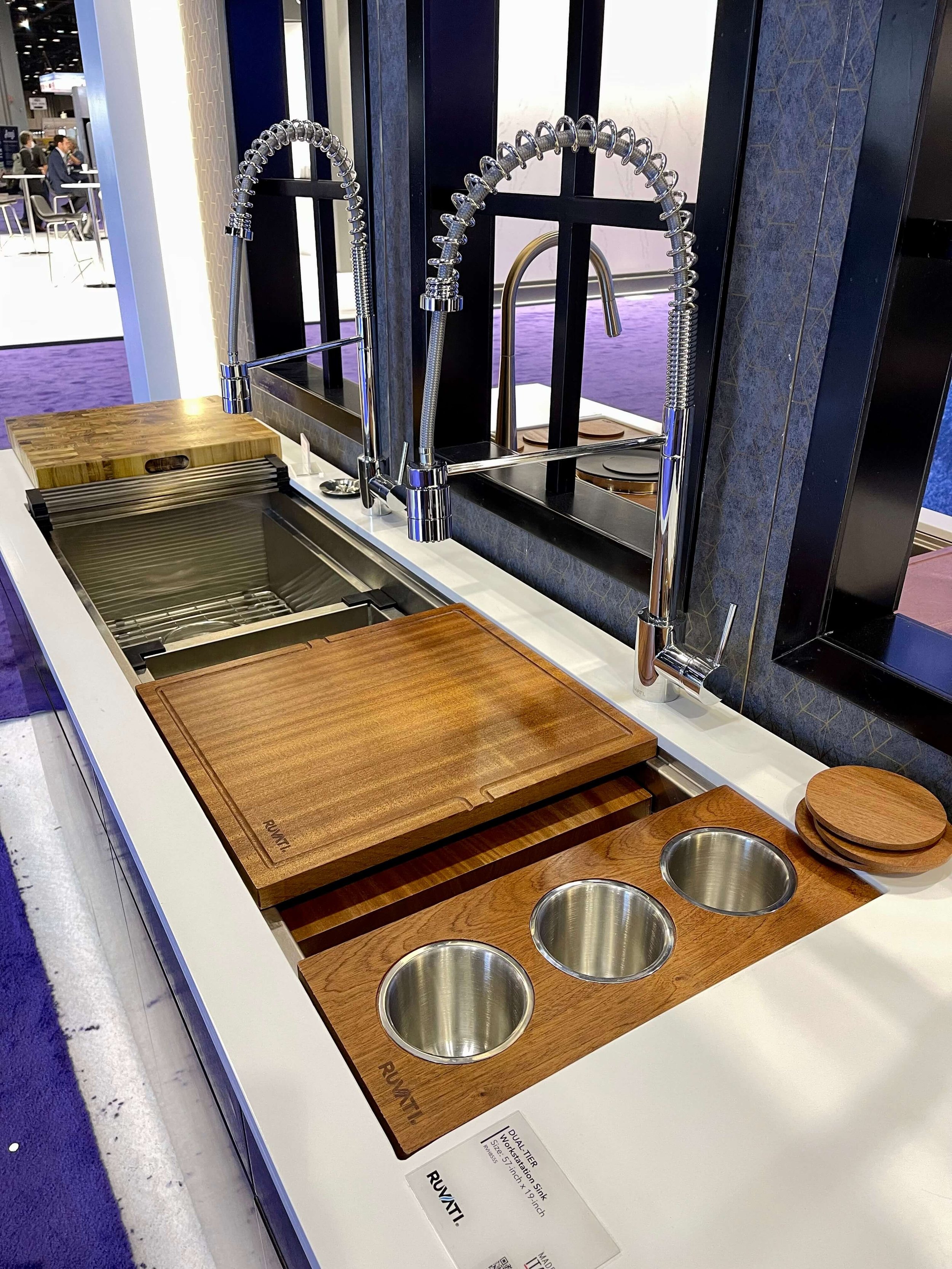
Many people doing remodels these days are opting for extra large sinks, like galley or “workstation” sinks as a preference.
Workstation sink from Kohler, seen at KBIS 2022. carlaaston.com
The reason they are called workstation sinks is because users truly keep a lot of the kitchen prep at the sink, which keeps the rest of the kitchen tidier. We’re seeing more and more of these at the national kitchen and bath show every year.
This large workstation sink is from a company that stocks in Texas, Ruvati. carlaston.com
9) Heavy traditional details like rope trim, fluted mouldings, heavily detailed corbels and curly decorative onlays.
There has been a big trend in recent years away from the very traditional details that many custom homes had in the 2000’s. Dentil mouldings, rope trim, curly onlays, they really are not typical these days and appear rather fussy and overly ornate.
On a real antique piece of furniture, these details are authentic and gorgeous. In kitchen cabinetry, not so much.
Most people want cleaner lines and less excessive detail in a kitchen now. You can remove some of it, although the surface underneath is definitely affected.
One of the biggest signs of this are the huge corbel brackets, like under a countertop. Now, builders, remodelers, etc. are using minimal steel brackets for supporting bar counters, that can’t be seen. As a result, the big traditional corbels look like a style from years ago.
The corbels, curly onlay detail, fluted mouldings and dentil trim at the crown make for a very traditional look kitchen.
Huge decorative corbels like this are not so popular in kitchens anymore. carlaaston.com
If you wanted to reuse the cabinets here, this onlay and the grape frieze moulding would need to come off or be replaced. Then the cabinets would have to be repainted. I’d get rid of those brackets too, they aren’t holding up the hood. carlaaston.com
Excessively heavy mouldings that wrap every nook and cranny are an outdated feature unless you’ve got some kind of opulent mansion. carlaaston.com
10) Lightboxes and dated light fixtures
20 + years ago, lightboxes were being done all over our suburb, but if you happen to still have one, take it out if you are going to remodel. Some are just attached to a sheetrock ceiling, some are more anchored up in the ceiling and will require more construction work, but it is worth it to make this change.
Remove them and drop pendants or install recessed lighting to get an updated look.
And by all means, get some new light fixtures if your lighting is over 10 years old and you hate it. Curly, Tuscan style lighting is one of the big items we replace around this area.
Here’s a rule with decorative lighting, backsplashes, etc……if you go simple and more plain, there will be less of a desire to change things out when the styles change.
Remove the dated kitchen fluorescent light boxes and the dated pendants in your next remodel. carlaaston.com
The lightbox is not the most up to date way to light a kitchen these days. carlaaston.com
The lightbox was one of the first things to come down in this kitchen remodel. carlaaston.com
Remove the dated kitchen fluorescent light boxes in your next remodel. carlaaston.com
Traditional chandeliers like this one, below, although I wouldn’t use it in a kitchen often, are pretty timeless if they aren’t too blingy, in my opinion.
When would I use a chandelier like this in a kitchen? - When it was the homeowner’s mother’s and had been carefully restored and it was the perfect size and style for an elegant, traditional kitchen. carlaaston.com
Lighting like this, below, feels dated and I’d encourage someone to replace that if they were doing a kitchen update. To me the color of the glass and the extra curly style gives it the Tuscan vibe that is no longer popular.
This style of chandelier is outdated for 2023. carlaaston.com
I have an additional 6 Outdated Kitchen Design Features in this post, below.
I’m heading to KBIS, the national kitchen and bath show at the end of this month and I have kitchens on my brain!
Subscribe below to see all the latest and greatest intros into the kitchen and bath design world!
Pin this image below to Pinterest to save for later reference.
This blogpost was thoughtfully written by me, Carla Aston, and not by AI, ghostwriters, or guest posters.

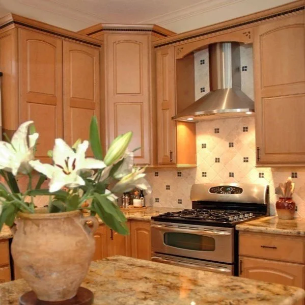
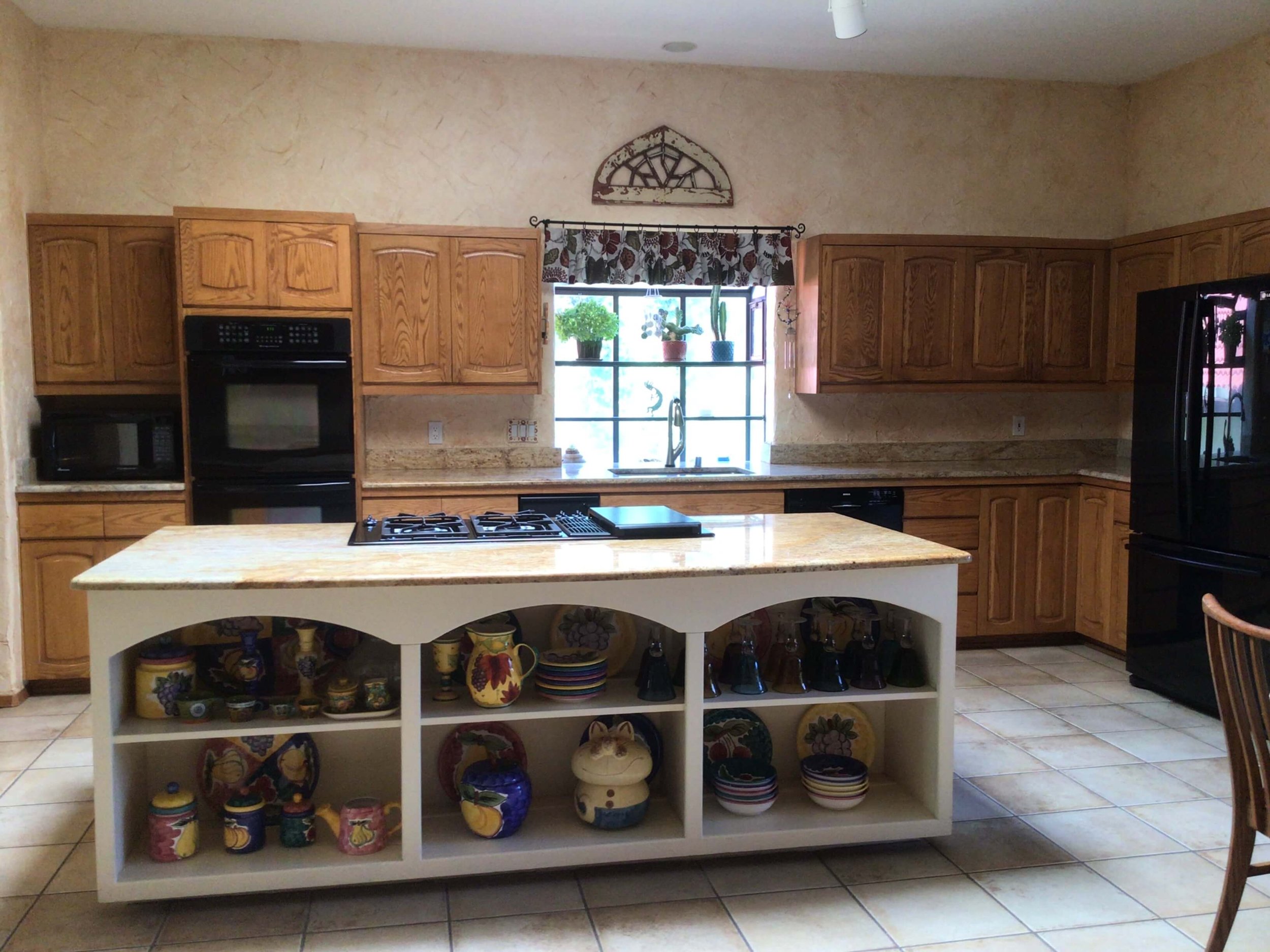
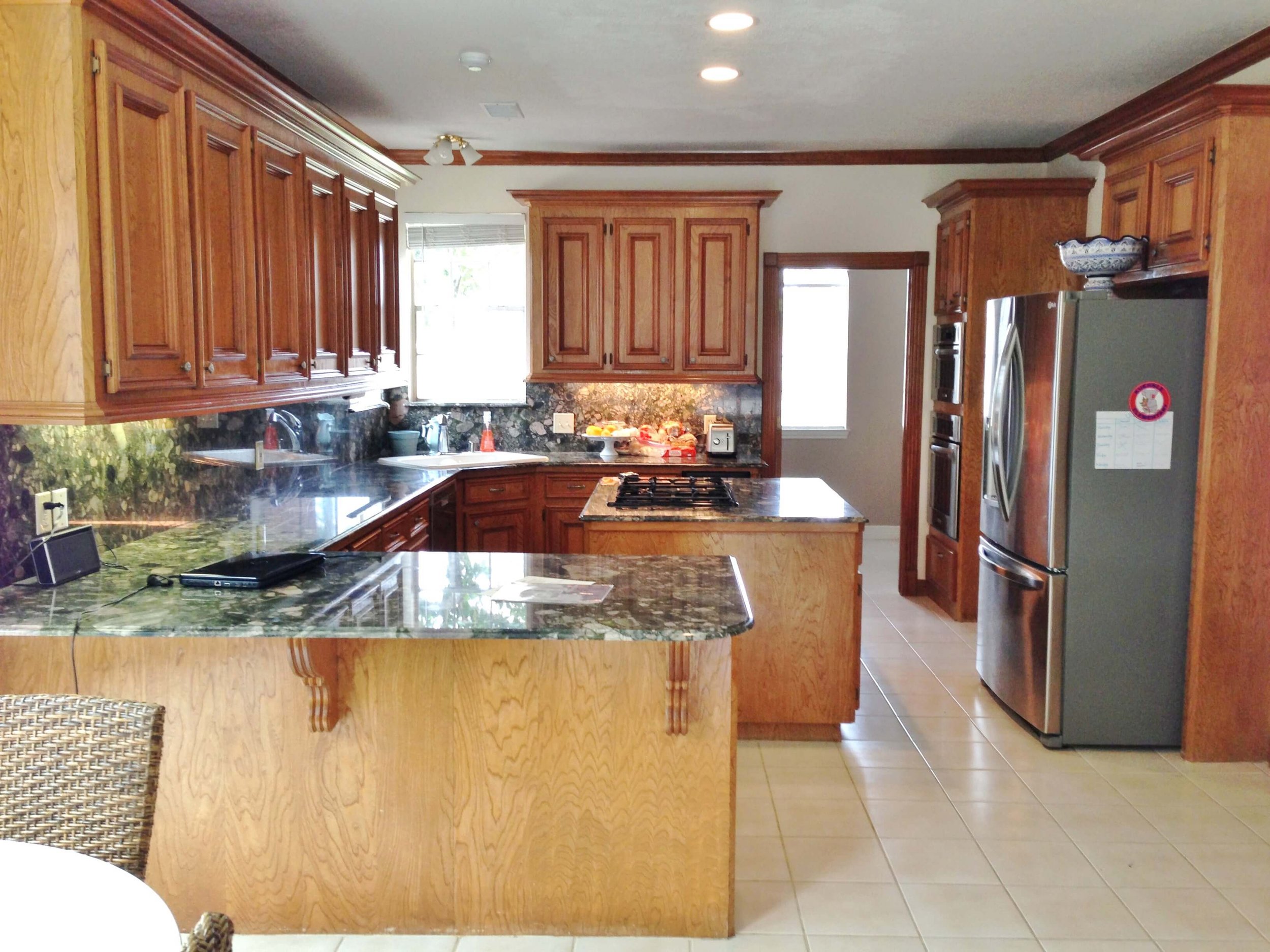


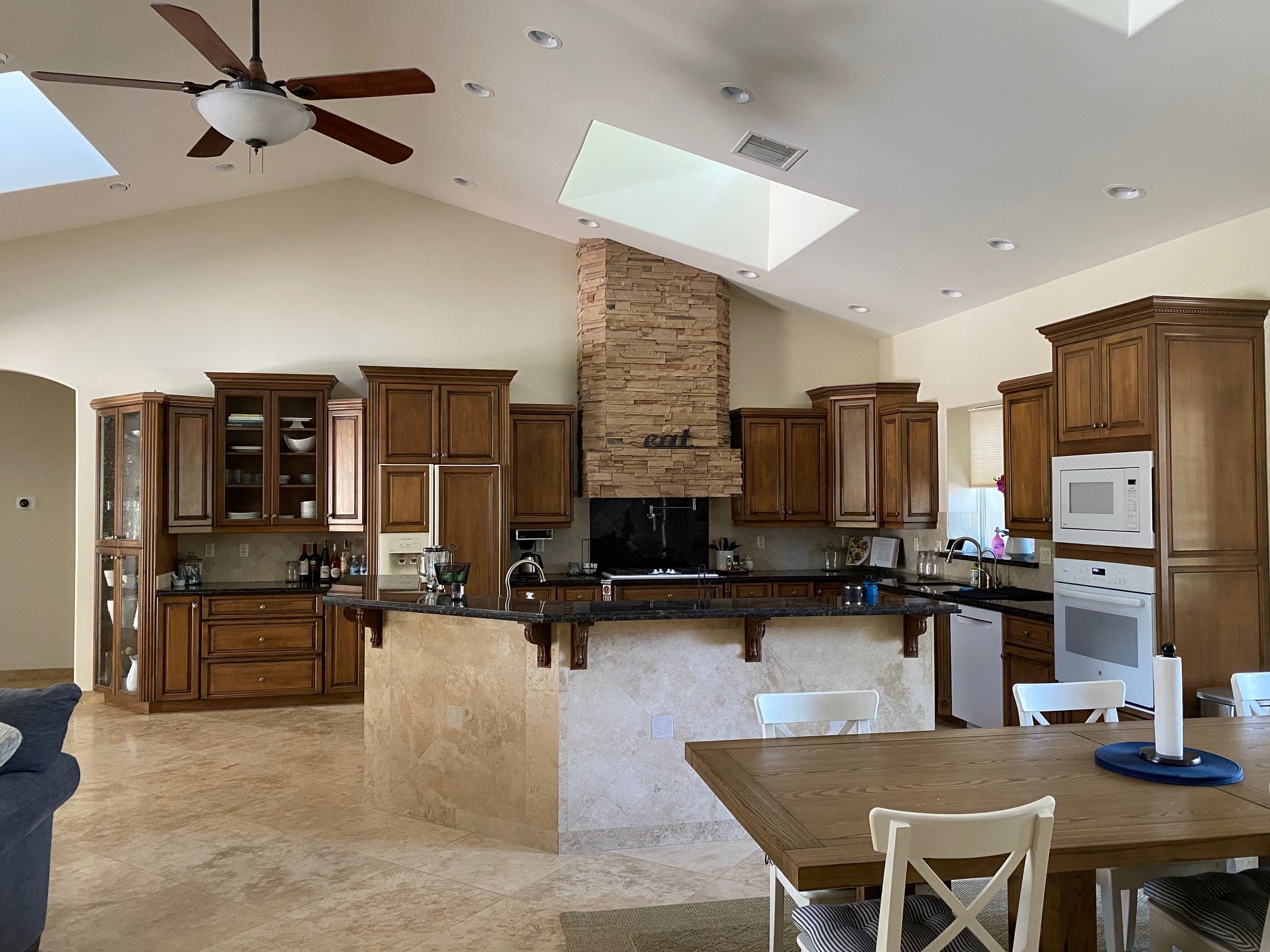

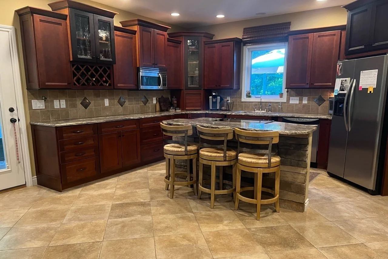


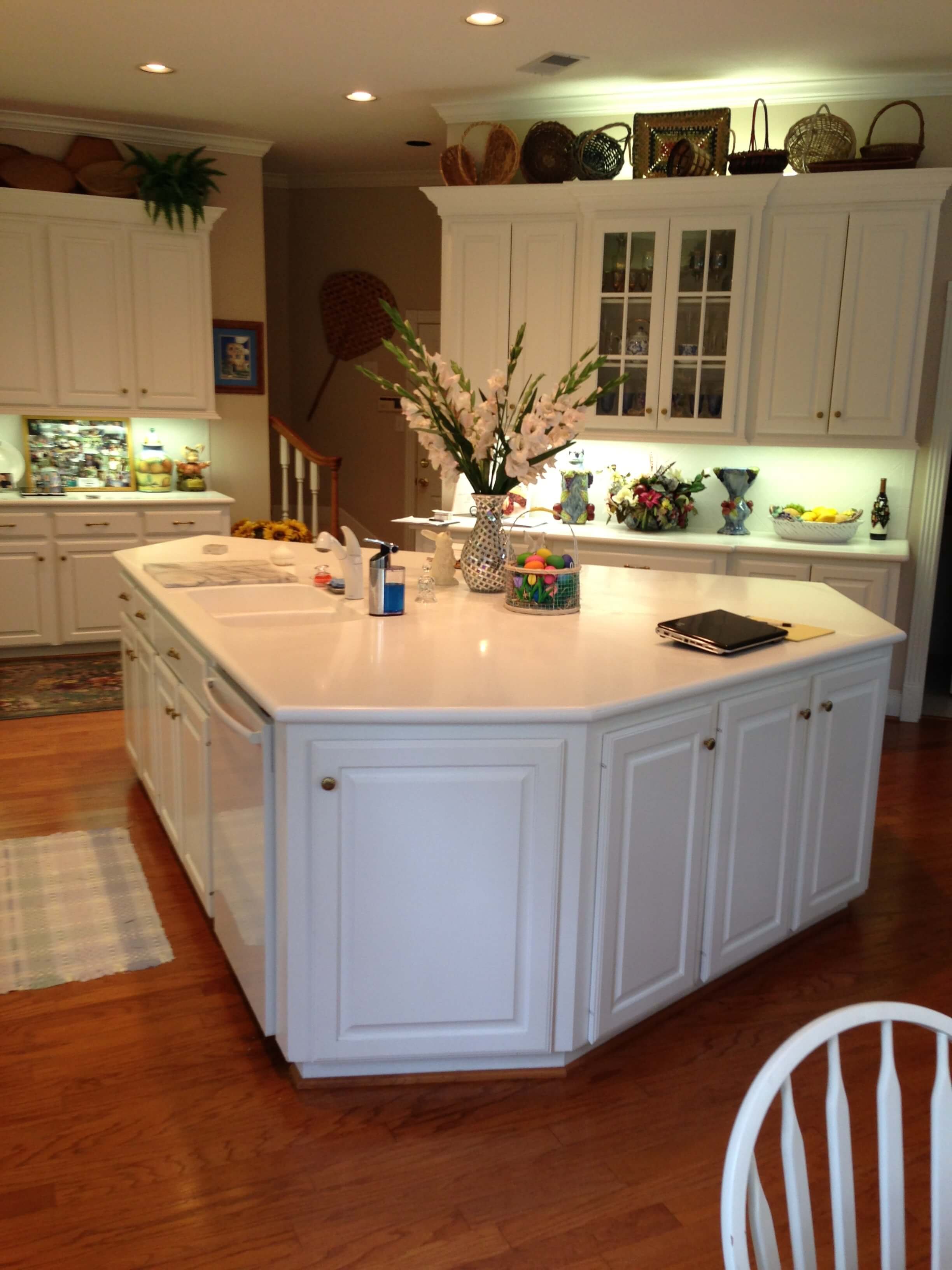


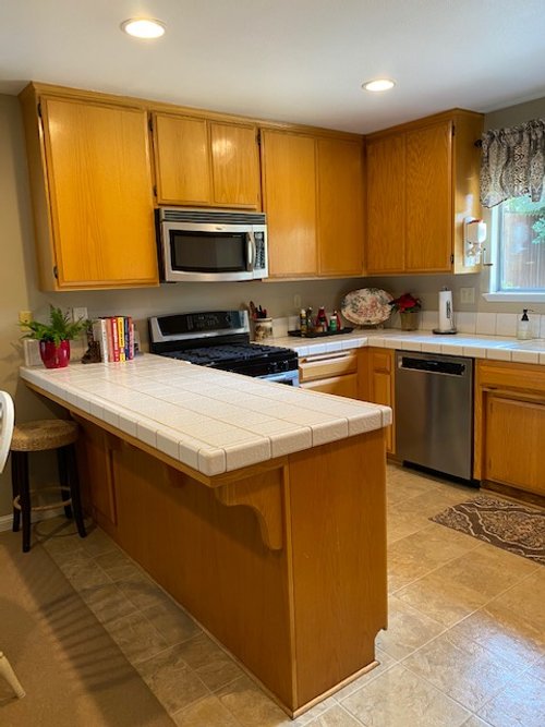


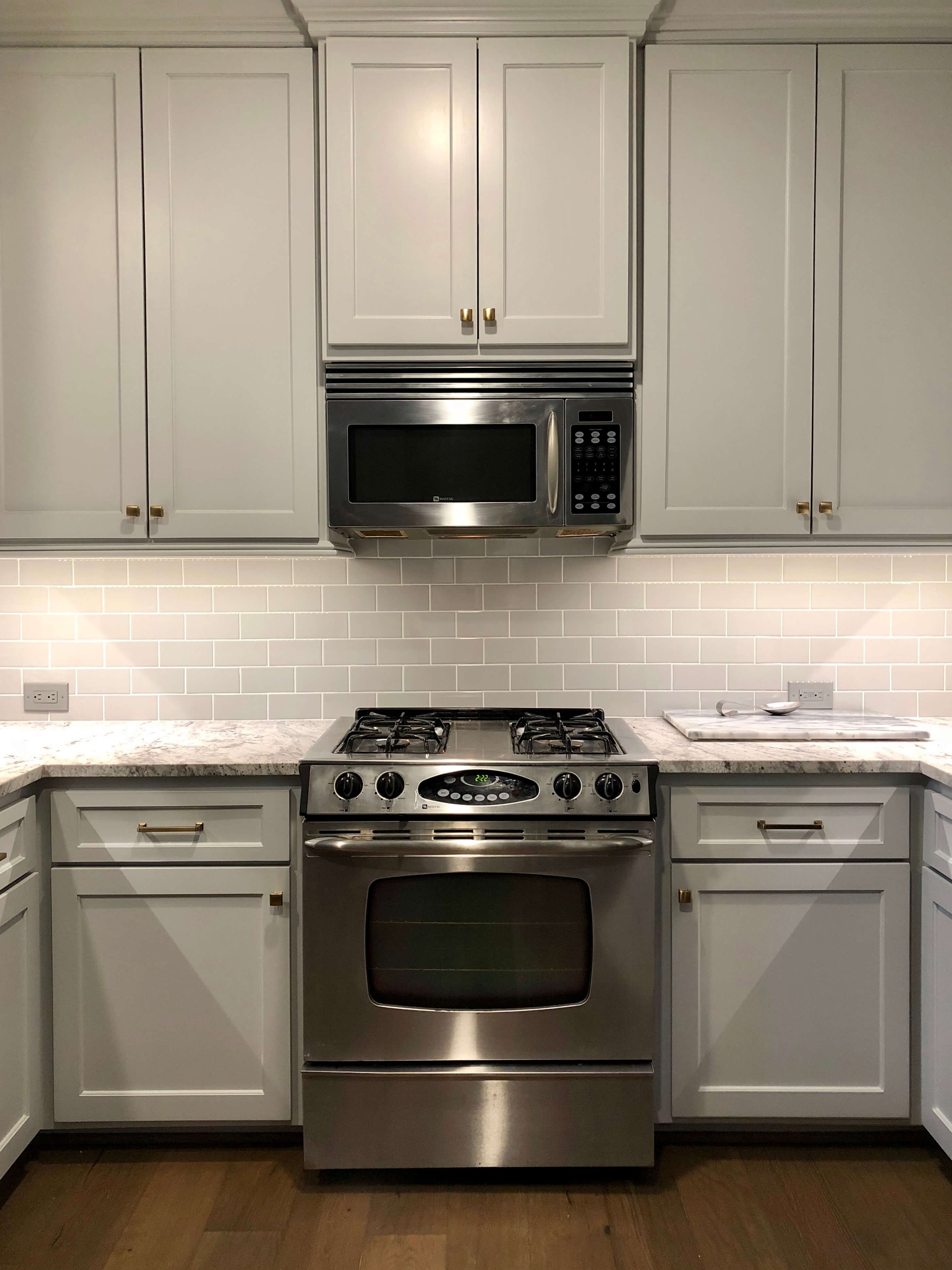









I’ve got 6 more outdated kitchen trends that are worth addressing in your next remodel for you today. If you are considering any kind of new kitchen or update in the near future, you’ll want to save this post to refer to later!