As I see my Facebook feed filling with pics of cute dorm rooms and young, smiling new collegiates, I think back to my college school days starting in interior design and art.
My blog may contain affiliate links. Any purchases, at no additional charge to you, earn me a small percentage, are most appreciated, and make this blog possible. :-)
We had books, but we also had lots of pen, paper, markers, and pencils because we were learning how to draw, by hand.
With all the digital drawing programs out there these days, available and useful to those even outside our business, I cannot help but realize that someday, I might have to get with the program with some computer aided drafting. :-)
I have great support with Autocad drawings in my office, which we use to create all of our construction drawings…..floor plans, elevations, details, etc. Those are the norm and a definite must-have for revisions and keeping a project on a professional level.
However, I’m still old school.
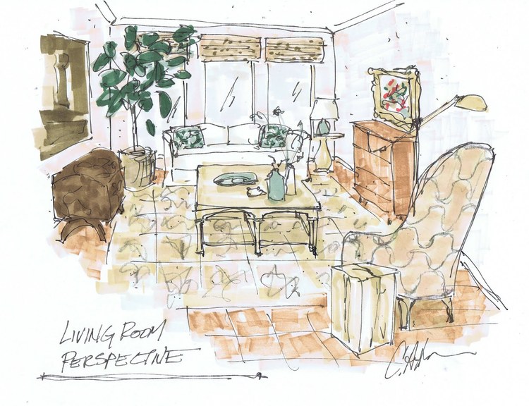
I draw and sketch by hand. It’s always seemed to me that I can sketch something, proportional and to scale, probably faster than almost anyone can create a digital drawing.
Bathroom with patterned tile floor and vessel sinks, sketch done with Prismacolor markers | Carla Aston, Designer
Mind you, I’m a sloppy sketcher, but it gets the point across and it is the way I like to draw. It sort of leaves a lot of the details as “to be determined” which is helpful when just sketching concepts and ideas.
And I am queen of the overlay. Laying over sketch paper to redraw, adjust and tweak until I get it all just the way I want is a very purposeful part of design that I love.
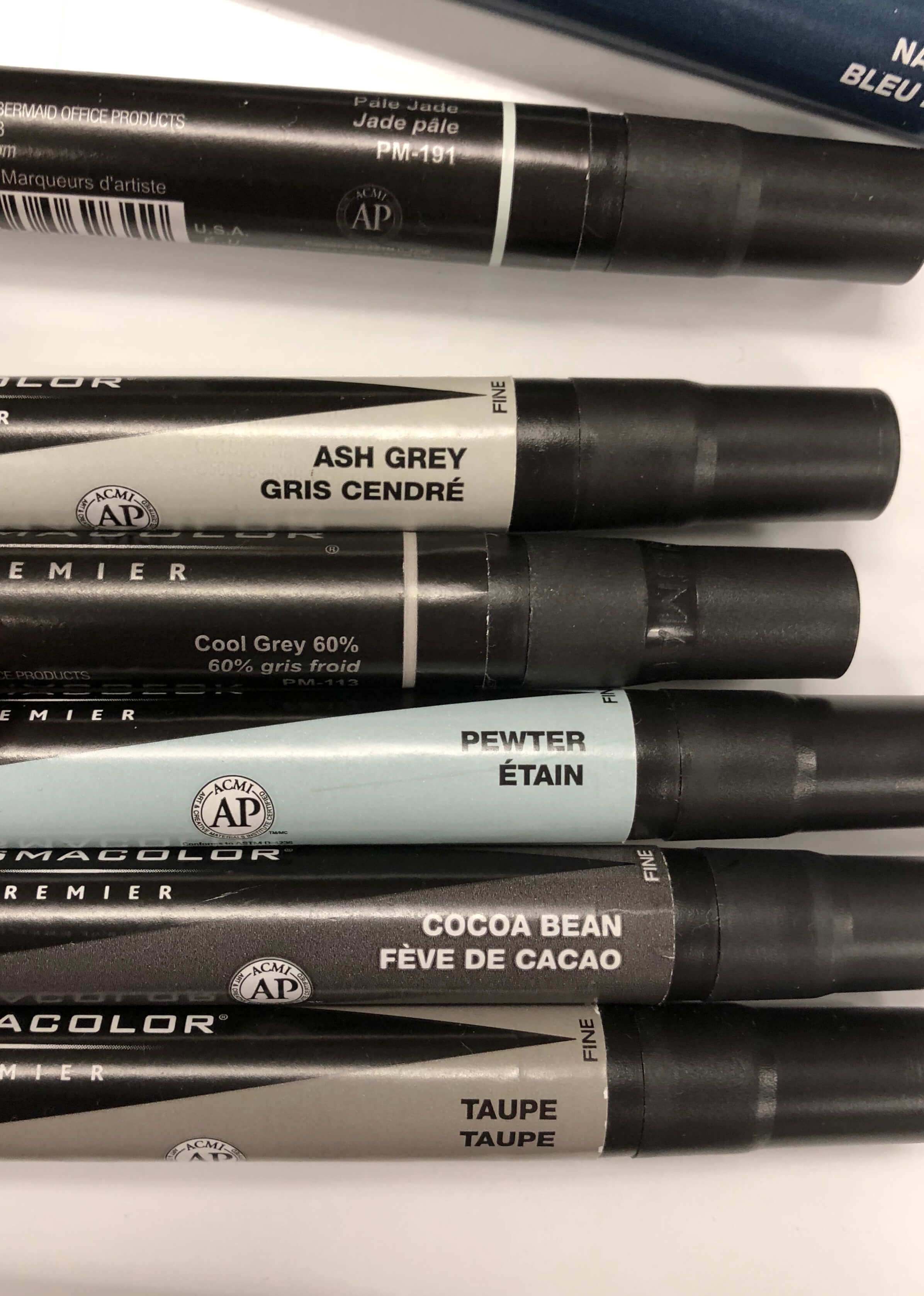
My own collection of Prismacolor markers and drawing implements.
I just invested in a bunch of replacement colors of my markers and I was actually giddy at the thought of receiving them, fresh and heavy with ink and color, ready to bleed onto the paper with my straight horizontal strokes. :-)
Trust me when I say there is a tactile sensation of creativity that flows when pen hits the paper.
I enjoy the feel of the texture of the paper against the felt tip of the pen or marker. It’s quite distinctive and somewhat reassuring to me and to other professionals too.
Gray and white kitchen design, sketch done with Prismacolor markers | Carla Aston, Designer
“Old School” Supplies for interior designers
I thought that perhaps you might be interested in some of the best colors and old school tools I’ve found through the years that help me do my job, just in case you might want to try out sketching someday. :-)
I’ve linked here to my favorite roll of sketch paper. 12” length is great since I do all my drawings in an 8 ½” x 11” format. It's the best size for the copy machine, files, etc.
I’ve also linked to my favorite drawing pens.
I like to work with pens, not pencils, and I typically use one pen throughout a sketch, but layer in a sharpie for heavy weight and then a small razor point for finer detail like tile patterns or texture, etc.
Next are Prismacolor markers.
I love these and have quite a collection. I use every gray at some point, it can tone down a more brilliant color to lay gray over it, but I use them to add shadows or depth in a drawing.
I’d get a box of gray markers as a starter set. They come with some black ones, so you don’t need to buy black if you get the box.
Don’t get the brush tip, get the chisel or broad tip. It comes with a fine tip on the opposite end for more detail work.
Cool grey is a must, but I also use a lot of warm grey and occasionally French grey.
My favorite individual color markers are:
Favorite Prismacolor Markers For Interior Design Sketching
Cool grey 90% - cool toned almost-black color
Cool Grey 30% - good for appliances in a cool toned kitchen
Warm Grey 30% - good for appliances in a warm toned kitchen
Black - super opaque black
Sepia - warm tone dark gray/brown, good for layering wood tones
Putty - lighter warm toned neutral
Parchment - lighter warm toned neutral
Dark Green - bold dark green
Navy Blue - dark navy color
Pale Jade - good for window or mirror color
Pewter - blue/gray, also use on mirrors or appliances
Taupe - medium taupe color
Ash Grey - good medium neutral
Cocoa Bean - kind of reddish, but good for some wood tones
Oatmeal - good for seagrass rugs and naturalcolored textural items
Dark Brown - good for brown wood flooring and furniture
I also like these metallic markers to add some sparkle on top of the layer of color. It is great for indicating cabinet pulls, and adding a little shine to a light fixture.
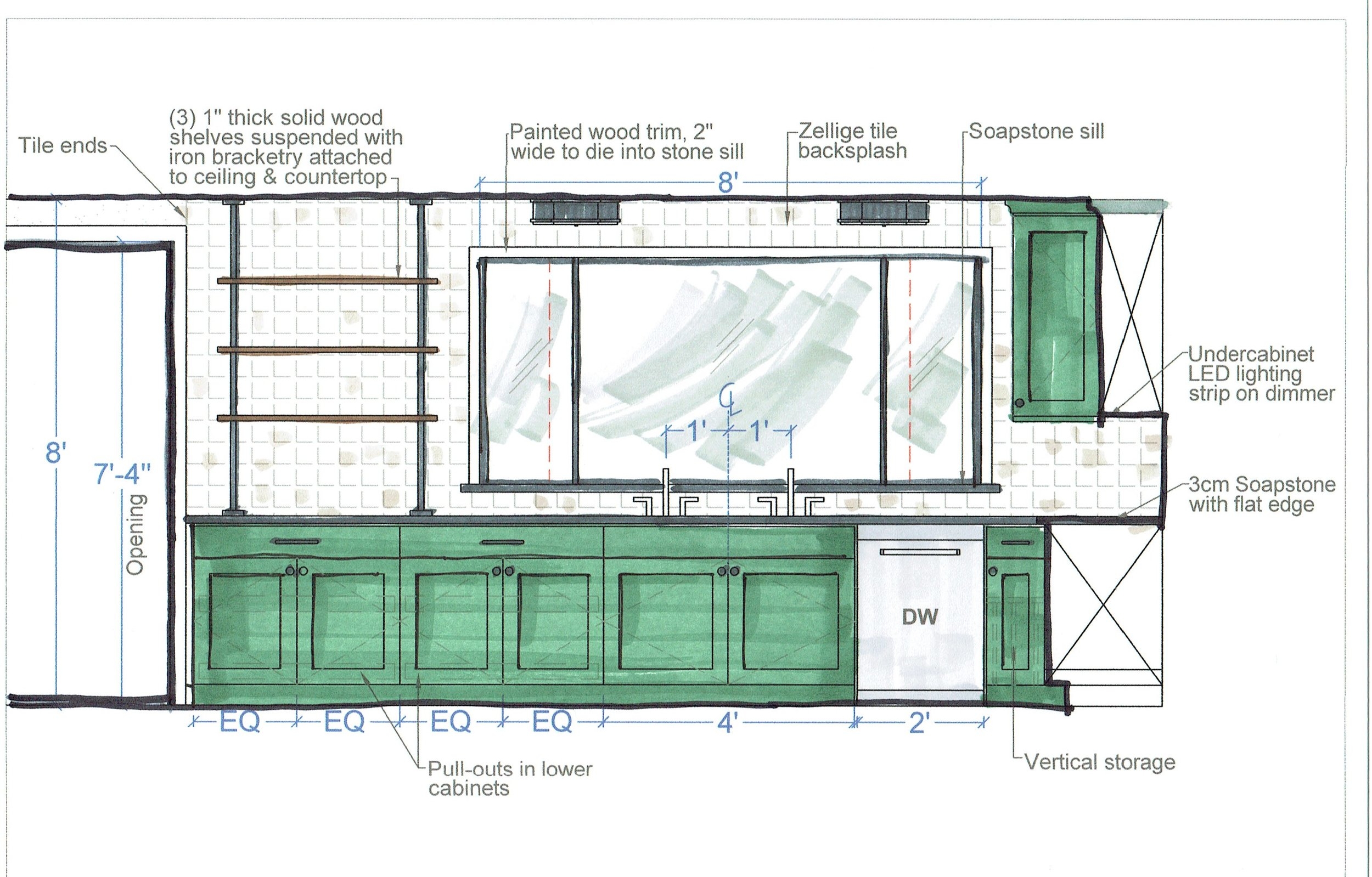
Color added to top of AutoCAD drawing with Prismacolor markers | Carla Aston, Designer
Need a few books for some design guidance?
I am also including a few links to the design guides I’ve written in the last few years, that help homeowners and designers with some basics on design and design business.
These go into more depth than a typical blogpost on their topics. Some are more of a summary of all I’ve written about on a certain aspect of design.
How about a private study session?
I’ve also considered that there could be designers out there who might just want a private look at one of their own projects.
Maybe you’ve run into something that has stumped you or maybe you just need a second pair of eyes to review your ideas. Maybe it is not something you feel comfortable exposing to a Facebook group for input.
In that case, I have my Designed in a Click service that could work well for that.
I’m open and interested to add my two cents if you ever have the need. Often times we just need someone to have a quick look at a specific problem to confirm what we already know or to give us some fresh, new insight.
In this case, I would keep your project private, I know in the service description it says I have the right to share anonymously on my blog, but that is only with homeowners.
If you’d like a second look at any of your projects, I am happy to just keep that between us. No need letting the world know our thought processes and insider secrets. :-)
So, if you have a design problem and just can’t see the best avenue to propose to your client, feel free to hit me up in that service offering and I’d love to take a look.

