I'm always surprised by how little interior designers use Pinterest to drive traffic to their site. It has basically been responsible for putting my site on the map. I'd have been nowhere without it.
Let me just say that there is an affiliate link to a scheduling app below that renders me a tiny percentage if you sign up via my link, at no additional cost to you. (I have to say this as per FTC rules before you read too much more into the post.)
Pinterest is still the number one driver of traffic to my site
Pinterest currently brings in a little more than half of my traffic to my site every day. Although it used to bring a lot more, their algorithm and other changes made in the last few years have slowed my traffic, but I have to say, it still works.
Back in the old days of Pinterest, I remember I pinned along, not seeing that much improvement in traffic, using it without much thought or strategy, but enjoying the platform, until one day. Irene Turner, a designer, facebook friend and power pinner extraordinaire in our design niche, repinned one of my pins and wow! My traffic peaked and that pin went viral.
These days, it doesn't quite work like that. Although it is great to have real power pinners or pinners with large follower counts repin your pins, it is no guarantee anything will take off because of how the algorithm works now.
I guess this just shows the power of being an early adopter in a social media website. :-/
Since I've used the site heavily for many years, I thought I'd share a few basic pointers today in case you were thinking of using Pinterest to share your content and projects.
First, a few rather obvious facts that you may or may not know.
Pinterest is not a social media site, it is a search engine
The great thing about Pinterest as opposed to other social media platforms, is that it WANTS to be a search engine. Pinterest's visual search engine is top notch and many people use it over Google for recipes, fashion, interiors, and so on.
Compared to Facebook and Instagram where they endeavor to keep you on their site to have conversations and interact with people, images and video, Pinterest is striving to link you to the information you are looking for, just like Google. That's why linking and incoming traffic is so good from Pinterest. Because it's goals are really the same as a content provider's goals.
Pinterest pins take time to catch on
Pinterest pins do not take off immediately. Don't be put off by low "save" counts or click throughs in the first month or two. I've had pins take off a year or more after pinning for some unknown reason, so it is a platform that you should not ever give up on.
Get Rich Pins For Your Site
Having rich pins enabled on your site basically brings the title of your blogpost over to Pinterest, shown in bold, below your pin. It just gives your pin much more information so that it can be found more easily in search.
These are a must for interior design websites and make a big difference overall in driving traffic to your site.
Here's Pinterest's article on how to get rich pins.
5 Basic Pinterest tips
1. Use vertical images in your blogposts.
I find this again and again with designer's websites. All they have are horizontal images! Vertical pins take up more real estate on Pinterest. They are much more likely to catch a pinner's eye than a horizontal one.
While we all love the big horizontal images to show an overview of a room or space, those will not typically do well on Pinterest. Frankly, I never bother pinning a horizontal photo from any site, rarely even my own. It's just not worth it.
Try to have at least one vertical in a blogpost. The more high contrast the better.
Just put your designer hat on and look at Pinterest's feed. As you are scrolling through, what stands out to you? What is attracting your eye? What images do you find the most appealing?
That's what you should be aiming for.
The optimum ratio for a Pinterest pin is 2:3 (2 being the width and 3 being the length) or 600 x 900. Really, any vertical is better than a horizontal.
There is lots of info on the internet about pin sizes, just remember whenever you search for an article about Pinterest, make sure it is fairly current, within the last two months or so, or has been updated in that time. Pinterest changes everything so often, you cannot rely on older information.
Here's a knowledgeable Pinterest marketer who has an updated article on Pinterest pin sizes.
I use a bit longer size for shopping boards. Sometimes Pinterest will only show the top portion of the image if they are too long. I've heard Pinterest calls them giraffe pins. :-)
Keep Pinterest in mind when photographing your work
When you are photographing your work, always make sure the photographer shoots some verticals. You don't want to go to all that trouble and expense to have nothing that will do well on Pinterest.
You should be shooting with all your social media platforms in mind, thinking about what area or vignette will do well on Pinterest, Instagram, Facebook, etc. They all have different looks that do better than others on their sites.
I'm just encouraging you to think of Pinterest too, not only Instagram!
2. Use text overlay on one image for pinning.
This has been a hard one for me. I really hate the look of text overlay. Plus, it is a hassle to add one of these after you've written a blogpost and have spent a lot of time on that already.
However, they do work much better than an average photo because it is like a big sign traveling through the feed. It helps explain what is behind that link to the user. It also helps with getting keywords into your pin which is good for search too.
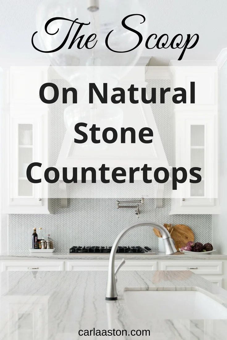
Here's what I mean by text overlay. This is a vertical image with text overlay that describes the article I'm linking back to.
Now, I'm not a graphic designer and I'm really at the point where I should hire one to develop a branded look for me. However, this is something I can do myself and it does work.
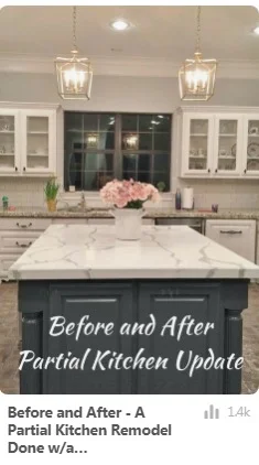
Here is another pin from a fairly recent post with text overlay. It has done pretty well to have been pinned in the last month.
Remember you should try to make these as graphically pleasing as possible (even though mine are mostly rather lame). They shouldn't look cluttered or messy or have too many little objects on them. Again, I'm no expert, but I know an ugly pin when I see one.
And I ain't pinning that. :-)
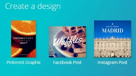
I make my pins in Canva, it's pretty easy to use. There is a template there that is an optimum size for pinning. I load in my own image or occasionally buy one of theirs for use, then add text and other graphic features as needed.
A few of the Canva templates
I download it then, as a jpeg, and load it into my blogpost at the bottom of the post.
The great thing about text overlay is that it gets your keywords in there.
You never know what Pinterest will play with as a change from one day to the next.
Lately they have cut off some of the rich pin info (more of their fairly recent changes) and haven't shown descriptions. I've also seen some of my pins go by with the descriptions only and no rich pin info. When I click on the pin, then the rich pin info shows up, so its not that the rich pin info has become detached from the pin, its because Pinterest is choosing not to show it. :-(
And, that can vary from one image to the next in the same post! Here are two images from the same post. My site is validated, both pins are rich pins, and yet, Pinterest is choosing to show different info on each pin. That's why you have to cover all your bases.
This pin has the rich pin info, the title of my blogpost (a portion of it as you can see, not all of it). Although I had a full description and hashtags at the end, the description does not show up, although the hashtags do.
This pin, from the same post, pinned the same day by someone else, does not have the title of my post, but has the description I put into my caption, along with the hashtags. Again, not all the description shows up.
While I don't include text overlay pin images for all my posts, sometimes it is just too hard to get all this done, I might go back and add them later.
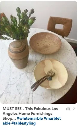
Then again, sometimes I might not do them at all. This post above had some beautiful images, it was really all about those images, not about information necessarily. I was just sharing my pics from a tour of a beautiful home decor shop, so it wasn't really worth my time to do a text overlay pin.
Text overlay is good for posts that teach something, for posts that share more than what the image can portray. A project reveal post would be a good candidate for a text overlay pin, for example.
Text overlay assures that your keywords will remain visible with the image. It also, graphically, lets Pinterest users know about your blogpost or article since a lot of people on Pinterest are looking for information.
3. Keywords in descriptions
It's important to realize what information or labels Pinterest pulls into their site from yours. You need to know where that info is located so that you include keywords and descriptions in that area of your site.
In Squarespace, which is the platform I use, it is located in the "caption" of the photo. That caption is what Pinterest will pull into their site. That's where I add a description, a photo credit, keywords, and hashtags, as I wish, for it to be taken into Pinterest.
At this present time, when Pinterest pulls that info (when either I or one of my readers pin an image from my site), all that info doesn't show up on the image when it is rolling along in the feed. It will, however, stay with the image and you can see that info when you click on the image.
Here is how that image I showed above reads when I clicked on it from the feed.
The title is showing up as a rich pin, it has the name of my site and logo, then the description of the pin that I labeled in my site shows up lower down, with the hashtags. All that info is associated with that image on Pinterest, helping to describe it for Pinterest's search.
Now, with regard to Squarespace sites, sometimes that caption can look heavy within your post, too detailed and repetitive all labeled up like that. You can hide the caption from view on your site. That information will still travel over to Pinterest and remain with the image for their search.
If I did not insert a caption for this photo above, the next place that Pinterest would pull from in a Squarespace site, would be my image title. You always want to go in and title your images in your post. That's just good SEO anyway, but it's not always the best labeling for Pinterest.
That's why it is good to understand from where Pinterest pulls your info on that image.
If you are going to pin, then take a little extra time and make sure your image is going in the best way possible to get the best hope of being seen on their platform.
4. Hashtags
Pinterest did not use hashtags for FOREVER, then all of sudden boom.....hashtags.
I do use them now. I only use a few, in my descriptions. They show up in the feed and can look a little obnoxious in my opinion, but they do work, so they are good to use.
What I've found is that they aren't really like Instagram hashtags. Hashtags on Pinterest seem to work better as more general information, not getting too specific. You can just go to their search bar and type in some of the hashtags you are thinking of using for a post and then see what comes up. You want the hashtag to be popular and have lots of pins showing that have similar content to yours.
I've found the word "ideas" at the end of the description works well. Remember, there are mostly end user/consumers there using the search bar and hashtags, so you want to try think like them.
For example, #livingroomideas, #kitchenideas, #decoratingideas are popular.
5. Tailwind
If you are an organized person and appreciate planning out your social media, I definitely recommend Tailwind, an app for pinning your content.
By the way, this link in this banner below is an affiliate link for me, I get a very small percentage if you join, at no additional cost to you.
I love Tailwind because it lets me space out my pins and look active on Pinterest at the peak times without me having to be there. Saturday mornings and Sunday evenings are great times for pinning interiors content, but Tailwind selects the best time slots for your site and serves them up for you in a very organized way.
It's quite intuitive and there is lots of info on their site about how to use it, as well.
I fill up my queue sometimes two weeks in advance. I try not to post from the same url in the same 24 hour period, that just looks a little spammy and I have read a lot in the past that Pinterest doesn't like that. Who knows now, but I still think it is a good practice.
So, I put up this post this week, that has lots of pinnable, vertical images, that have now been pinned into my schedule for the next two weeks. I'll also go in and pin from my older, popular posts and from other websites, always conscious of pinning content that is good for my brand.
I "live pin" my content and others too, especially during high traffic times, Sat morning and Sun evening when I have time. There are many opinions out there about how pinning live is better than pinning just from an app. Pinterest wants people to be active on their site, so repinning content from their feed is good too.
My full presentation recently made to a group of industry pros with extra links and info provided, for only $15!
It's hard to remember to consider everything when putting up a blogpost on your site, but taking time to optimize for Pinterest can be a very good idea. If you're going to take the time to write a post and put it out there, make sure you are doing everything possible to get it seen.
One thing I've found for sure, you get used to going through the steps whenever you write a post. It slowly becomes second nature, remembering to photograph for Pinterest, to make a text overlay pin when necessary, to pin regularly to Pinterest.
It's not all as difficult as it sometimes seems. :-)
Check out this downloadable pdf for only $15, of the presentation about Pinterest and how to drive traffic to your site, I made to a group of industry pros at a recent event. I’ve got the full presentation here, with added links and info.
That beats most online courses prices everywhere!

